Kiram A.
See all reviews
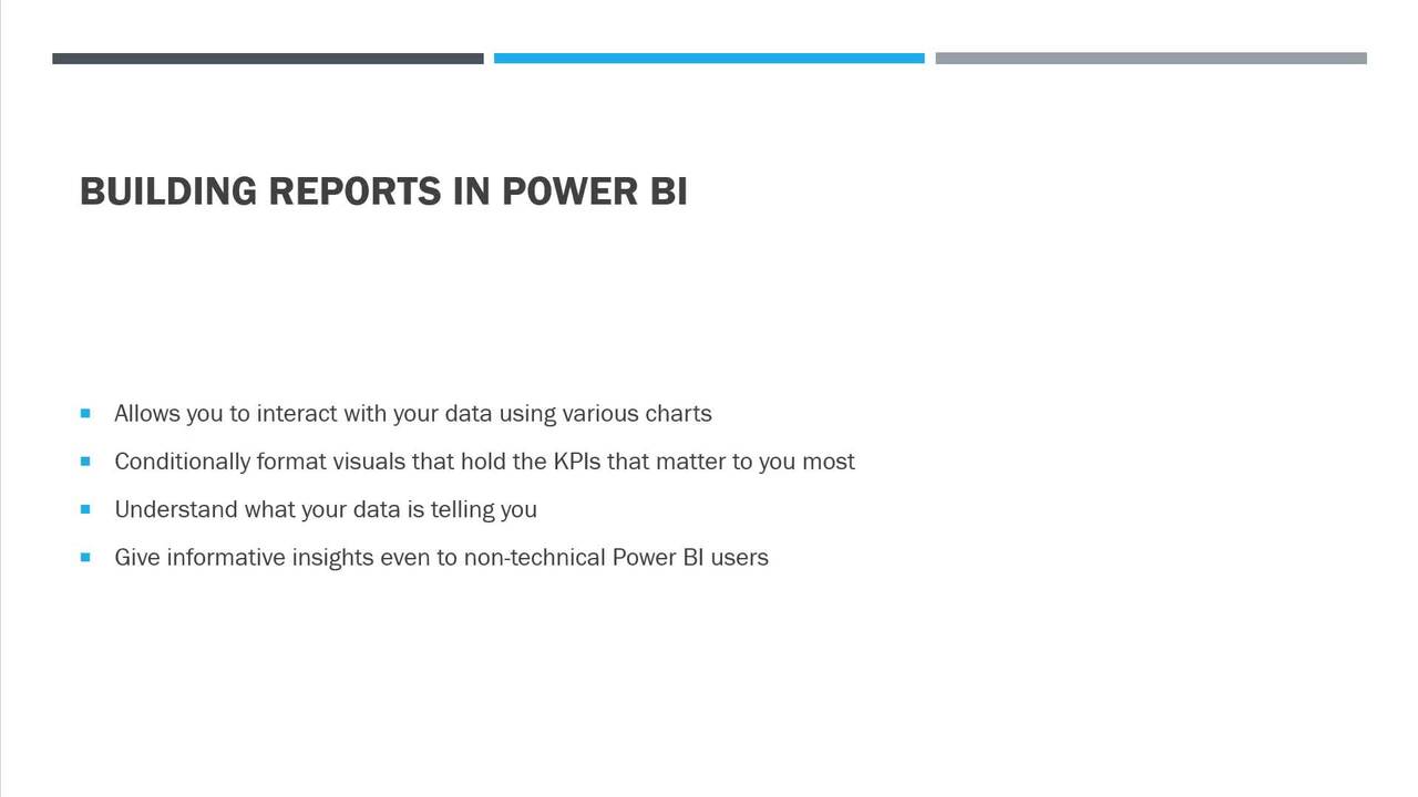
Leverage Power BI to the fullest: Master the art of creating interactive, useful, and informative business reports in Power BI


Skill level:
Duration:
CPE credits:
Accredited

Bringing real-world expertise from leading global companies


Bachelor's degree, Advertising and Marketing

Description
Curriculum
Free lessons
1.1 Course intro
1 min
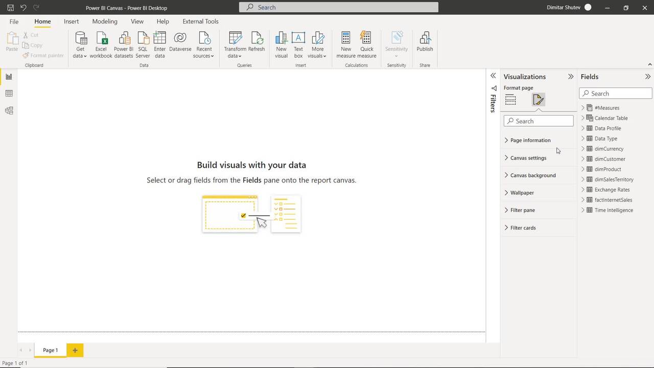
1.2 Power BI Canvas
6 min
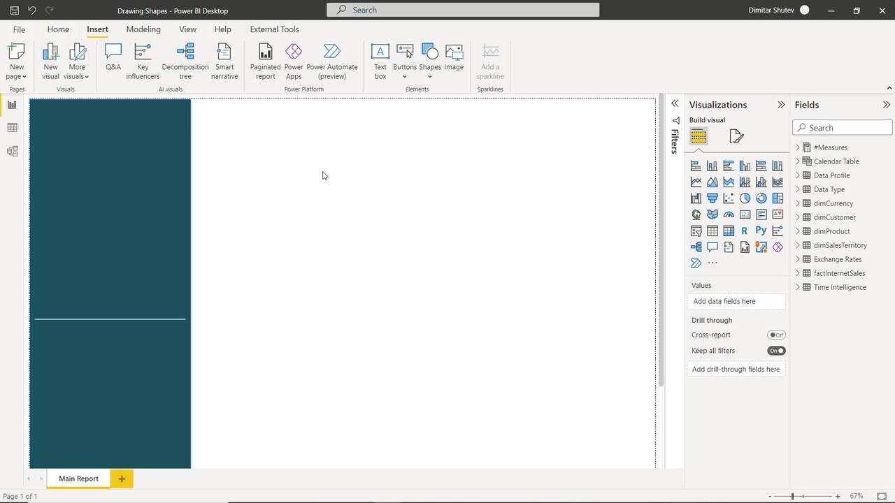
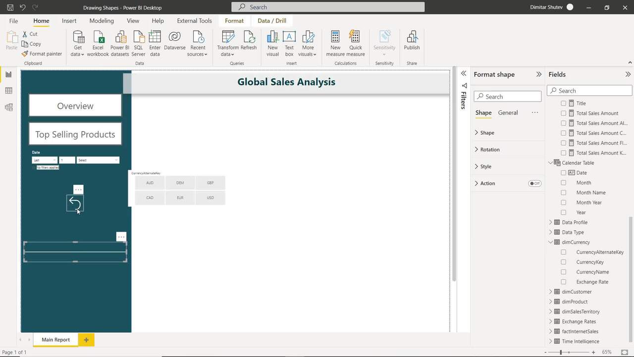
1.3 Drawing Shapes
13 min
1.4 Slicers
16 min
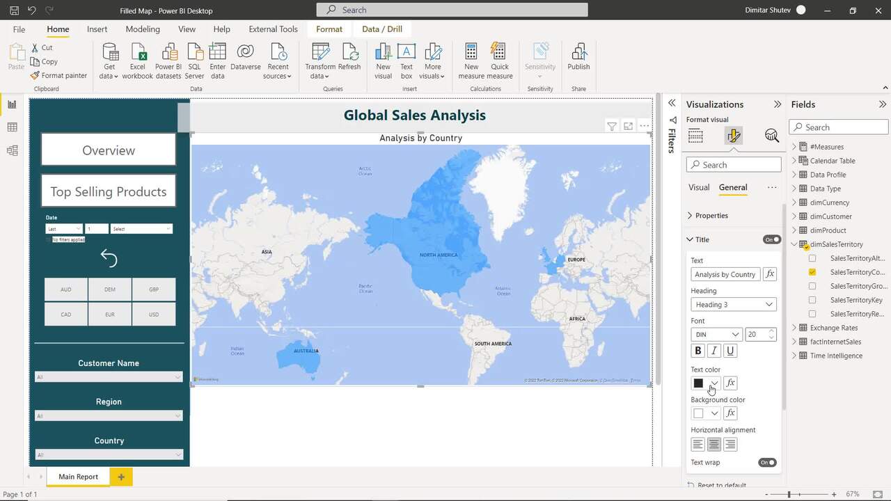
1.5 Filled Map
8 min
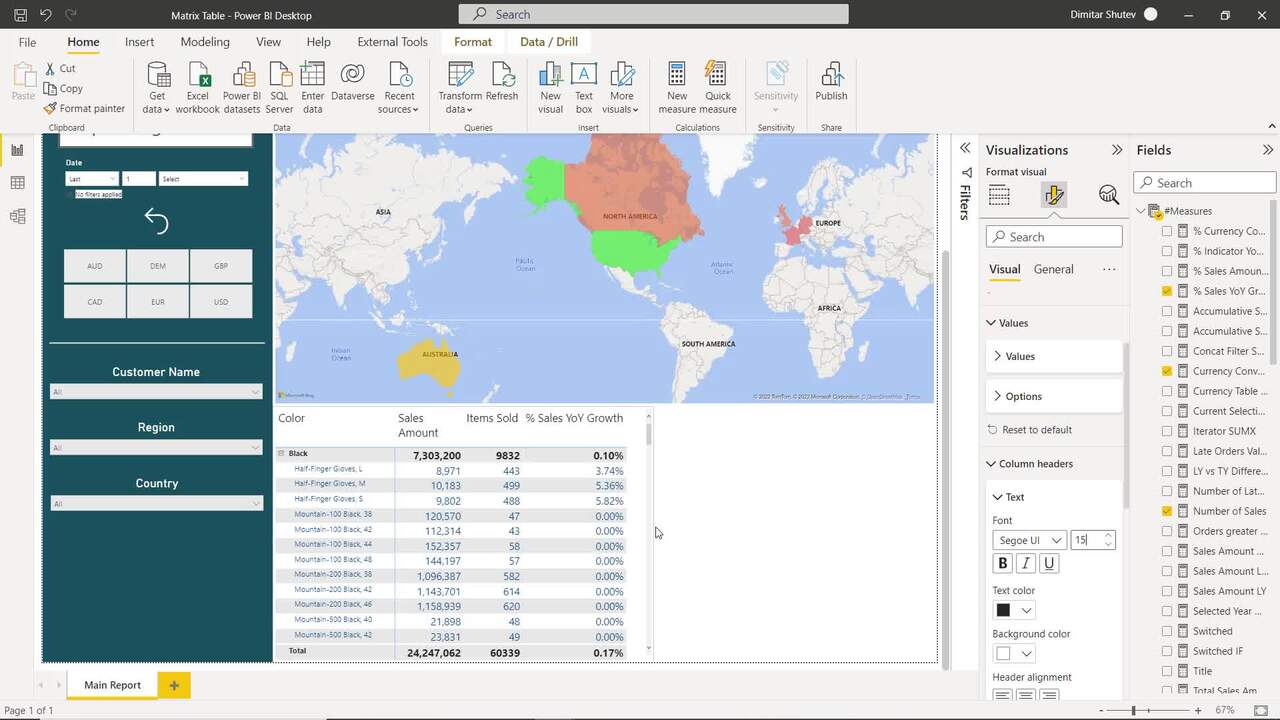
1.6 Matrix Table
13 min
#1 most reviewed
94%
of AI and data science graduates
successfully change
$29,000
average salary increase
ACCREDITED certificates
Craft a resume and LinkedIn profile you’re proud of—featuring certificates recognized by leading global
institutions.
Earn CPE-accredited credentials that showcase your dedication, growth, and essential skills—the qualities
employers value most.
Certificates are included with the Self-study learning plan.

How it WORKS
Student REVIEWS