Online Course free
The Complete Data Visualization Course with Python, R, Tableau, and Excel

Master the art of creating compelling data visualizations: learn how to create professional charts in Python, R, Tableau, and Excel

4.9

808 reviews on
30108 students already have enrolled
  • Institute of Analytics
  • The Association of Data Scientists
  • E-Learning Quality Network
  • European Agency for Higher Education and Accreditation
  • Global Association of Online Trainers and Examiners

Skill level:

Basic

Duration:

10 hours
  • Lessons (9 hours)
  • Practice exams (38 minutes)
  • Projects (5 hours)

CPE credits:

12.5
CPE stands for Continuing Professional Education and represents the mandatory credits a wide range of professionals must earn to maintain their licenses and stay current with regulations and best practices. One CPE credit typically equals 50 minutes of learning. For more details, visit NASBA's official website: www.nasbaregistry.org

Accredited:

certificate

What You Learn

  • Gain a solid understanding of data visualization fundamentals and theory
  • Learn how to create professional and aesthetically pleasing charts in Python, R, Tableau, and Excel
  • Understand how to select the right type of chart depending on the problem at hand
  • Develop expertise in interpreting data and communicating your findings through data visualizations
  • Boost your resume and career prospects with highly sought-after data visualization skills
  • Enhance your project portfolio with compelling data visualizations and impress recruiters and hiring managers

Topics & tools

data visualizationdashboardpythontableaurexceltheory

Your instructor

Course OVERVIEW

Description

CPE Credits: 12.5 Field of Study: Specialized Knowledge
Delivery Method: QAS Self Study
The Data Visualization course is designed for everyone looking to deepen their understanding of creating meaningful and compelling visualizations. Whether you’re coming from a business or data science-related field, knowledge in data visualization is both important and advantageous. That’s precisely why this course is centered not in just one, but four different environments: Excel, Tableau, Python, and R. Each section is dedicated to a specific type of chart – bar charts, pie charts, area charts, line charts and many more. In addition, there are lectures that specifically explore what to avoid when creating a certain graphic. You can stick with your preferred environment and follow each section. Or you could master all four environments and add indispensable skills to your data visualization toolset.

Prerequisites

  • Python (any recent version, such as Python 3.8 or later) and a code editor or IDE (e.g., Spyder, VS Code, or Jupyter Notebook)
  • Tableau Desktop or Tableau Public
  • Completion of an introductory Python course is recommended. Completion of an introductory Tableau course is recommended.

Curriculum

108 lessons 6 exercises 1 project 5 exams

Free preview

What does the Course Cover

1.1 What does the Course Cover

5 min

Why Learn Data Visualization

1.2 Why Learn Data Visualization

6 min

How to Choose the Right Visualization - Popular Approaches and Frameworks

1.4 How to Choose the Right Visualization - Popular Approaches and Frameworks

7 min

Color Theory and Colors

1.6 Color Theory and Colors

9 min

Setting Up The Environments - Do Not Skip, Please!

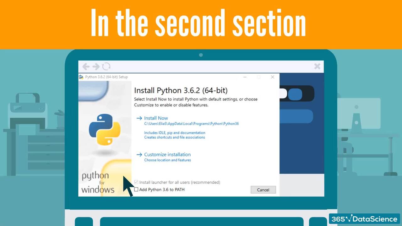
2.1 Setting Up The Environments - Do Not Skip, Please!

1 min

Tableau - Downloading Tableau

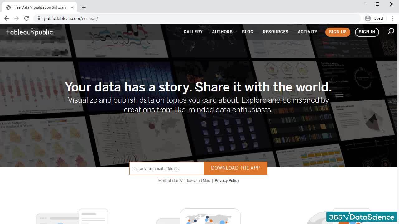
2.2 Tableau - Downloading Tableau

2 min

Start for free

96%

of our students recommend

365 Data Science.

4.9

Based on 808 reviews

#1 most reviewed

AI and data learning platform on Trustpilot.

94%

of AI and data science graduates

successfully change

or advance their careers.

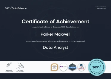
ACCREDITED certificates

Craft a resume and LinkedIn profile you’re proud of—featuring certificates recognized by leading global institutions.

Earn CPE-accredited credentials that showcase your dedication, growth, and essential skills—the qualities employers value most.

  • Institute of Analytics
  • The Association of Data Scientists
  • E-Learning Quality Network
  • European Agency for Higher Education and Accreditation
  • Global Association of Online Trainers and Examiners
A LinkedIn profile mockup on a mobile screen showing Parker Maxwell, a Certified Data Analyst, with credentials from 365 Data Science listed under Licenses & Certification. A 365 Data Science Certificate of Achievement awarded to Parker Maxwell for completing the Data Analyst career track, featuring accreditation badges and a gold “Verified Certificate” seal.

How it WORKS

  • Lessons
  • Exercises
  • Projects
  • Practice Exams
  • AI Mock Interviews

Lessons

Learn through short, simple lessons—no prior experience in AI or data science needed.

Try for free

Exercises

Reinforce your learning with mini recaps, hands-on coding, flashcards, fill-in-the-blank activities, and other engaging exercises.

Try for free

Projects

Tackle real-world AI and data science projects—just like those faced by industry professionals every day.

Try for free

Practice Exams

Track your progress and solidify your knowledge with regular practice exams.

Try for free

AI Mock Interviews

Prep for interviews with real-world tasks, popular questions, and real-time feedback.

Try for free

Student REVIEWS

A collage of student testimonials from 365 Data Science learners, featuring profile photos, names, job titles, and quotes or video play icons, showcasing diverse backgrounds and successful career transitions into AI and data science roles.