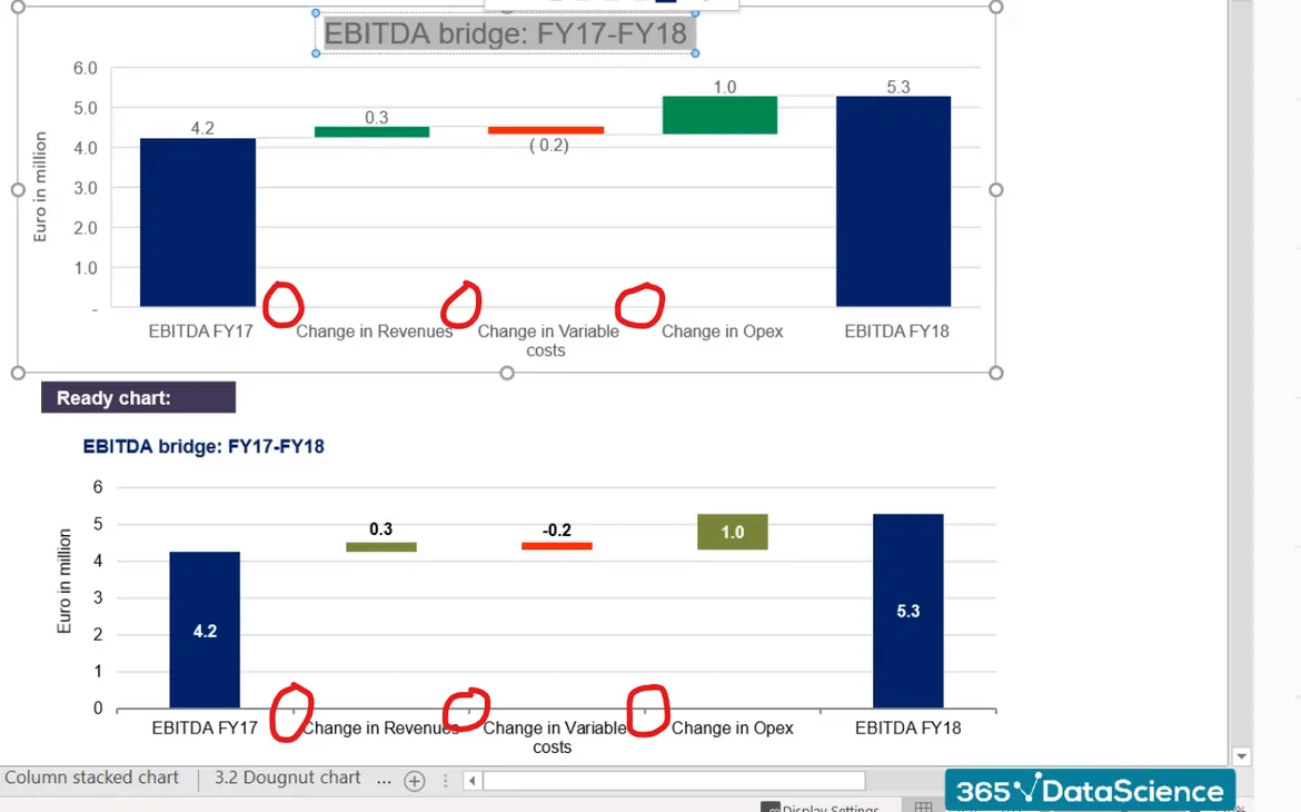
Little increment lines between the horizontal axis titles
The prepared chart at the bottom has small increment lines between the horizontal axis information. E.g. The little vertical dash between "EBITDA FY17" and "Change in Revenues".
Wondering which chart feature can generate these small inserts? They look quite nice, and I notice that the finished chart from the tutorial is missing them in the recreation.
Thanks!
Hi Sheldon,
Thanks for reaching out but I was unable to understand which are the dashes you are referring to, please. Could you send me a screenshot with the detail that is available in the ready chart and the difference that you see in your chart? Thanks!
Best,
Ned
Hi Ned,
Apologies for my lack of clarity. Hope fully, this screenshot provides a better understanding in regards to which dashes I'm referring to. I don't see them in the chart created within the video. It's a pretty small feature, but I quite like the small detail. Any idea how to re-create it?
Thanks,
Sheldon
Hi,
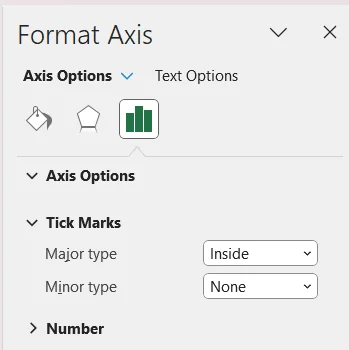
These marks are called Tick Marks. They can be added as follows:
select and right-click the X-axis (or the Y-axis), select the "Format Axis" option from the right-click menu, select "Tick Marks" from the menu and selecting position of tick mark for the major and/or minor axis. Snapshot attached below.