Rabab A.
Before 365:
Project Coordinator | SOFRECO
After 365:
Freelance Data Analyst
See all reviews
Gain first-hand data analyst experience: Use SQL and Tableau to tackle real-world business challenges


Skill level:
Duration:
CPE credits:
Accredited

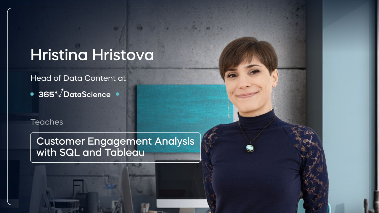
Bringing real-world expertise from leading global companies

Master's degree, Theoretical and Mathematical Physics

Description
Curriculum
Free lessons
1.1 What Does the Course Cover?
4 min

1.2 Motivation - Our Story
5 min

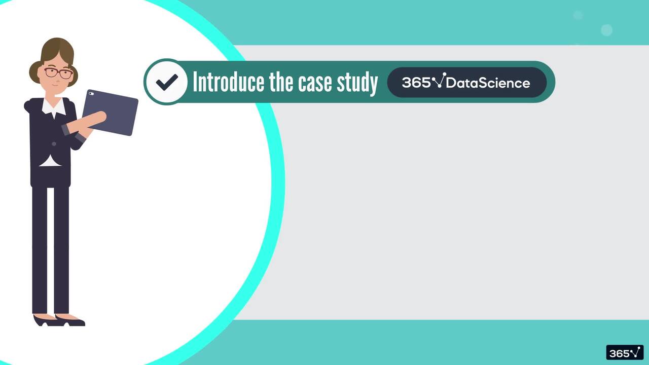
2.1 The Case Study
5 min
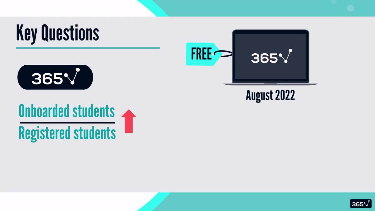
2.3 Defining the Key Questions (Part 1)
7 min
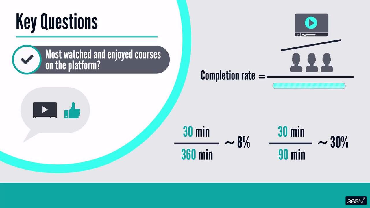
2.5 Defining the Key Questions (Part 2)
6 min
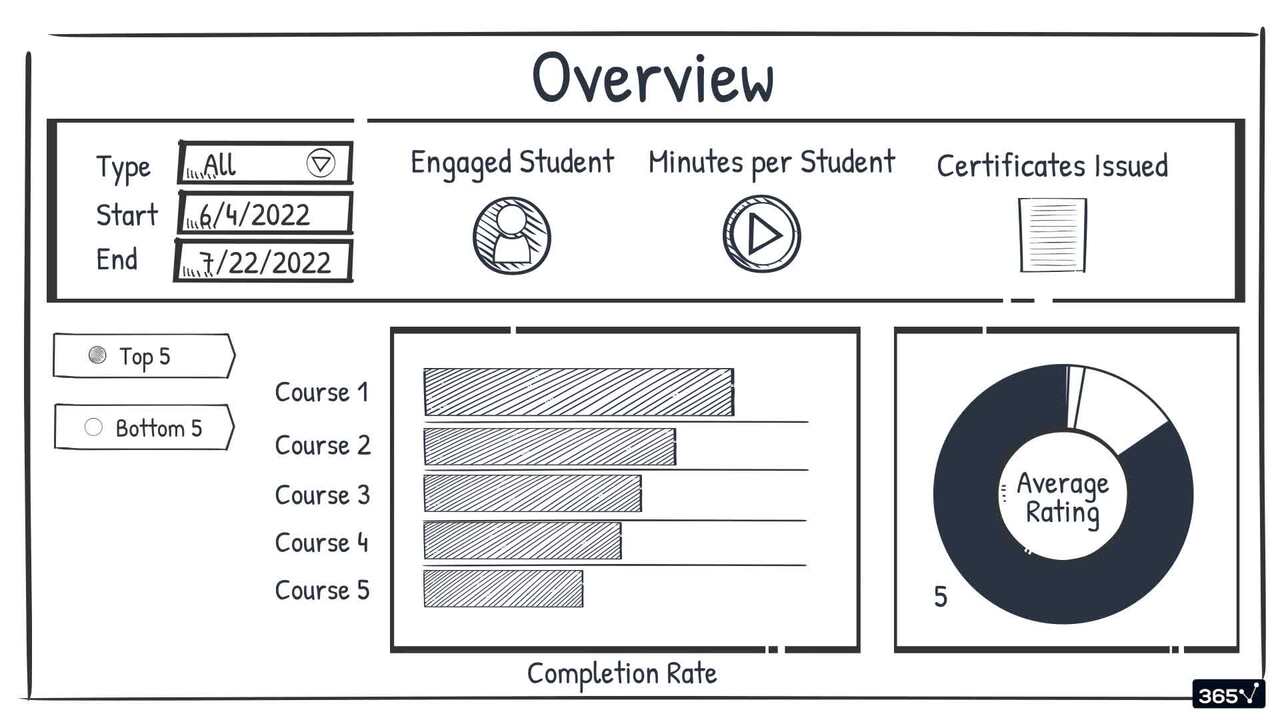
2.7 Sketching the Dashboard (Part 1)
4 min
94%
of AI and data science graduates
successfully change
9 in 10
people walk away career-ready
$29,000
average salary increase
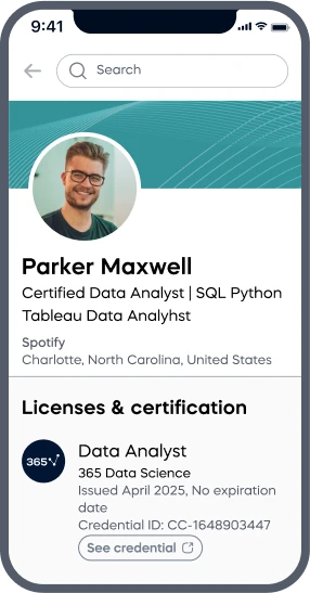
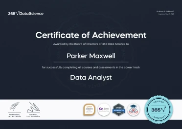
ACCREDITED certificates
Craft a resume and LinkedIn profile you’re proud of—featuring certificates recognized by leading global
institutions.
Earn CPE-accredited credentials that showcase your dedication, growth, and essential skills—the qualities
employers value most.
Certificates are included with the Self-study learning plan.
How it WORKS
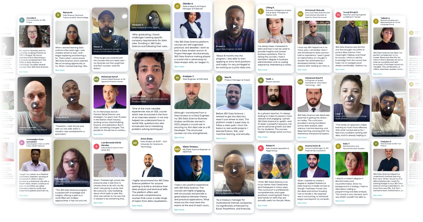
Student REVIEWS