Task 7 Pareto Line % is wrong
I made this chart in the web version of Excel but the percentages are wrong and I don't know how to change it. For some strange reason, it starts at a strangely high percent and decreases as the line increases. How can I correct the percent?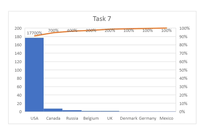
Hi Dylan,
thanks for reaching out! Could you also share a screenshot of the columns you used to create the chart? And any formula's you may have used in any of the columns
Thanks in advance!
Best,
365 Eli
Hi Eli,
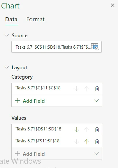
I think this is what you mean? If not let me know. Using the USA row as an example the formulas are =COUNTIF('365RE'!$V$6:$V$201,'Tasks 6,7'!C11) for the Frequency column, =D11/$D$19 for the Relative Frequency column, and =E11 for the Cumulative Frequency column.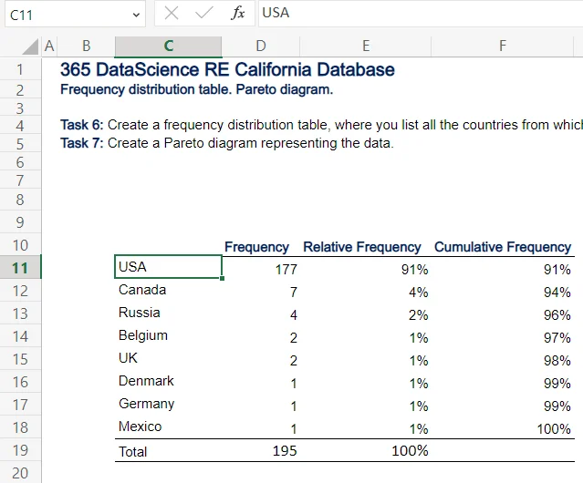 Clicking the Pareto Diagram shows me this information.