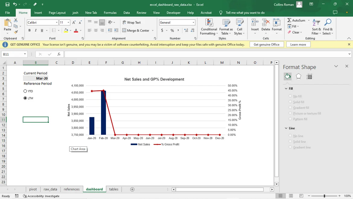
Dashboard in Excel- Bar and Line Chart combination
in
The Complete Data Visualization Course with Python, R, Tableau, and Excel
/
Dashboard in Excel – Charts - Bar and Line Combination Chart
Hello good day, please i think there's a problem with my chart. When i click on LTM it shows me the chart for YTD and vice versa. i followed all the steps in each lesson so i'm stuck here. Please help out. Thanks. kindly see attached below.
1 answers ( 0 marked as helpful)
Hi Roman,
thanks for reaching out! Could you check that you've created the radio buttons without mixing up the two values. You can also check if the columns in the data and the columns in the tables sheet aren't mixed up somehow, or you haven't referenced the opposite columns in the formulas themselves.
I hope this helps!
Best,
365 Eli