
Megan V.
Before 365:
Medical scientist | Triumvira Ummonologics
After 365:
Director, Translational Medicine and Data Management | KaliVir Immunotherapeutics
See all reviews
Go from beginner to pro in Excel with this introductory Excel course that will quickly boost your skills. Learn the most popular office productivity tool in the world


Skill level:
Duration:
CPE credits:
Accredited

Bringing real-world expertise from leading global companies


Master's degree, Finance

Description
Are you looking for Excel courses for beginners that will elevate you to pro level?
Would you like to learn to work competently in Excel in just a few hours?
If so, this is the perfect Excel course for you!
You don’t need to spend hundreds of hours trying to learn Excel on your own. It doesn’t get any easier if you rely on Excel tutorials from specialized websites and YouTube. There is a good reason for that.
The most effective way to master Excel is through comprehensive Excel training, where an industry professional guides you from the basics to advanced techniques, offering a structured, step-by-step learning experience beyond mere snippets of information.
This Excel course for beginners stands out because it introduces practical tools and best practices and combines all the acquired knowledge to solve a real-world problem. We know this system works exceptionally well because hundreds of thousands of users worldwide have provided feedback and expressed satisfaction.
The Excel training is ideal for recent graduates, inexperienced young professionals, and analysts a few years into their roles who need to enhance their skills and adopt best practices. No prior knowledge of Excel basics? No problem. This course efficiently guides you from the ground up. Hundreds of Excel courses are available online, but this highly popular one stands out. Instructor Ned Krastev delivers Excel lessons in a clear, friendly manner—ensuring that students can work proficiently on their own by the course's end.
Ned brings practical insights from his roles at PwC, Coca-Cola, and Infineon Technologies—making him the perfect instructor for Excel beginners. With over a decade of teaching experience and millions of students globally, his courses have proven effective. Join us to master quick Excel navigation with shortcuts and popular functions like VLOOKUP, SUMIF, SUMIFS, INDEX, MATCH, and more.
Gain the flexibility to create financial and data analysis reports with pivot tables and Excel functions. Format your work professionally and follow Excel best practices. Earn an Excel certificate recognized by employers and boost your resume.
What sets this beginner Excel course apart from others?
Click the 'Buy Now' button to embark on an incredible learning journey and invest in a career-changing opportunity.
Curriculum
Free lessons

1.1 Welcome to the Course
4 min
1.2 Excel Made Easy: A Beginner's Guide to Excel Spreadsheets
4 min
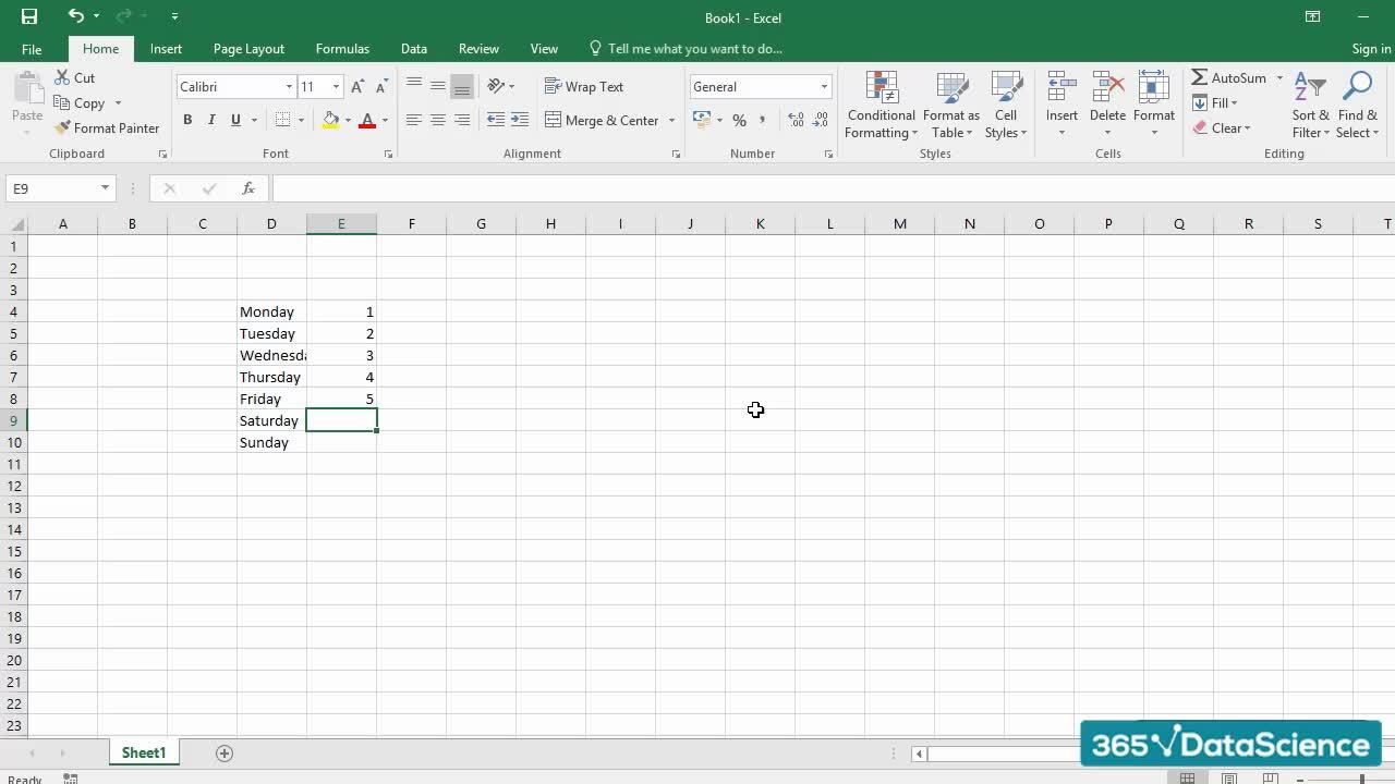
1.3 Data Entry Techniques in Excel
3 min
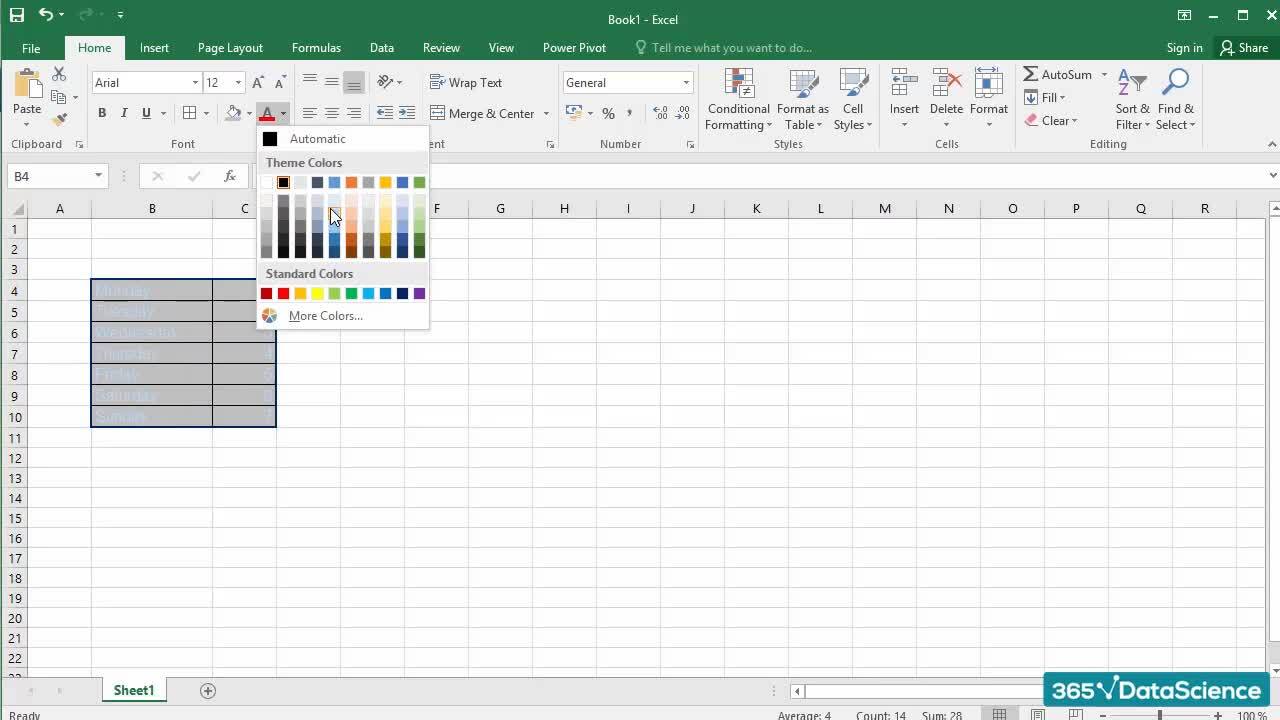
1.5 How to Make Your Spreadsheets Look Professional
6 min
1.7 Inserting, Deleting, and Modifying Rows & Columns
2 min
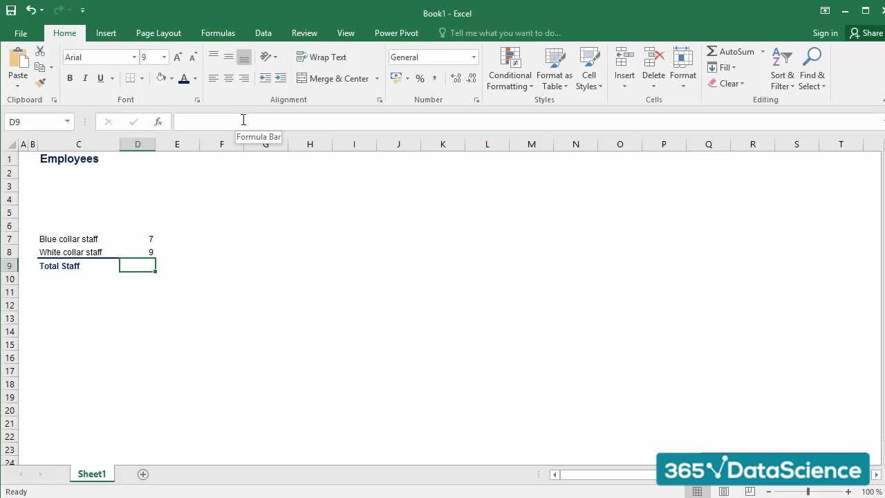
1.8 Excel Formulas for Beginners
3 min
$29,000
average salary increase
94%
of AI and data science graduates
successfully change
9 in 10
people walk away career-ready
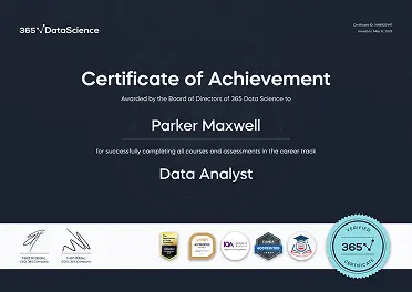
ACCREDITED certificates
Craft a resume and LinkedIn profile you’re proud of—featuring certificates recognized by leading global
institutions.
Earn CPE-accredited credentials that showcase your dedication, growth, and essential skills—the qualities
employers value most.
Certificates are included with the Self-study learning plan.

How it WORKS
Student REVIEWS