
Creating and understanding a histogram is an integral part of any data analysis process. In fact, if your work or education is in any way related to a quantitative discipline, you’ll most likely be required to make a histogram of your own or examine results featuring one. Not to mention that in today’s data-driven world, a strong data visualization skillset is one of the gateways to a successful career in data science.
That’s why in this tutorial, we’ll show you how to create a histogram in R.
More specifically, you will learn how to make a GGplot2 histogram. You’re about to find out how to use one of the most popular visualization libraries in R. And, what’s more, you will be able to add the ggplot histogram to your own analysis.
So, let’s get started, shall we?
What Is a Histogram?
A histogram is one of the most useful tools to understand numerical data.
What Is a Histogram Used for?
The first thing you need to remember is that a histogram requires precisely one numerical feature.
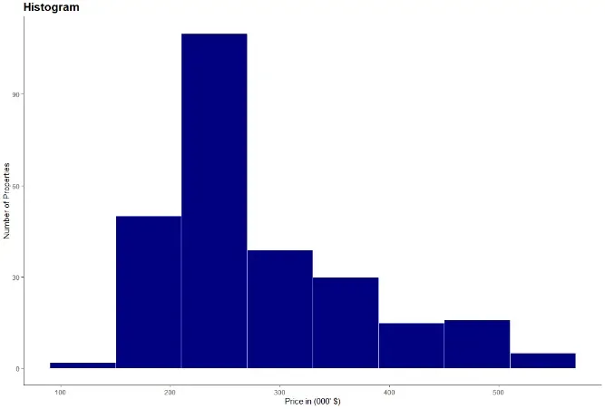
A Histogram shows the distribution of a numeric variable. The variable’s range of values is split into intervals, represented by different bins. The height of the bins shows the number of observations within an interval.
What Is the Difference Between a Bar Graph and a Histogram?
At this point, it’s worth mentioning another key aspect of a histogram.
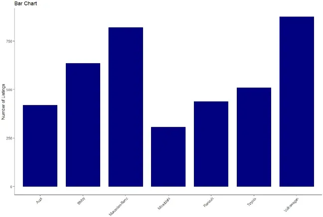
You may have noticed that it looks similar to a bar chart. However, histograms bins show neighbouring intervals. Hence, there is no space between the bins of the histogram, unlike between bars in a bar chart.
Now that you know what is a histogram and what is its purpose, let’s start work on our actual ggplot2 histogram.
How to Create a Histogram in GGplot2 in R?
When it comes to data analysis and statistics, R is one of the most popular choices among data scientists.
And when it comes to visualizing data in R, there is one clear stand out choice – ggplot2. ggplot2 is one of the most popular data visualization libraries in the R language. So popular in fact, that there is now a ggplot2 library in Python, based on the R version. So, it supports more than one single programming language.
But no matter which environment you’re programming in, to obtain a histogram, first, you need some data.
How to Load the Data Set for the GGplot2 Histogram?
For our histogram, we’ll be using data on the California real estate market.
In a new variable called ‘real estate’, we load the file with the ‘read CSV’ function. We also specify ‘header’ as true to include the column names and have a ‘comma’ as a separator.

Here, if your data file isn’t in your main r folder, you must also include the path’s location to your file, as well.
After loading the data we’re able to explore it in more detail with the aid of the environment pane. By clicking on the real estate variable, we observe that our real estate data frame contains a little over 250 observations and a total of 9 features.
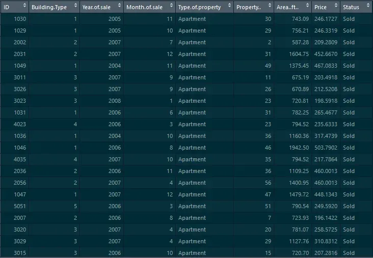
However, we rely on a single feature for our histogram, namely ‘Price’. As we’ve discussed, a histogram requires precisely one measure.
What are the GGplot2 Histogram Mandatory Layers?
With that in mind, let’s proceed with creating our Histogram with the help of the ‘GG plot’.
1. Data Layer
We start with the data layer, which is our ‘real estate’ data frame.
2. Aesthetics Layer
We move on to the aesthetics and as discussed, we’re creating a histogram of ‘Price’. Hence, we need only specify the ‘Price’ column here.
3. Geometry Layer
Lastly, the third layer is geometry. To create our histogram, we must use ‘geom histogram’.

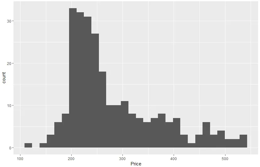
After executing the code, we obtain our gg histogram.
How to Choose the Number of Histogram Bins in a GGplot2 Histogram?
Now, we can examine our newly obtained histogram. It shows 30 different bins, which is the default number in a ‘GG histogram’. However, based, on our data, a smaller number would be more appropriate.
Choosing an appropriate number of bins is the most crucial aspect of creating a histogram. Through varying bin sizes, a histogram can reveal vastly different insights. This is a broad topic and examining it in more detail would require a tutorial on its own!
But here, we stay on the practical side of things and see how to alter a histograms bin size in a ‘GG plot’.
We can achieve this through the bins parameter. In the geometry layer, we add another parameter, which is bins. For this histogram we make it equal to 8.

Also, in this layer, we’re able to control additional aspects of our histogram. For instance, we can specify the ‘bin width’, ‘boundaries’, even ‘geometries’ of our histogram. Feel free to explore these options when you’re creating your own histogram.
How to Change the Color in a GGplot2 Histogram?
We‘re moving on to some styling options (but we encourage you to explore additional options for a ‘GG histogram’ on your own, as well).
One of the most crucial aspects of every visualization is the colors we choose to display it. And while remaining with the default is always an option, taking that extra step and choosing a custom color is what sets your visualization apart.
For our histogram, it will be a blue color - close to our hearts. It’s the 365 Data science blue, which has the code ‘#108A99’. Altering the color is achieved with the ‘fill’ parameter. Now, in a GG histogram, unlike a bar chart, there is no space between two neighboring bins. All the bins seem as if they’ve been glued together which, sadly, makes the bins less distinguishable. But we can avoid that by adding a white border for each bin. That way we’re creating separation among the blue bins. We can control the border color through the ‘color’ argument, so we set it to white.

This is already an excellent result! However, there are a few additional elements, aside from color, which could really set your chart apart.
How to Style the GGplot2 Histogram?
You can style a chart by customizing its theme. The default in a ggplot has a grey background. But this isn’t fitting, especially with our brand new color. So instead, we’ll rely on a ‘classic theme’. A classic theme has a clean design and a white background.
And of course, we cannot leave our histogram without a title. We include a title with the help of a ‘GG title’. It reads as ‘Distribution of Real Estate Prices’. Here you could do with increasing the title size. This can be achieved by adding a theme layer with a ‘plot title’ element. We need a ‘text element’ and in the brackets let’s choose a ‘size of 16’ and the ‘face’ to be bold.
While we’re at it, some axis labels wouldn’t go amiss. With ‘xlab’ we set the x-axis label to ‘Price in thousands of dollars’. For ‘ylab’ we have ‘Number of Properties’.

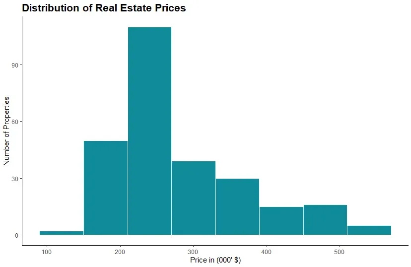
And that’s all folks! With just a few, carefully curated steps, we’ve achieved a professional and well-styled histogram. We relied on ggplot2’s capabilities in R and then used our knowledge and aesthetics to further transform the histogram. This way we ensured that our chart is the best it can be.
GGplot2 Histogram: Next Steps
The topic of how to create a histogram, and how to create one the right way is a broad one. And this tutorial’s goal was to provide you with all the necessary steps to create a ggplot histogram in R. However, you shouldn’t limit yourself to one environment only. So, if you’d like to develop your data visualization skillset, check out our Complete Data Visualization with Python, R, Tableau, and Excel course.
And if you want to build your R skills, take our Introduction to R Programming course.
Next tutorial: How To Make a GGPlot2 Scatter Plot in R?


