How to select among different chart types?
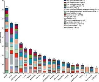
This is the perfect article if you want to avoid creating charts like this one...
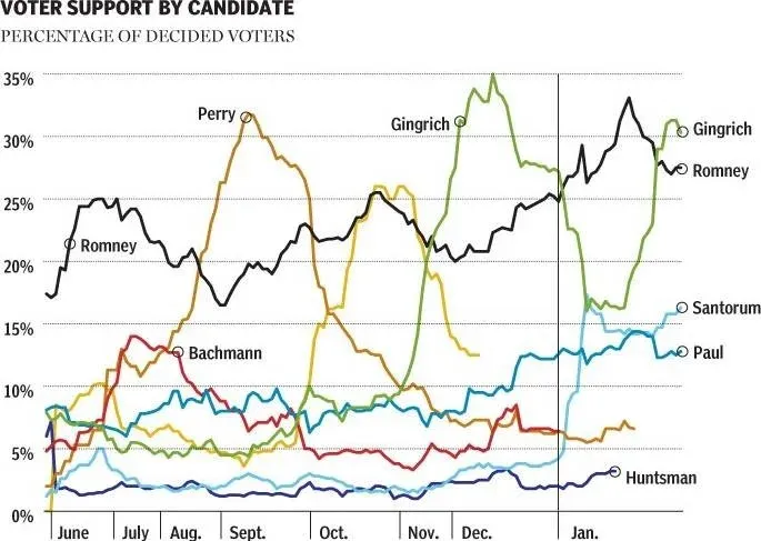
Or perhaps this one…
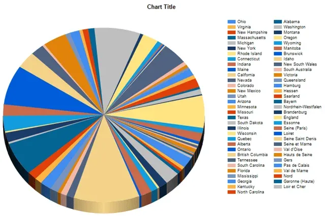
And especially this one...
Being able to choose the right chart type for the data you are working with is not an exact science, but I’m sure you will agree something went wrong with these examples. One can’t be certain whether they have been taken from a horror movie or a hippie fest.
In 99.9% of cases, we don’t want to show this to our audience.
Charts are an opportunity.
A storytelling tool.
A chance to make a convincing argument through visualizing data. And that's of major importance if you want to become an outstanding data science professional.
If we work with chart types that are not the right fit for the data, we won't convince anybody. To help you overcome or avoid this issue, in this article we’ll discuss:
- the different chart types, and
- the type of data different chart types are suitable for
1. Bar Graph
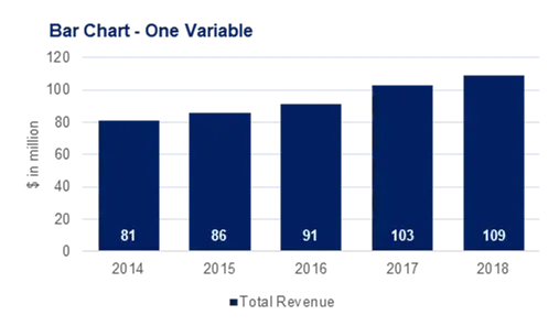
Bar charts are among the most frequently used chart types. As the name suggests a bar chart is composed of a series of bars illustrating a variable’s development. Given that bar charts are such a common chart type, people are generally familiar with them and can understand them easily. Examples like this one are straightforward to read.
A bar chart with one variable is easy to follow.
However, please be aware that bar charts can be confusing, too. Especially if one uses them to compare several variables. I personally believe that a comparison of more than two variables with a clustered bar chart becomes too cluttered. Here is an example of a clustered bar chart that is not exactly crystal clear:
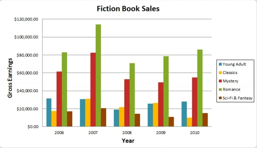
This isn’t a horrible visualization, but it leaves plenty to be desired.
First of all, it is difficult to follow the trend of all five variables simultaneously, isn’t it? Moreover, it is hard to gain an idea about the overall state of the Fiction Book Sales market, and how it changed, which was probably what the person who created the chart wanted to show in the first place.
When to use bar charts
Bar charts are nice but limited. We have to consider the type of data we want to visualize and the number of variables that will be added to the chart.
Bar charts are great when we want to track the development of one or two variables over time. For example, one of the most frequent applications of bar charts in corporate presentations is to show how a company’s total revenues have developed during a given period.
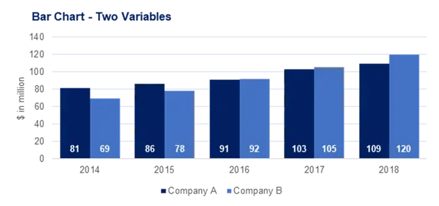
A bar chart can be used to make both a year-on-year comparison and a monthly breakdown. Moreover, bar charts can be pretty intuitive when we compare the development of two numerical variables over time. Let’s say we would like to compare the revenues of two companies in the timeframe between 2014 and 2018.
Bar charts can work well for comparison of two variables over time
When to avoid using bar charts
Simple bar charts are far from ideal in situations when we have several variables and all of them are part of a whole. Such as the case In the Fiction Book Sales chart we showed you, there were five categories: Young adult; classics; mystery; romance; and Sci-fi. These account for all fiction books. Meaning, their sum gives us the total volume of the Fiction book sales market.
Do we get any of this information with this bar chart?
We don’t.
It simply shows us multiple lines and one has to start making calculations on their own to understand how numbers developed over time. And if they have to do that, why bother even creating a chart in the first place? We are better off showing the data in a table format, right? So, this certainly is one case where we should use different chart types.
Along the same lines, a simple bar chart isn’t suitable when we have a single period breakdown of a variable. If I want to portray the main business lines that contributed to a company’s revenues in 2018, I wouldn’t use a bar chart. Instead, I’d create a pie chart or one of its variations.
Author's note: If you are interested in pursuing a career as a data scientist go ahead and download our free data science career guide that teaches you how to become a data scientist
2. Pie Chart
A pie chart is a circular graph divided into slices. The larger a slice is the bigger portion of the total quantity it represents.
When to use a pie chart
So, pie charts are best suited to depict sections of a whole.
What does that mean?
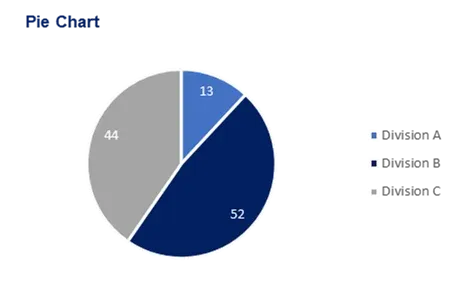
If a company operates three separate divisions, at year-end its top management would be interested in seeing what portion of total revenue each division accounted for.
Pie charts are great for depicting sections of a whole
A pie chart is perfect in this case. However, we need to be certain that the sum of the proportions makes 100% of the total. That is, we cannot afford to forget any of the three divisions contributing to total revenue.
When to avoid pie charts
Obviously, we can’t use a pie chart in situations when we would like to show how one or more variables develop over time. Pie charts are a definite no-go in these cases. Moreover, as mentioned earlier, a pie chart would be misleading if we don’t consider all values. In the context of our example from earlier, we shouldn’t create a pie chart that includes revenue of only two of the firm’s three divisions.
3. Doughnut Chart
Doughnut charts are basically pie charts with a hole in the middle. (It is as if their heart is missing…)
When to use doughnut charts
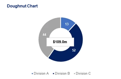
The use cases of pie and doughnut charts are identical. The only important difference is that doughnut charts allow us to indicate the total amount by adding a text box in the middle.
Doughnut charts show the same information as a pie chart but from a different perspective
If you use a pie chart, you will have to include the total amount elsewhere (like adding it to the title).
When to avoid using doughnut charts
We already explained when to avoid using pie charts. The same is valid for doughnut charts.
One piece of advice when choosing whether to include a pie or a doughnut chart would be to think of your audience. How likely is it they would be interested in seeing the total figure for breakdown you are providing? If the split itself is more important, then go ahead and use a pie chart. If the value of the total is important too, then perhaps a doughnut chart would be preferable.
Moreover, some studies have shown that people tend to get a distorted idea when shown pie charts, as larger portions can look even more so because they cover more space. With doughnut charts, this isn’t as much of an issue.
4. Line Graph
A line chart is, as one can imagine, a line or multiple lines showing how single, or multiple variables develop over time. It is a great tool because we can easily highlight the magnitude of change of one or more variables over a period.
When to use line charts
Remember the awkward 'Fiction book sales' chart we saw earlier? Well, a simple line chart would have been much better in that case. A line chart allows us to track the development of several variables at the same time. It is very easy to understand, and the reader doesn’t feel overwhelmed.
Author's note: If you want to quickly and easily add a line chart to your report, you can do it with the help of Canva's Online Graph Maker.
Line charts track several variables at once
When to avoid line charts
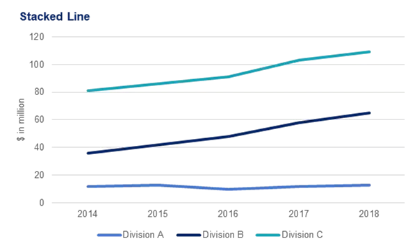
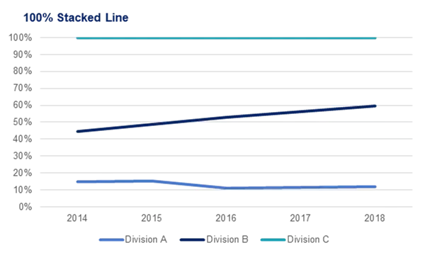
Line charts are not that great in situations when you want to show how the individual parts of a whole change over time. Yes, in theory, one could use a stacked line chart (where line values accumulate) or a 100% stacked line chart (where lines accumulate to 100%), but a stacked area chart would look better.
This chart type is less effective when showing portions of a whole
5. Area Chart
Area charts are very similar to line charts. In fact, at first, I wanted to show them together. However, one major confusion could have arisen. So, please pay attention.
The idea of an area chart is based on the line chart. Coloured regions (areas) show us the development of each variable over time.
There are three types of area charts: regular area chart, stacked area chart, and 100% stacked area chart.
When to use an area chart
Whenever we want to show how the parts of a whole change over time, we should consider an area chart. So, for example, if the company has three revenue generating divisions, it is very likely that management would like to see the development of each of these divisions.
This is a great way to draw attention to the total value and still emphasize an important trend – say, revenues from one division have been growing rapidly while the other two have kept the same level. A stacked area chart is perfect in this case.
However, if we are interested in the portion of revenue generated by each division and not that much of the total amount of revenues, we can simply use a 100% stacked area chart. This will show each division’s percentage contribution over time.
Area charts show how variables change in relation to each other
When to avoid area charts
Obviously, similarly to line charts, area charts are not suitable for representing parts of a whole over a single period. In our example, we can’t use an area chart to show the proportion of revenues each division generated in say, 2018 alone. So that’s a situation where we can’t use an area chart.
In general, I would stay away from the classical area chart too. It can be very confusing and even Microsoft themselves recommend avoiding it and to consider using a simple line chart. If we wanted to show the development of revenues generated by each of the firm’s divisions over time with a simple area chart, we would have something looking like this.
Area charts can confuse things when showing parts of a whole
I know. A nightmare.
So, to recap. Line and area charts function in a strange symbiosis between each other:
It is recommended to use the line chart, stacked area chart, and 100% stacked area chart; 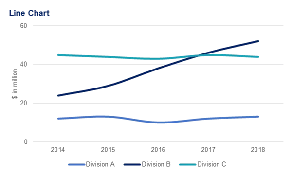
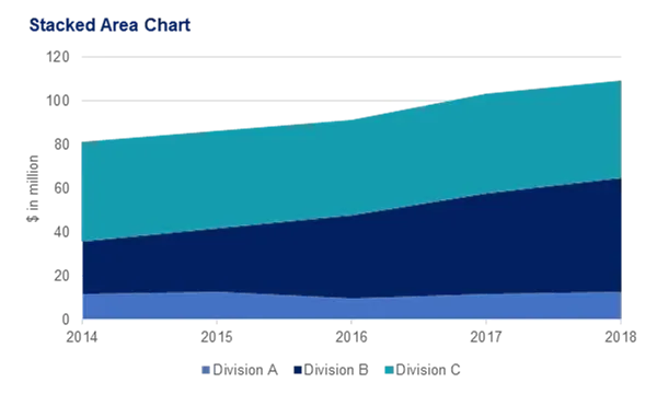
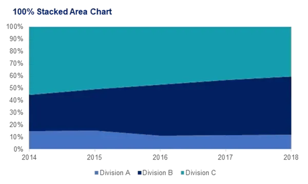
We should avoid using: area chart, stacked line chart, and 100%-line chart;
6. Treemap Chart
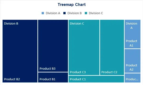
There are some chart types that are effective but often neglected. Treemap charts are a good example. Here is what one looks like.
Treemap charts are a very organised chart type
It allows us to split the sum of the whole into hierarchies and then show an internal breakdown of each of these hierarchies.
When to use Treemap charts
The company we have been looking at so far has three divisions. And each of them has its own products. This is the perfect way to provide information about the weight divisions have with respect to the firm’s total revenue. At the same time, it shows how much each product contributes to the revenue of its division. Very informative, right?
When to avoid Treemap charts
As you can imagine it is quite difficult to apply treemap charts to a context that is not the one we just described. Treemap charts are one of the chart types that are not suitable when the data we are working with is not divisible into categories and sub-categories. Moreover, we can’t use treemap charts if we want to track development over time.
7. Waterfall Chart
Waterfall, also known as bridge charts, take their origins from consulting. Several decades ago top tier “24/7 at your service” consultants at McKinsey popularized this type of visualization among their clients. And ever since, the popularity of bridge charts has continued to rise.
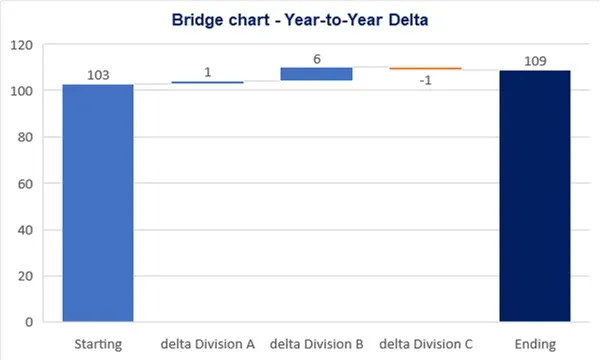
Bridge charts are made of bars showing the cumulative effect of a series of positive and negative values impacting a starting and an ending value. Here’s an example.
Waterfall charts have gained popularity due to their eye-catching design
When to use bridge charts
There are two major use cases of bridge charts. Both are very interesting and intuitive.
First, we can use this type of visualization whenever we would like to bridge the difference between two periods.
So, in our example from earlier, the company registered different revenues in 2018 compared to 2017, right? The starting period for this chart is the end of 2017 or 2018. The ending period is the end of 2018. With a simple bar chart, we would just see an increase of 6 million.
The bridge chart gives us additional information – how different divisions contributed to this increase. In fact, the revenues of two of the divisions increased, while the other one didn’t.
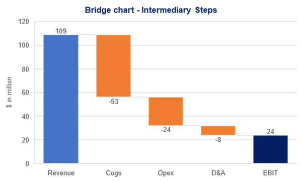
In a similar fashion, a bridge chart can show us how one variable was influenced by a series of factors to obtain a specific output. Let’s provide an easy to understand example, which is heavily used in finance. The company’s revenues were equal to 109 million $ in 2018, right?
What if we would like to create a visualization showing how revenues are related to operating profits? We have the necessary information knowing the intermediary steps in between. Here’s the equation we will use.
Operating Profit = Revenue – Cost of goods sold – Operating expenses – D&A.
There are three intermediary steps between revenues and operating profit. A bridge chart allows us to show the impact of each of these steps. Very nice, right?
When to avoid bridge charts
When we deal with data that does not involve intermediary steps or segments, we will have to use different chart types. Simple as that.
8. Scatter Plot
A scatter plot is a type of chart that is often used in the fields of statistics and data science. It consists of multiple data points plotted across two axes. Each variable depicted in a scatter plot would have multiple observations. If a scatter plot includes more than two variables, then we would use different colours to signify that.
When to use scatter plots
A scatter plot chart is a great indicator that allows us to see whether there is a pattern to be found between two variables.
See the example we have here?
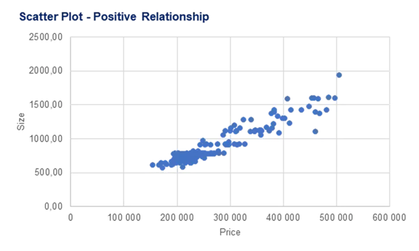
Scatter plots chart types are excellent for finding correlations
The x-axis contains information about house price, while the y-axis indicates house size. There is an obvious pattern to be found - a positive relationship between the two. The bigger a house is, the higher its price.
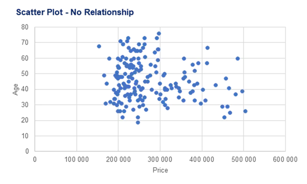
On the other hand, house size and the age of the person who bought a house are two uncorrelated variables, and a scatter plot helps us see that easily.
And also excellent for showing when there isn't one
So, this can be a very useful chart type whenever we would like to see if there is any relationship between two sets of data.
When to avoid scatter plots
We can’t use scatter plots when we don’t have bi-dimensional data. In our example, we need information about both house prices and house size to create a scatter plot. A scatter plot requires at least two dimensions for our data.
In addition, scatter plots are not suitable if we are interested in observing time patterns.
Finally, a scatter plot is used with numerical data, or numbers. If we have categories such as 3 divisions, 5 products, and so on, a scatter plot would not reveal much.
9. Histogram Chart
The last type of chart we will consider here is the histogram chart. A series of bins showing us the frequency of observations of a given variable. The definition of histogram charts is short and easy. Here’s an example.
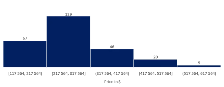
An interviewer asked 267 people how much their house cost. Then a histogram was used to portray the interviewer’s findings. Some prices were in the range between \$117-217k, many more in the range \$217-317k, and the rest of the houses were classified in more expensive bins. Here’s what the histogram looks like.
Histogram is the chart type you want when working with results within a range
When to use histograms
Histograms are great when we would like to show the distribution of the data we are working with. This allows us to group continuous data into bins and hence, provide a useful representation of where observations are concentrated.
When to avoid histograms
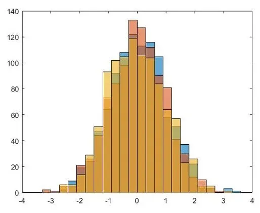
Be careful when the data you are working with contains multiple categories or variables. Multi-column histograms are among the chart types to be avoided when they look like this.
Overly complex histograms are near impossible to follow
Next Steps: Creating Charts and Graphs
In this article, we were able to provide a great summary of the different chart types you will need when working with data.
In addition, you learned something which is even more important: when to use these charts and when to avoid using certain chart types. Clear and intuitive visualizations should be the main focus. There is no point in using sophisticated chart types that must be packaged with a translator or a 5-page legend. To further hone your skills and practice what you've learned, take our Complete Data Visualization with Python, R, Tableau, and Excel course.

