The Complete Data Visualization Course with Python, R, Tableau, and Excel
Master the art of creating compelling data visualizations: learn how to create professional charts in Python, R, Tableau, and Excel
$99.00
Lifetime access
What you get:
- 10 hours of content
- 6 Interactive exercises
- 157 Downloadable resources
- World-class instructor
- Closed captions
- Q&A support
- Future course updates
- Course exam
- Certificate of achievement
The Complete Data Visualization Course with Python, R, Tableau, and Excel
$99.00
Lifetime access
What you get:
- 10 hours of content
- 6 Interactive exercises
- 157 Downloadable resources
- World-class instructor
- Closed captions
- Q&A support
- Future course updates
- Course exam
- Certificate of achievement
$99.00
Lifetime access
$99.00
Lifetime access
What you get:
- 10 hours of content
- 6 Interactive exercises
- 157 Downloadable resources
- World-class instructor
- Closed captions
- Q&A support
- Future course updates
- Course exam
- Certificate of achievement
What You Learn
- Gain a solid understanding of data visualization fundamentals and theory
- Learn how to create professional and aesthetically pleasing charts in Python, R, Tableau, and Excel
- Understand how to select the right type of chart depending on the problem at hand
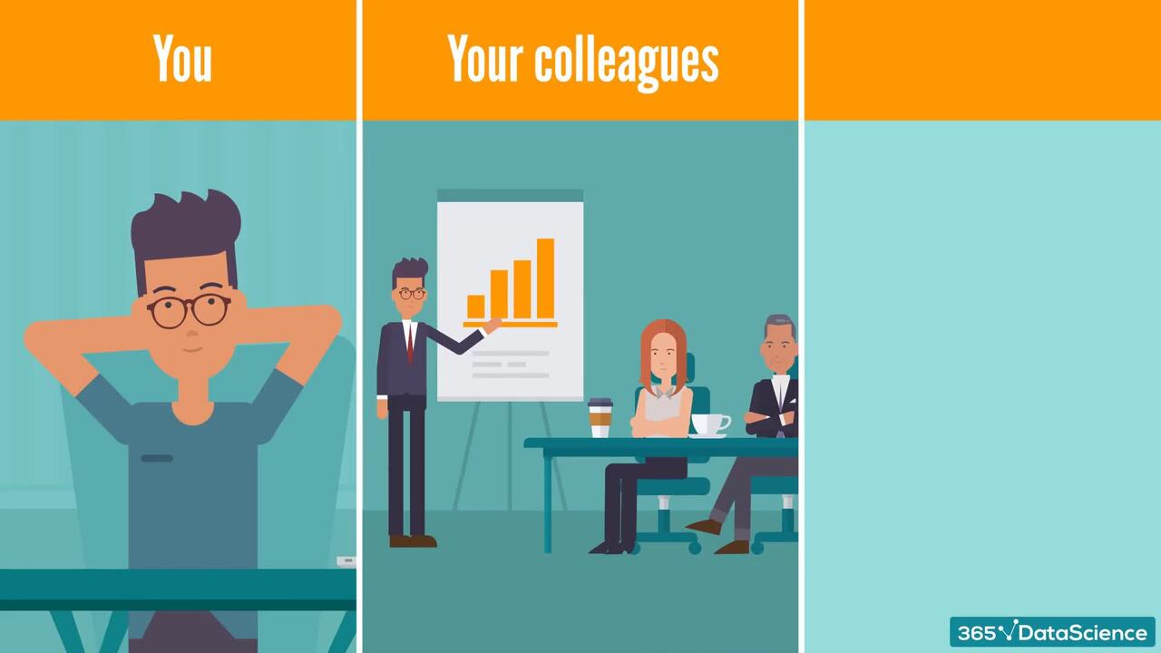
- Develop expertise in interpreting data and communicating your findings through data visualizations
- Boost your resume and career prospects with highly sought-after data visualization skills
- Enhance your project portfolio with compelling data visualizations and impress recruiters and hiring managers
Top Choice of Leading Companies Worldwide
Industry leaders and professionals globally rely on this top-rated course to enhance their skills.
Course Description
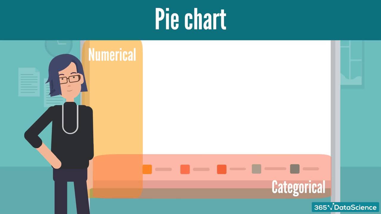
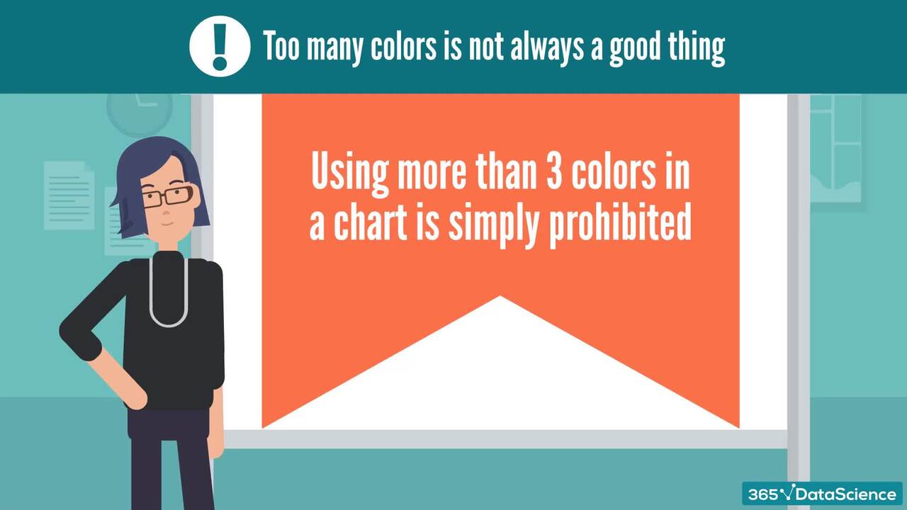
The Data Visualization course is designed for everyone looking to deepen their understanding of creating meaningful and compelling visualizations. Whether you’re coming from a business or data science-related field, knowledge in data visualization is both important and advantageous. That’s precisely why this course is centered not in just one, but four different environments: Excel, Tableau, Python, and R. Each section is dedicated to a specific type of chart – bar charts, pie charts, area charts, line charts and many more. In addition, there are lectures that specifically explore what to avoid when creating a certain graphic. You can stick with your preferred environment and follow each section. Or you could master all four environments and add indispensable skills to your data visualization toolset.
Learn for Free
1.1 What does the Course Cover
5 min
1.2 Why Learn Data Visualization
6 min
1.3 How to Choose the Right Visualization - Popular Approaches and Frameworks
7 min
1.4 Color Theory and Colors
9 min

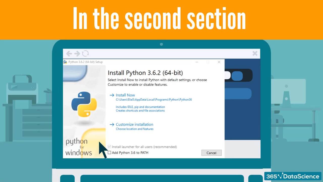
2.1 Setting Up The Environments - Do Not Skip, Please!
1 min
2.2 Tableau - Downloading Tableau
2 min
Interactive Exercises
Practice what you've learned with coding tasks, flashcards, fill in the blanks, multiple choice, and other fun exercises.
Practice what you've learned with coding tasks, flashcards, fill in the blanks, multiple choice, and other fun exercises.


Curriculum
Topics
Course Requirements
- Basic prior experience with Python, R, Tableau, or Excel is required. You can complete the course by focusing on just one of these technologies.
Who Should Take This Course?
Level of difficulty: Beginner
- Aspiring data analysts and data scientists
- Data analysts and data scientists who have work experience and are eager to improve their data visualization abilities
- Graduate students who want to learn the building blocks of professional data visualization
- Everyone who wants to learn how to create good-looking data visualizations
Exams and Certification
A 365 Data Science Course Certificate is an excellent addition to your LinkedIn profile—demonstrating your expertise and willingness to go the extra mile to accomplish your goals.

Meet Your Instructor


Elitsa Kaloyanova is a Computational Biologist, with significant expertise in the fields of algorithms, data structures, phylogenetics, and population genetics. She has a solid academic background in Bioinformatics with publications on constructing Phylogenetic Networks and Trees. In 2021, she led 365’s effort to create practice exams and course exams for each course included in the program. Elitsa was able to successfully coordinate with several types of stakeholders and performed superior Quality Assurance.
What Our Learners Say


365 Data Science Is Featured at
Our top-rated courses are trusted by business worldwide.