Why create a bar chart in Python with Matplotlib?
A bar chart is one of the most popular visualizations you’ll ever come across, as it represents information in a clear and straightforward way. You’ll be hard pushed not to find a bar chart during corporate business meetings, science seminars or even during news broadcasts. As such, bar charts are an inseparable part of data visualization, whether you’re working in the newsroom viz department, as a BI analyst or as a data scientist. And no matter which visualization tool you choose (and there seems to be an ever-increasing number of those), they are all well equipped to handle a bar chart.
However, if you’re working as a data scientist, most likely, you’ll be analyzing data in Python. Since data preprocessing, analysis and prediction are performed in Python, it only makes sense to visualize the results on the same platform. And it’s exactly why we’ve dedicated this tutorial to the creation of your very own bar chart in Python.
We’ll rely on one of the most popular data visualization techniques in Python: using the PyPlot module of Matplotlib to craft the chart. But that’s not all, because we’ll also make use of another visualization library – Seaborn - and borrow its aesthetics to achieve an even better visual result.
So, let’s dive right in!
How to Import a Dataset in Python Using Pandas?
As with any programming task, we must begin by importing the libraries we’ll need. To create our bar chart, the two essential packages are Pandas and Matplotlib.
import pandas as pd

import matplotlib.pyplot as plt
We import ‘pandas’ as ‘pd’. Pandas is a widely used library for data analysis and is what we’ll rely on for handling our data. Then, we also import ‘matplotlib.pyplot’ as ‘plt’. Matplotlib is the library we’ll be using for visualization.
Now that we are all set, we can proceed with acquiring the data to display on our chart. In our case, the data represents ads for second-hand automobiles and is aptly names ‘used cars.csv’. We can read the file using the Panda’s read_csv() method.
df_used_cars=pd.read_csv('used_cars.csv')

df_used_cars
When we check to see what our data contains, we can notice it is comprised of two columns. The first represents the car brand, while the second - the number of car advertisements of that brand. This dataset is rather simplistic, but extremely fitting for an introduction into charts.
It’s time to relay this information in the form of a bar chart.
How to Make a Matplotlib Bar Chart Using plt.bar?
Luckily, the ‘PyPlot’ module from Matplotlib has a readily available bar plot function.
So, first, we need to type ‘plt.bar’. For our bar chart, we’d like to plot the number of car listings by brand. Therefore, let’s select the ‘Brand’ column from the ‘Used Cars’ variable for the x-axis. On the y-axis, which is the ‘height’, we need the number of cars sold. Hence, it’s best to take the second column: ‘Cars Listings’ from our ‘used cars’ data frame.
plt.bar(x=df_used_cars['Brand'],
height=df_used_cars['Cars Listings'])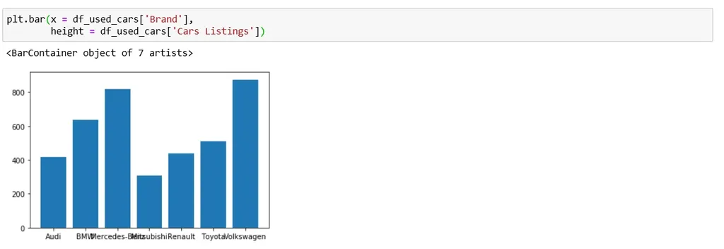 And that’s what’s great about Python. Only a line or so of code is all we need to create a bar chart.
How to Style a Matplotlib Bar Chart?
Now, although this chart is displaying the correct information, we can still improve its appearance. Data visualization is not only about creating a chart, but also styling it in a compelling way.
First things first, we want to be able to read all the labels on our x-axis... and at the moment they are overlapping.
How to Adjust the Size of a Matplotlib Plot Using plt.figure?
We can resolve the issue by increasing the size of the plot. The default size is 6.4 by 4.8 inches. We could increase it by specifying the size through the ‘Fig Size’ parameter. Speaking from experience, a 9 by 6 figure is appropriate for most visualizations.
But there is also another way to fix this issue.
How to Rotate Labels in Matplotlib Using plt.xticks?
We can avoid overlapping labels by rotating them. We just need to introduce an additional line of code: ‘plt.xticks’ with a rotation angle of 45 degrees.
plt.figure(figsize=(9,6))
plt.bar(x=df_used_cars['Brand'],
height=df_used_cars['Cars Listings'])
plt.xticks(rotation=45)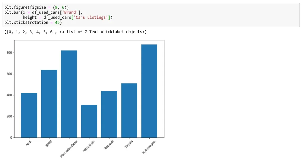 Rotating labels is an easy way to utilize space without changing anything else in the plot.
Now that this is out of the way, we can enhance our chart even further using ‘Seaborn’.
How to Integrate Seaborn Styles with Matplotlib?
So far, we’ve been working with Matplotlib, which, as a visualization library has a default setting for chart formatting, including ‘Font’, ‘Font Size’, ‘Background Themes’, etc. Sadly, this particular look isn’t everyone’s cup of tea. Not long ago, a new visualization library called Seaborn emerged and became the preferred choice for many programmers, especially in the field of data science. ‘Seaborn’ is actually built on top of ‘Mat Plot Lib’. As such, the two libraries can be seamlessly integrated and work alongside each other, which is great news for us.
To be more precise, we can import Seaborn and set its look to overwrite the default one in Matplotlib.
import pandas as pd

import matplotlib.pyplot as plt

import seaborn as sns

sns.set()
First, we import seaborn as ‘SNS’.
Second, we must overwrite the ‘mat plot lib’ look with ‘sns.set()’, to take advantage of the seaborn styling.
In essence, this will allow us to code the graphs in Matplotlib but they will be displayed with what some call the “much superior Seaborn look”. 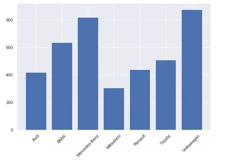
This is the result of running the same code we had for Matplotlib. Only this time we’ve used the ‘Seaborn look’.
And since we’ve taken the first steps into chart-styling, we can continue our venture into the area with a very important topic:
How to Change the Colors of a Matplotlib Bar Chart Using plt.bar?
Generally, data visualizations convey insights through shape and color. While the shape is somewhat restricted by the nature of the data, the color is up to us. Nonetheless, choosing a color for our visualizations is of utmost importance and should be thought through carefully.
In Matplotlib, we can change the colors of our plot by adding a color argument.
Furthermore, we can choose a color name from a predefined color list available in the Seaborn library. Seaborn recognizes over a hundred color names; starting from basic ones, such as red, green or blue, which we can refer to by their initials: ‘R’, ‘G’ or ‘B’ respectively. If you’re feeling more adventurous you can also choose colors like ‘linen’, ‘honeydew’ or ‘dark orchid’.
In fact, you can assign an individual color for each of the bars in a simple manner.
We can type in a string with the following seven letters: ‘R G B W Y M C’. Each of these letters is an abbreviation for a frequently used color. Here’s what we get:
plt.figure(figsize=(9,6))
plt.bar(x=df_used_cars['Brand'],
height=df_used_cars['Cars Listings'],
color='rgbwymc')
plt.xticks(rotation=45)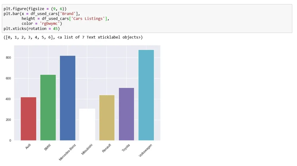 I don’t know about you, but I’d call this a pretty fun chart. Each column has been assigned an individual color. We have: R for Red, G for Green, B for Blue, W for White, Y for Yellow, M for Magenta and lastly C for Cyan.
This just goes to show how versatile plotting in Python is. We can specify a color for any number of bars we have in this manner. Just bear in mind, the color abbreviations aren’t limitless. Therefore, at some point, you might have repeats.
However, for a professional presentation, we want our color to be uniform across the whole worksheet. Therefore, let’s also see a variant with 'dark blue' or ‘midnight blue’ as the only color of our bar chart.
plt.figure(figsize=(9,6))

plt.bar(x=df_used_cars['Brand'],

        height=df_used_cars['Cars Listings'],

        color='midnightblue')

plt.xticks(rotation=45)
You can find the full list of colors in Python’s online documentation.
Now that we've taken care of this, we’ve come to the last section on chart formatting. Although last in place, it is certainly not last in value, so keep reading.
How to Add a Title to a Matplotlib Bar Chart using plt.title?
Every plot needs a title and yours will be no different.
To integrate a title, we type ‘plt.title()’ and, in brackets, specify the desired name. ‘Used Cars Listings by Brand’ has a nice ring to it. Note that you need to put that in quotation marks so that Python knows that it is a string.
plt.figure(figsize=(9,6))
plt.bar(x=df_used_cars['Brand'],
height=df_used_cars['Cars Listings'],
color='midnightblue')
plt.xticks(rotation=45)
plt.title('Car Sales by Brand')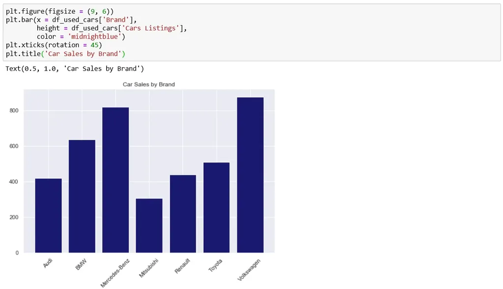 While we've successfully placed a title on top, it is a bit small in comparison to the rest of the graph. But no worries – everything in Python is customizable. We can increase the font size by adding an extra argument and then specify a ‘font-size’ of 16. We could also add a ‘Font weight’ argument and set it to ‘bold’. Let’s format the other text elements a little bit, so they look more pronounced, as well. Just increase the ‘font-size’ to 13 for the x and y-axis labels and set the ‘Y ticks’ ‘font-size’ equal to 13, as well.
plt.figure(figsize=(9,6))
plt.bar(x=df_used_cars['Brand'],
height=df_used_cars['Cars Listings'],
color='midnightblue')
plt.xticks(rotation=45)
plt.title('Car Sales by Brand')
plt.savefig('Car Sales Bar.png.')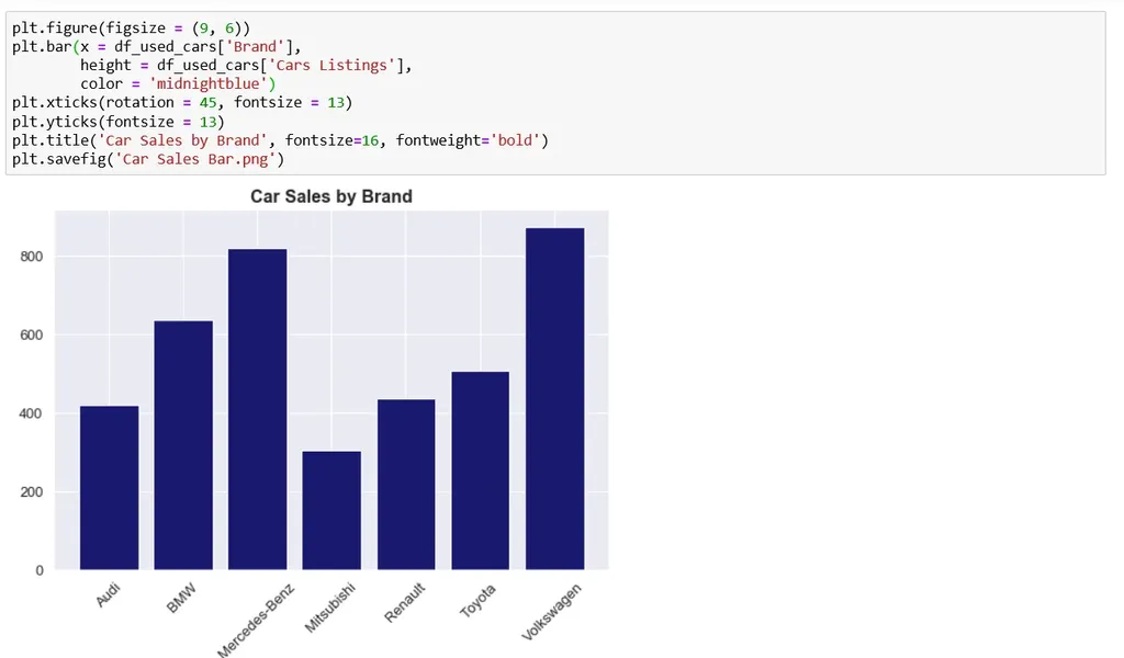 Now, this is a Bar chart ready for a presentation!
How to Export а Matplotlib Bar Chart Using plt.savefig?
A quick side note before we wrap up: not all people are comfortable with coding in Python. In fact, you may often need to use your plot outside a Jupyter Notebook. To achieve that, you can export your plot as an image.
We can easily achieve this with the ‘savefig’ method. In the brackets, you need to specify the name and file format. In our case, it is a ‘PNG’, under the name ‘Used Cars Bar.PNG’.
How to Make a Matplotlib Bar Chart in Python: Overview
Matplotlib and its PyPlot module are essential tools for data scientists who are programming in Python. However, becoming an expert user of these tools may take some time. Especially because the Matplotlib online documentation is lacking, to say the least (I have yet to meet someone who disagrees with this statement. But please correct me, if you feel differently). That’s why it is so important to practice, practice, practice to improve your visualization skills.
We’ve already demonstrated that making a bar chart in Python can be easy and straightforward with the help of Matplotlib and Seaborn. And hopefully, you’ll feel inspired to try your hands at creating your own visualizations!
If you’re interested in sharpening your skills in Python, check out our super-practical Python tutorials.
In case you’re a Python beginner, this detailed piece on learning Python programming will guide you through everything you need to know. From the installation, through Python IDEs, Libraries, and frameworks, to the best Python career paths and job outlook.
Ready to Take the Next Step Towards a Data Science Career?
Check out the complete Data Science Program today. Start with the fundamentals with our Statistics, Maths, and Excel courses. Build up step-by-step experience with SQL, Python, R, and Tableau; аnd upgrade your skillset with Machine Learning, Deep Learning, Credit Risk Modeling, Time Series Analysis, and Customer Analytics in Python. If you still aren’t sure you want to turn your interest in data science into a solid career, we also offer a free preview version of the Data Science Program. You’ll receive 12 hours of beginner to advanced content for free. It’s a great way to see if the program is right for you.


