
Whether you’re in business analytics, data science, or data analytics, at some point you'll most likely be in charge of presenting findings based on the data in front of your colleagues, bosses, or a wider audience. And unless you’d like them to go through countless rows of raw data, you’ll probably use a form of summary statistic or a visual representation of the data. In the case of the latter, you’ll inevitably ask yourself: "What colors should I use for my chart?" Or rather more importantly:
How to Choose the Right Data Visualization Color Palette?
Understanding color, as well as the techniques involved in how to curate, combine, and even invent a color palette, requires an education of its own. Luckily, there is an easy way to choose your colors wisely if you’re in data visualization and this article will show you how.
Chances are you won’t have an eternity to spend on color alone, which is why in the next paragraphs, we’ll provide you with an overview of some of the best color palette generator websites you can rely on throughout your data viz work. We’ll also touch on the meaning of colors in the different industries, an important aspect to keep in mind when creating visualizations.
Let’s dive in straight to it.
Why Is It Important to Choose the Right Data Visualization Color Palette?
Anytime you’re visualizing data in some form or other choosing the right colors is a top priority. It’s the first thing your audience will notice straight away. And this is true for almost any form of visuals we encounter in our day-to-day life. Naturally, colors (especially bright colors) are what our eye is attracted to on a billboard or a bus stop ad. And this is precisely what we can use to our advantage when we’re creating our color palette: to draw the attention to the most important or key aspects of our graphic. But it isn't as simple as picking a few dazzling colors and calling it a day. In fact, you need to consider the requirements for choosing the most appropriate data visualization colors.
What Are the Requirements for Choosing the Right Data Visualization Color Palette?
First and foremost, you’d like them to be outstanding. At the same time, they’ll need to comply with the data visualization rules, your company rules, and still make sense in terms of representing your findings. That’s a lot of constraints, just for a single step of the data viz building exercise.
So, how can you satisfy all the above requirements without spending a lifetime in choosing the same 2 or 3 colors over and over again?
Fortunately, there's a simple solution. You can rely on an online color palette generator. To help you with that, we took up the time-consuming task of exploring numerous such platforms and picked the best and easiest to use. Here are our top 3 picks.
Top 3 Online Color Palette Generators for Data Visualization
1. Adobe Color Wheel
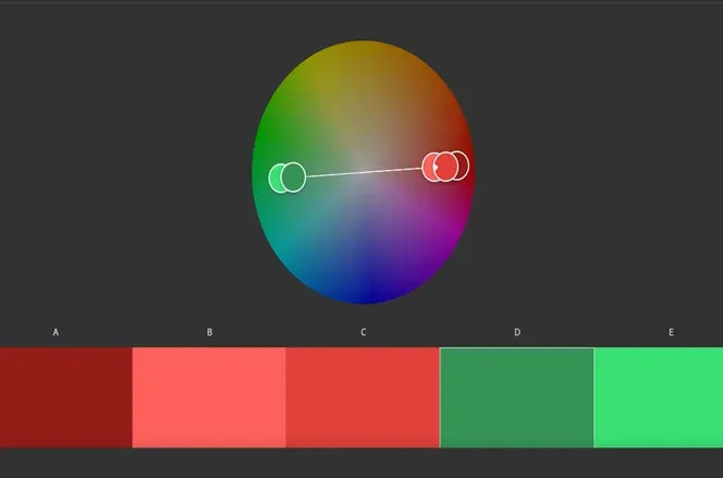
First up is none other than the Adobe Color Wheel.
The Adobe color palette generator allows you to create custom palettes with its neat color wheel function. In addition, you can specify the kind of palette you’d like to create. You can choose a monochromatic (based on a single color), triad (based on three colors, which are opposites on the wheel). Or why not create an entirely customized adobe color palette, for instance, if there are any rules or guidelines you need to follow when creating the chart. Additionally, for those interested in exploring creative tools, AI image generators can complement the design process by turning your ideas into stunning visuals.
2. Coolors
Hey, but if the adobe color wheel doesn’t spin you the right way, worry not! There is another great option to explore, which puts the cool in colors. It’s the coolors.co site: 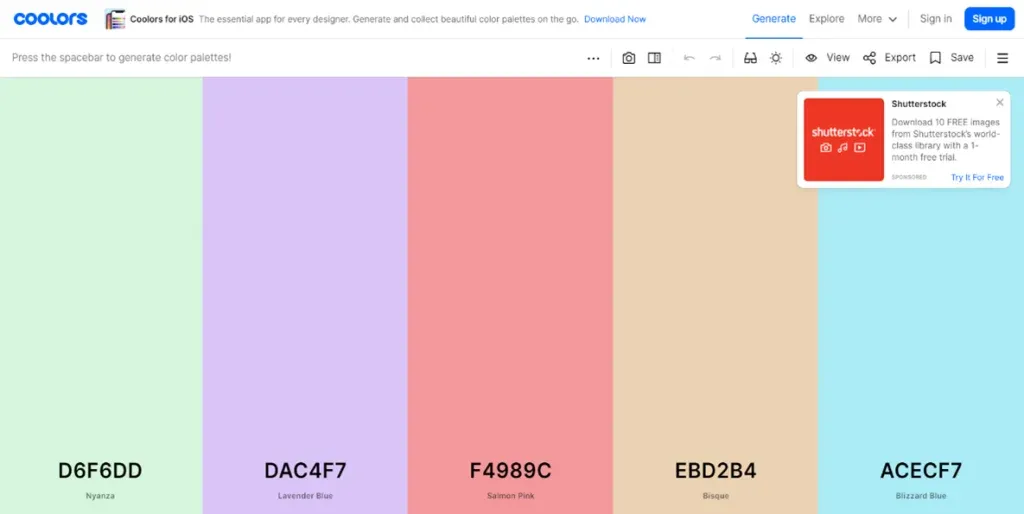
It’s another great option to create color palettes. With its random generator, there are numerous color palettes you could explore if you’re stuck for ideas.
One of the standout features is the color blindness filter you can add to any palette (look for the sunglasses on the top right-hand side). With it, you can adjust any palette to be colorblind-friendly.

Another cool option is to create a palette based on a picture. You can simply upload something you found on the web or from your personal collection and curate a palette based on the colors from your picture.
3. Pantone
The last site on our list, which we believe is worthy of your time, comes from Pantone:
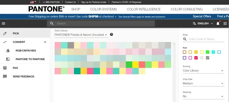
The Pantone company is known for proprietary color space, used in graphic design, fashion, printing, to name just a few. So, it’s a company that creates pretty colors both in digital, as well as physical formats. They are a great option if you’re looking for aesthetics, and if you’re designing say a logo or a graphic, which will be printed in some physical format. With the Pantone color finder, you can choose from a carefully curated list of colors, as well as choose an emerging trendy palette, inspired by the fashion world.
Now, that you have the necessary tools to pick the colors for your chart (and not waste too much time in due process), let’s discuss another crucial aspect when it comes to color: its meaning.
What Is the Meaning of Colors in Our Lives?
Yes, many colors are associated with a specific meaning. We see colors in virtually every aspect of our lives. So, naturally, through the years, they’ve developed a meaning beyond the colors themselves.
Not only that but color meanings can differ depending on the field or specific industry where they’re used. To illustrate let’s consider a very well-known example: the traffic lights, with their three colors: 
Red, Yellow, and Green.
Typically, red means stop, yellow says to proceed with caution, while green signals go. That’s one meaning associated with these three colors and possibly the most widespread. But it’s not the only one.
What Is the Meaning of Colors in Psychology?
In psychology, for instance, colors are associated with a specific emotion. Red means power and emotion, yellow can stand for optimism or cheer, while green can be associated with balance and healing. Alright, to be fair knowledge from colors in psychology might not be considered strictly necessary in data viz terms. Nonetheless, understanding the meaning or impact the colors on your chart can have on your audience can certainly be of help when you’re creating visualizations. You can further explore the topic in this article on colors and their meaning in psychology.
What Is the Meaning of Colors in Business?
What’s important to note is that a data color has different meanings depending on the industry where you work. Let’s come back to our street light example. Only this time we’ll discuss what red, yellow, and green mean in the business world.
Red usually means you’re generating losses, or there is a problem area.
Yellow means you’re leveled, you’re not losing, but you’re not improving your performance either.
Green means you’re making a profit, your company is growing, and things are swell.
Of course, it all depends on the context. For instance, during a recession, staying in the yellow zone would be a much-desired result.
How to Avoid Misleading Data Visualization in Different Industries?
When it comes to storytelling with data, the important part to keep in mind is that each industry interprets colors somewhat differently. Not only that, but different industries tend to use a specific subset of colors and data visualization color schemes more often. For instance, these could belong to a cold color palette or a dark palette. So, no matter what your data visualization inspiration is, it's not about choosing the most beautiful color or going for more colors than necessary. And this certainly makes sense. As we’ve said, an aesthetic color palette of 2 or 3 colors works best. So, instead of including too many colors, choose a subset of colors that everyone in your field is familiar with.
And then, once the industry has settled on its preferred colors of use, it can even assign meaning to the colors (or borrow it from a differing field). You can check out this Color Meaning and Psychology poster to find out more about the meaning of colors and which color is preferred by what industry.
How to Create Great Data Visualizations: Next Steps
As you’ve probably surmised by now, color theory is a complex topic. And, very often, using lots of colors gets in the way of effective data visualization. We did our best to provide you with a user-friendly way of choosing nice colors and designing your own data visualization color palette. We also touched on what’s important to take into account when picking the colors for different industries and the varying meanings a color can hold, depending on the said industry.
Now it’s up to you to put that know-how to the test and start creating your own outstanding graphs and interactive data visualization projects. And if you're looking to learn the most in-demand data visualization techniques, try our super comprehensive Data Visualization with Python, R, Tableau, and Excel course for free.