If you're familiar with data visualization and presenting data analysis results, you'll understand the importance of neatly organized findings.
Well-structured data analysis findings enhance communication, showcasing skills in data management, analytical thinking, and effective communication—highlighting your value to employers as a potential team asset.
You can present your project results in two ways: through a detailed PowerPoint (PPT) presentation showcasing each step of your work or opting for simplicity with a project poster.
Many individuals prefer posters because they provide an overview without going into excessive detail. Posters are time-efficient for the reader and the presenter, underscoring only the critical points of a project.
A poster is more effective than lengthy PowerPoint presentations for complex projects because it maintains viewer interest by focusing on a single page, reducing distractions.
Our Projects at 365 Data Science
If you're looking for ideas for your portfolio or simply for practice, check out our wide selection of data science projects. They're an excellent way to test your data science skills—covering data analysis, processing, visualization, programming, and machine learning. You can begin with our selection of free, beginner-friendly projects. They're a great place to start if you're new to the field.
After finishing your projects, you may be unsure about designing your poster. This article will guide you through the process, covering the following topics.
Table of Contents
- What is a Data Science Project Poster and What Makes a Good One?
- What Are the Key Components of a Poster?
- Examples and Resources
What is a Data Science Project Poster and What Makes a Good One?
A poster, usually fitting a single page, is used to present the conclusions you’ve come to during the analysis of your data. It needs to be organized and easy to understand. This means taking care of the little details, such as the font size and colors, so the words are readable and easy to comprehend.
So, how to make a poster which works and also stands out?
- Words should be readable from a reasonable distance
- Bullet points, numbering and underlining important concepts do a great deal of organization
- Different sections should be separated with lines to build a structure
- The colours should be suitable, neither too bright nor dark, taking into consideration the contrast between the background and the font colour
- The title should be concise and descriptive
What are the Key Components of a Poster?
A project poster consists of 6 main sections. Each one has its specific purpose and includes the most important elements of your project. To make it easier, I have visualized these sections in the graphic below. Then, I’ll go into detail with each one of them.
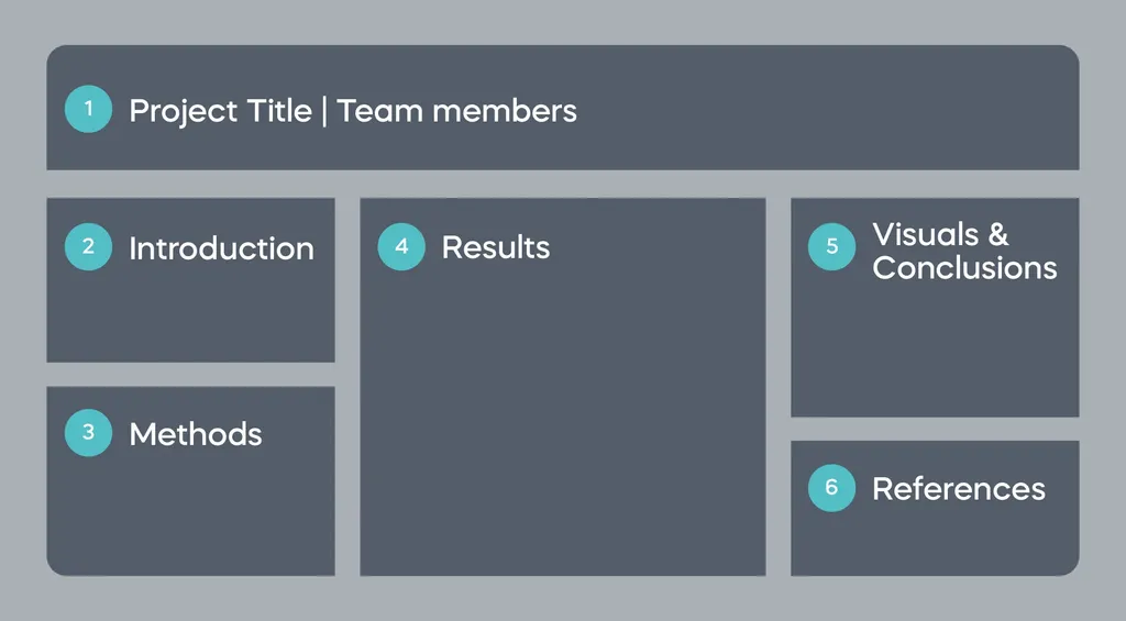
Project Title
First, remember to write the name of your project in a large font. Then, add the names of your team members. If you have worked on the project by yourself, it is still a good idea to add your name under the title. After all, you should give yourself some credit for a job well done. Stick to smaller font for the names.
Introduction
Here, you can talk about the problem statement or the idea of your project. The introduction can be a couple of sentences or bullets describing the project’s aim and what your objectives for solving the problem are. You can also include the data source and what inspired you to do the project. For example:
“As stated by the World Health Organization (WHO), stroke is the 2nd leading cause of death globally, being responsible for nearly 11% of total deaths. The main objective of this project is to predict a stroke based on some demographic and clinical features.”
Or another might be: “Kerala is a state in South India where floods affect the whole region due to high rainfall during the monsoon season. In this project, we’ll build a binary logistic model to predict floods based on the monthly rainfall index for each year in Kerala, India.”
Methods
In this part, you explain the steps you’ve taken to achieve the project’s objectives. They can vary from one project to another but let’s say that you’re trying to predict an output using some variables in your dataset by building a predictive model. The basic steps in this case would be:
I- Assessing the data
II- Cleaning the data
III- Training and building the model
IV- Evaluating the model’s performance
Remember to keep it short and to the point. You don't need to mention all the details in each step. Just a summary would be sufficient for the readers.
Results
Now that you’ve elaborated on the methods you've used, in the results part, you have the chance to share the outcomes of your project. This can be as a summary, a table, or a graphic visual to present your findings. Getting back to the example from the methods section where a predictive model was built, the results can be in the following form:
I- Mention the methods used to evaluate the model’s performance
II- Insert an image showing the performance report or a ROC curve
Remember that you don’t have to include all the results because there might be many. Just focus on the points related to the objectives you’ve mentioned in the problem statement.
Visuals & Conclusions
This is your chance to show your artistic side and your deductive skills. There are many cases when people approach the problem correctly and follow the right steps to solving it but, eventually, cannot communicate their findings. This might happen when they lack the ability to draw conclusions that prove the success of their work. It’s just like a detective working on a hard case, eventually able to crack it but then doesn’t show up in court!
There isn’t a specific blueprint when delivering your results. However, here in this section, you can insert some visuals explaining the correlation between different variables and your conclusions based on these correlations. Besides visuals, you can summarize your findings in bullet points to enhance the readability. Or, include bar charts, pie charts, graphs etc. depending on your needs. Let’s go back to the example with the stroke-rate prediction.
Normally, bar charts are useful when comparing data values across certain categories in the dataset. When predicting strokes, a bar chart can depict how many people had or hadn’t had a stroke in each age category.
In the same project, a box plot will show the effect of clinical features, like average glucose level and body mass index, on the likelihood of having a stroke. Also, pie charts are good providing an overview of a certain variable, such as the proportion of males and females in a dataset. Line charts, on the other hand, are best for illustrating a change in a certain variable over time, such as the number of COVID-19 deaths in a year.
All these types of visuals can be used in our example to display different aspects of the findings. Of course, don’t limit your creativity and restrain yourself only to the above-mentioned.
References
Finally, you’ve reached the easiest part of your project poster. In the references section, you need to list the sources you've used or, in some cases, give credit to the people whose work helped you complete the project. This can be:
- Research papers
- Authors
- Articles
- Books
Final Advice on the Project Poster Structure
There are no specific guidelines or criteria when it comes to designing your poster. The layout can be horizontal or vertical. The number and structure of columns can vary from one to another. Some posters have images, and some don’t. It’s totally flexible. The most important thing is that you deliver your message clearly and organized. Make sure that the language is simple yet descriptive and don’t repeat the same idea over and over. After all, you have limited space so put everything in a structured way.
Examples and Resources
The components I have mentioned so far are the most common structural elements of a project poster. And since we need to see how it all comes together in practice, let’s look at some examples and resources to download free templates for your next data science project!
Example No.1 - Multimodal Neural Decoding with Natural Data
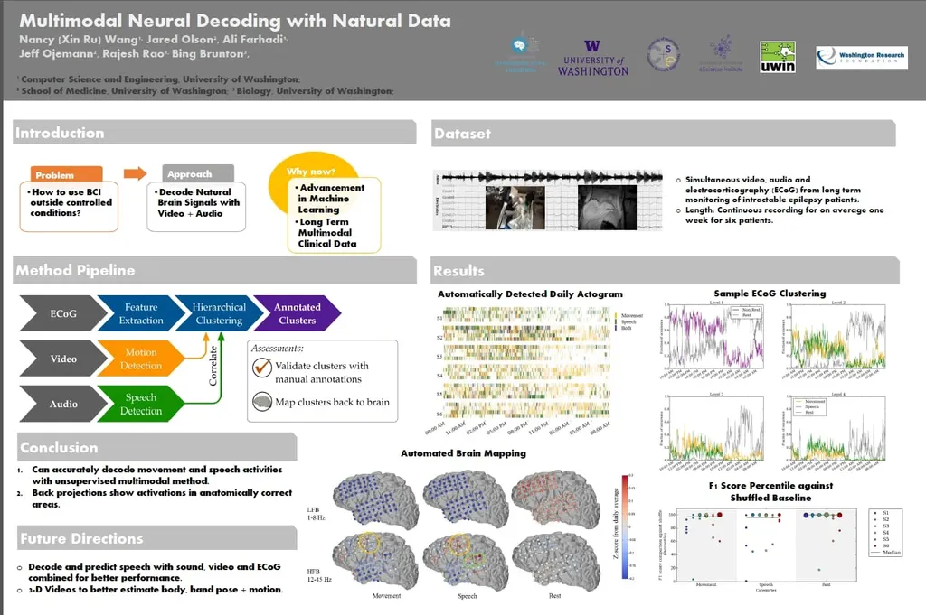
This one is quite exciting - although the project isn’t simple, it’s presented in a fashionable and organized way, making it easy to understand. As you can see, it has most of the parts I have talked about. The introduction, methods, results, and conclusion, plus enough clear and creative visuals.
Example No.2 - Probabilistic Cause-of-death Assignment Using Verbal Autopsies

This collaborative project of the University of Washington is discussing how deaths are assigned causes, especially using Verbal Autopsy. This is one way to determine the cause of death using all the available information from recent symptoms to surrounding circumstances. Well, we’d steer away from reading about this project before bed!
Example No.3 - Predicting Discontinuation of Docetaxel Treatment for mCRPC with Hill-climbing and Random Forest.
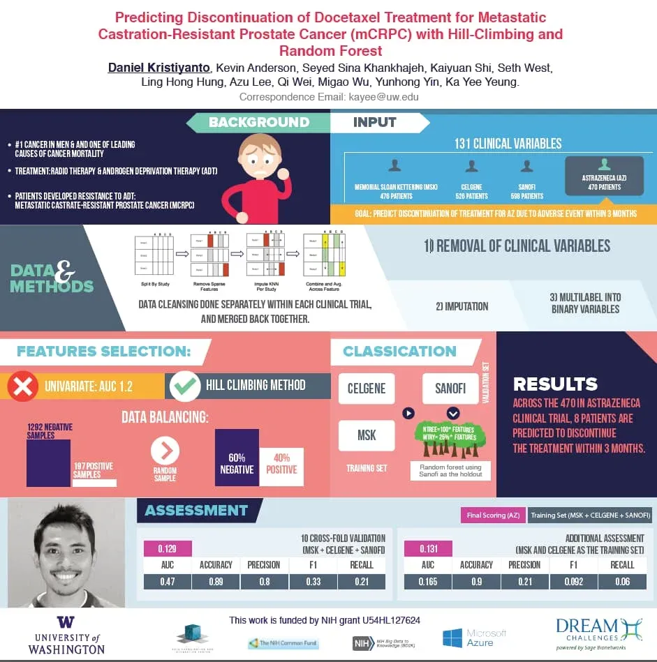
After analysing patients’ data in AstraZeneca clinical trial, these guys tried building a model to predict which patients are more likely to discontinue their treatment within 3 months. The poster is quite creative in terms of design, and colour choice, and is structurally pleasing to the eye. Again, the major elements discussed in this article are present.
Example No.4 - Predicting Strokes
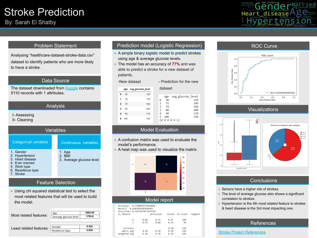
The project’s primary aim is to predict a stroke based on some demographic and clinical features. The project was hosted as a competition on Kaggle a year ago. There are different approaches to solving the problem, but in this poster, a binary logistic regression model was trained to predict the likelihood of a stroke based on the 2 most related features: age & average glucose level.
Resources
If you’d like more details on how to make a poster and get to the very nitty-gritty, I have created a list with useful resources. They vary from explanatory articles to actual guides and templates.
Here is an article by Michael G. Lemieux that explains what a scientific poster is and what to include along with easy tips for designing a good one. Although the article is dedicated to scientific posters for conferences, the basic elements are applicable to any type.
This is a short guide by the NYU libraries that illustrates how to create a research poster. It also starts by defining a research poster and then proceeds with the criteria of a good poster. Beneficial in this article are the examples of both well-designed and poorly made posters. Here you can also find links to software where you can start your design process.
Moving on to the templates, we have the Scientific Poster PowerPoint Templates by MakeSigns. All are free to download!
Also, you can get free-download Microsoft Word templates for research posters by TemplateLab.
This one would be quite useful. Science project poster template by Microsoft which is commonly used specifically for data science projects.
Q&A
How to Make a Poster for Your Data Science Project: Next Steps
Now that you have the right toolkit, things will get much easier along the way when you start your next project. It’s alright if you feel like there’s still some knowledge or skill that you are missing. Often, we all do. To help you fill in any learning gaps, 365 Data Science has created a variety of courses and a career track prepared by experts
The 365 Data Science Program offers self-paced courses led by renowned industry experts. Starting from the very basics all the way to advanced specialization, you will learn by doing a myriad of practical exercises and real-world business cases. If you want to see how the training works, start with a selection of free lessons by signing up below.


