
The Importance of Data Visualization
What is data visualization and why is it important?
Data visualization is the art of providing insights with the aid of some type of visual representation, such as charts, graphs, or more complex forms of visualizations like dashboards. Usually, the process involves various data visualization software – top data visualization tools such as Tableau, Power BI, or Python, and R on the programming end.
Investing time in learning data visualization techniques is worthwhile, as data visualization is becoming one of the most sought out fields in data science overall. Moreover, excellent data visualization skills are high-in-demand across a myriad of businesses and industries and open the door to many rewarding career opportunities.
With that in mind, we dedicate this post to some of the classic data visualizations combined with inspirational data visualization project ideas. Data is beautiful and invaluable when presented the right way and we believe the examples we listed below will come in handy in your own practice.
Ready-Made Data Visualization Projects
Before getting into the list of project ideas, we want to highlight the ready-made data visualization projects available on our platform.
With free options and advanced projects as part of your 365 subscription, you can access a wide array of projects that cater to different levels of expertise—from beginners to advanced practitioners looking to further hone their skills.
Using these projects lets you address real-world problems immediately without the stress of creating the project and hunting for data.
Our projects span multiple fields, allowing you to apply your data visualization skills in such areas as music, real estate, and beyond.
These projects will enhance your skills and serve as standout additions to your portfolio. Showcasing your data visualization projects to potential employers can demonstrate your practical skills, creativity, and ability to derive meaningful insights from data.
Consider the following projects we’ve prepared for you.
- Newsfeed Analysis in Tableau (beginner, free)
- Career Track Analysis with SQL and Tableau (beginner, free)
- Music Genre Classification with PCA and Logistic Regression (intermediate)
- Checkout Flow Optimization Analysis with SQL and Tableau (intermediate)
- Student Onboarding Analysis in Tableau (intermediate)
- Customer Engagement Analysis with SQL and Tableau (intermediate)
- Housing Market Data Analysis in R (intermediate)
- Real Estate Market Analysis with Python (advanced)
Hands-on experience is one of the most effective ways to learn and grow. That's why our projects are designed to challenge you and stimulate your creativity while providing practical experience in data visualization. No matter where you are on your data science journey, these projects are a valuable resource to help you progress.
Now, let’s move on to some more data science project ideas that you can prepare yourself.
Top 10 Data Visualization Project Ideas
In this Top 10, you will find the staples in data visualization and ideas on how to use them in different projects. You can use the table of contents to jump directly to the ones that interest you most or just scroll down to absorb all dataviz ideas from first to last.
Table of Contents
- Bar Chart Data Visualization Project ideas
- Time Series Data Visualization Project Ideas
- Box Plot Data Visualization Project Ideas
- Word Cloud Data Visualization Project Ideas
- Map Data Visualization Project Ideas
- Graph Network Data Visualization Project Ideas
- Race Chart Data Visualization Project Ideas
- Correlogram Data Visualization Project Ideas
- Dendrogram Data Visualization Project Ideas
- Heatmap Data Visualization Project Ideas
- FAQs
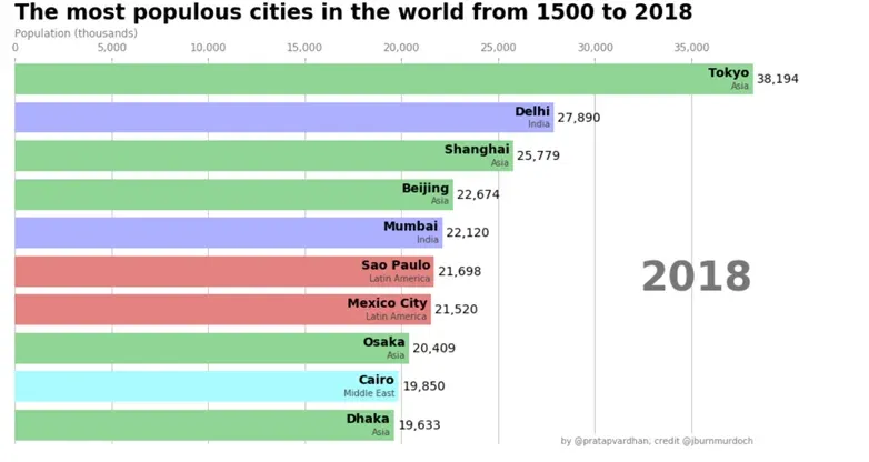
1. Bar Chart Data Visualization Project Ideas
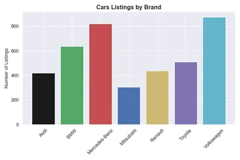
Any data visualization journey starts with the bar chart.
So, to answer the question we posed at the start “What is data visualization?”: in the majority of cases, the answer is the bar chart. It’s one of the most popular data visualization examples you’ll ever come across because it is truly versatile, intuitive, and clear as a visualization.
There is no shortage of available options here. However, our suggestion is plotting the flight delays values, as suggested in this Kaggle tutorial:
2. Time Series Data Visualization Project Ideas
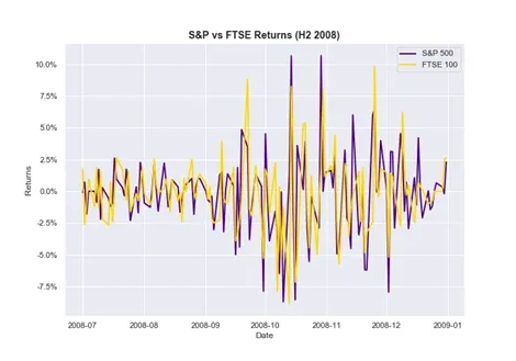
Time series data is one of the staples in data visualization. So, chances are, no matter what field you’re working in, at one point or another you’ll face a project where you’ll have to display data with time series elements.
For this type of data, it is crucial to make sure the date features in your data are converted into date type format. No matter what your go-to data visualization tools are: Tableau, Python, R, or Excel, the conversion step is crucial to ensure your data is plotted correctly.
That said, here’s a great project idea to explore: Stock Returns indices data. You can visualize and compare different stock market returns for various indices, at different points in time. You can easily download the up to date stock market information from the finance yahoo website:
3. Box Plot Data Visualization Project Ideas
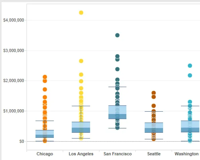
Box plot is a chart that might seem a bit intimidating or foreign if you’re seeing it for the first time. But nothing is too complicated once you get to know it better. We use the box to represent numerical data via quartiles. The whiskers that you sometimes see on top of this type of chart show the variability of the data. In such cases, we call it a box and whiskers plot.
Project-wise, we continue with the stock market theme because opening and closing prices on the stock market is one of the prime use cases of this visualization. And, of course, you can check out yahoo finance for the most current data.
4. Word Cloud Data Visualization Project Ideas

When it comes to data visualization examples, word clouds are often neglected, when in fact, they can be quite useful. Recently, they’ve found a place aiding text data analysis. Turns out, when performing sentiment analysis, word clouds can be tremendously helpful to find common topics within a cluster. Therefore, any time you’re looking at the most common items within a topic, word clouds can be a helpful way of visualizing your data.
Project idea? Any type of top 10 list, or most popular word search. Why not do a word cloud on the subject of top data visualization projects? Or head over to the Large Movie Reviews Dataset and try data visualizations based on their data.
5. Map Data Visualization Project Ideas
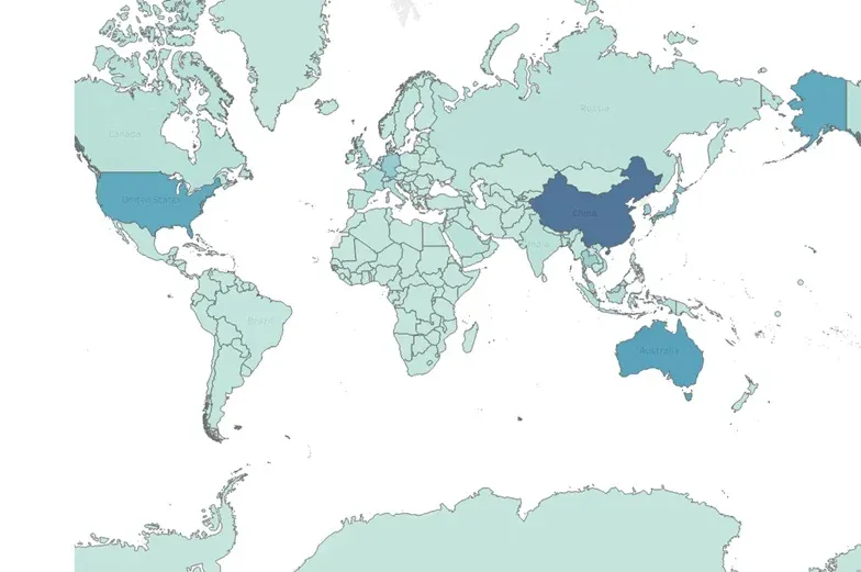
Being able to chart and interpret geographical data is one of the utmost skills required for a data viz expert. Depending on what software you use, this can vary in terms of difficulty. The free data visualization software most equipped to handle geographical data is probably Tableau and I recommend using it if there are no specific software requirements. Or you could also try R’s highcharter or Python plotly module (alternatively cartopy, which is based on matplotlib) if you’d prefer statistical analysis tools for visual communication.
An interactive map of Australia’s bioluminescence organisms is one of the best visualization projects just in general. Why not try and recreate the result yourself?
6. Graph Network Data Visualization Project Ideas
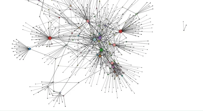
This type of visualization usually reflects complex systems where the importance is placed on the interaction between the elements. Despite being intricate, networks are one of the most inspiring topics in terms of dataviz, as they show that information is beautiful when translated in the correct form. Think infrastructure, social networks or biological pathways such as genetic pathways or integrated systems – all of them can be displayed with the help of a network.
If you’re looking for graph network data viz project ideas, you can head over to the network repository and explore numerous data sets on a variety of topics. The great news is that you can directly visualize each data set on the same site using their interactive tool. And maybe it’s only me but it’s great fun exploring all the different networks.
7. Race Chart Data Visualization Project Ideas
The race bar chart is an animated bar chart, showing the development of an entity (usually top 10) over time. Recently made popular by Data is Beautiful YouTube channel. There are numerous interesting races in stock, for instance, the most popular sci-fi Movies from 1968 until 2019 (that is my personal favourite). But hey, if you’re stuck for data visualization projects ideas here is our proposal.
Go over to Kaggle and see how to implement the bar chart race of the most populous Turkish provinces from 2007 until 2018 :
8. Correlogram Data Visualization Project Ideas
Data visualization examples run through various parts of the data science process. And correlograms are a part of the data exploratory phase that can reveal information on various relationships within our data. A correlogram displays n variables within our data on an (n-1)x(n-1) grid of subplots. On these subplots, you can display scatter plots, density plots, or histograms, each revealing different insights about your data.
For a correlogram data visualization project, you could try out a classic, like the Iris data set. In fact, any data where you have numerical features will do the trick. However, we recommend a data set you’d most likely be familiar with. This way, you can practice and delve into the different options presented with this form of visual.
9. Dendrogram Data Visualization Project Ideas
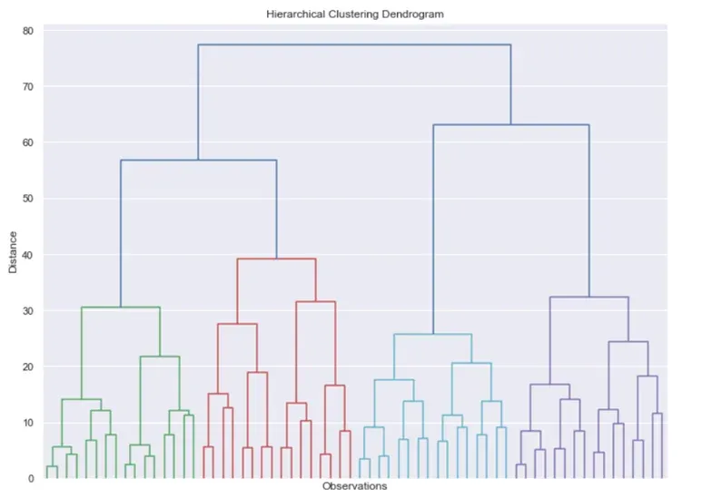
Continuing with data visualization examples from data science, we delve straight into machine learning with a technique used in unsupervised learning – the dendrogram. A dendrogram is a type of tree used for the hierarchical representation of points and is the main data visualization used for hierarchical clustering solutions. In fairness, results in machine learning, tend to be hard to visualize. That is one of the reasons why the field is considered hard to understand… Without any visual, it’s hard to develop an intuition of the matter. That’s why we couldn’t skip the chance to include this data visualization example.
Any type of clustering data set will do for such a project. You can visit the UCI Machine Learning Repository and check out their clustering data sets. Just a small tip. If you’re using hierarchical clustering, a large data set might require extra computing time. So keep that in mind.
10. Heatmap Data Visualization Project Ideas
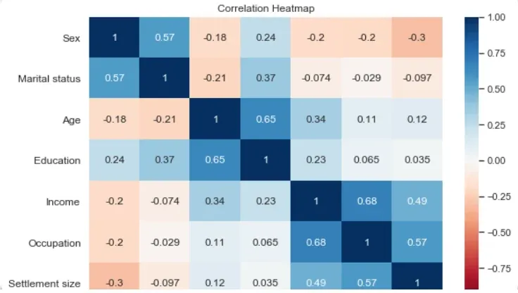
Heatmap visualization is surely one of the most effective ways to intuitively show relationships between variables. What makes a heatmap stand apart is the excellent use of colors that contribute to the intuitive understanding of the plot. With a heatmap, you can observe the correlation between variables within your data and find dependencies.
The Heatmap is yet another crucial element for data analysis (or beginning stages of machine learning tasks).
So, to wrap up our list on a high note, here is an idea for a data visualization project with widespread application in data science. In fact, it is the same suggestion we started with: flight delays. There is hardly a better example of how data visualizations are interconnected.
Bonus Data Visualization Project Idea
If you’re eager for more ideas, here is another of my favorite data visualization examples, which features microbial life represented as a heatmap.
Ready to Learn Data Visualization?
Looking for data visualization training that will teach you how to turn any bad data visualization into a great one? Check out our data visualization course where you’ll learn how to create stunning data visualizations with free data visualization tools: Python, R, Tableau, and Excel.