• Learn
    • Courses
    • Career Tracks
    • Upcoming Courses
  • Certificates
    • Career Track Certificate
    • Course Certificate
  • Resources
    • All Resources
    • Course Notes
    • Templates
    • Infographics
    • Career Guides
    • Practice Exams
    • Blog
    • Success Stories
  • Pricing
  • Business
    • Team Plan
    • Live Trainings
Log In Sign Up
Follow this topic
Share
Manizha Khairiddinova
Last answered:

12 Jan 2023

Posted on:

05 Jan 2023

0

Dynamic range - dynamic chart

in The Complete Data Visualization Course with Python, R, Tableau, and Excel / Dashboard in Excel - Charts – Clustered Bar Chart I
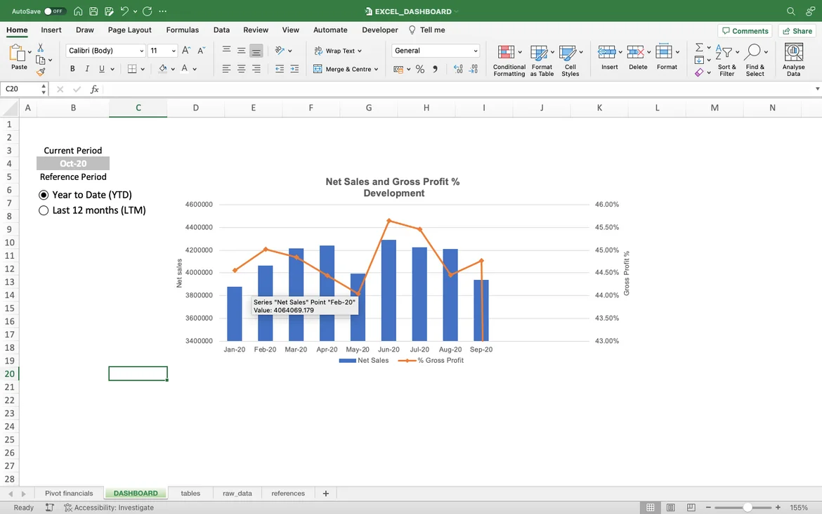
1 answers ( 0 marked as helpful)
Elitsa Kaloyanova
Instructor
Posted on:

12 Jan 2023

0

Submit an answer

related questions

MINHEE SUNG
0
5
excel chart x-axis 'bounds' missing
PRAFUL NIMBAJI CHALAKH
0
4
area chart not showing up in rstudio
Mohamed Magdy
0
4
Resolved: Chart not showing after filtering
Sam Parker
0
3
How to import data to create a bar chart in R studio?
Eric Layer
0
1
Making duel axis chart with selected dates
Erick KIPROTICH YEGON
0
1
Resolved: Help on Stacked Area Chart in R
Roman Collins
0
1
Resolved: Data Visualization- Line chart-R
Sylvester Odae
0
1
The data on the chart is divided equally

All the Data Science Courses You Need

About

  • About Us
  • Instructors
  • Contact Us
  • Pricing

Learn

  • Courses
  • Career tracks
  • Career Certificate
  • Course Certificate

Resources

  • Course Notes
  • Templates
  • Career Guides
  • Practice exams
  • Blog

Platform

  • Success stories
  • Q&A Hub
  • Help Center
  • Verify Certificate
© 2023 365 Data Science. All Rights Reserved.
Terms of Use Privacy Policy Cookies