Simpson's paradox explained, or when facts aren't really facts
Simpson's paradox –
the effect that occurs when the marginal association between two categorical variables is qualitatively different from the partial association between the same two variables after controlling for one or more other variables…
-Britannica
Come on. There must be a more intuitive explanation!
Simpson's paradox. Okay. When you cross the doorway of statistics and set forth to enter the world of data science, you should have a few “Remember me” ribbons tied around your fingers. They ought to say, “Don’t jump to conclusions based on significance”, “Don’t automatically infer causality”, and “Check your assumptions before waving the STATISTICALLY SIGNIFICANT banner”.
What we’ll talk about here, has to do with all three and the elusiveness of truth. The phenomenon in question is the Simpson's Paradox, and every statistician worth her salt ought to know about it. The paradox surfaces when individual groups making up a population show a trend in one direction, but the population as a whole presents a trend in the opposite direction.
Before we do a nose-dive into the world of Simpson's paradox, here’s what to expect.
- A real-life Simpson's paradox example concerned with US wage change
- A simplified explanation borrowing J.K. Rowling’s fictional world
- A practical implications section – think medical trials, and voting systems
- A How To Sidestep Simpson’s Paradox in Data Science section
So… Simpson's paradox?
Let’s illustrate
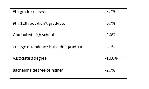
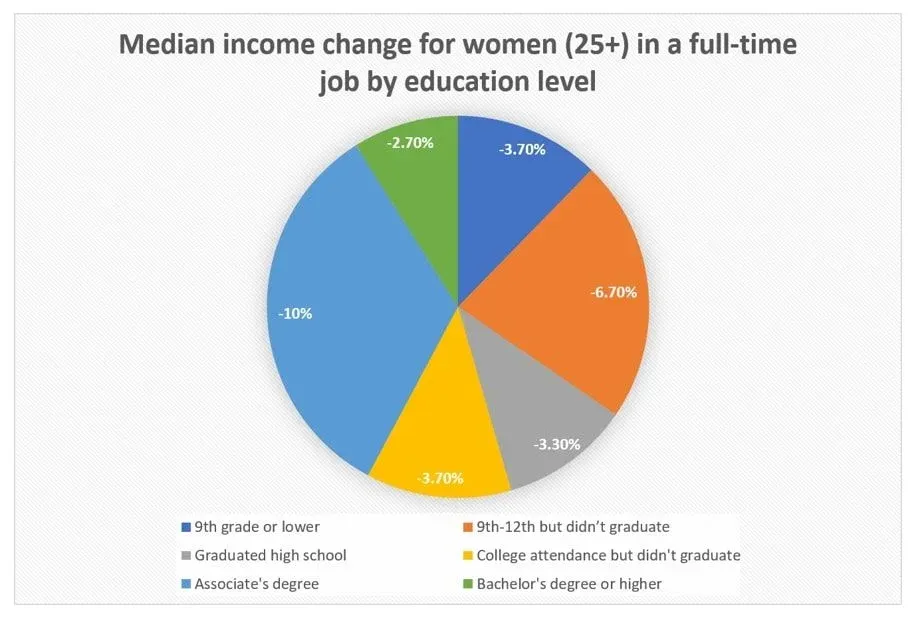
A few years back, data on nation-wide income change between 2000 and 2012 in the US sparked a rigorous dialogue. The data came from women at the age of 25 and older who were working full-time. It suggested that in that time frame, their median income had suffered a considerable decrease. Broken down by education level, the data looked like this:

Not a great-looking twelve years, for sure. If you decide you want to average this out and obtain an approximation of the income change across the board, you would think you ought to expect the number will fall somewhere in the -5% range, right? Even if you decided to weigh the numbers based on sample size, you would still expect it to be in the ballpark.
However, these calculations will not reflect reality at all. In fact, the income of our target group increased in the period between 2000 and 2012. By 2.8%.
But how does this happen? Given that every segment showed a decrease, why is there an increase in the total numbers for the population?
This is what Simpson's paradox looks like in real life.
Before I answer how it emerged, let me first give you a much simpler example. See if you can come up with an answer by analogy.
Let’s move into the world of Harry Potter for a second.
As you know, the Ministry of Magic governs the magical world. With the fight against He-Who-Must-Not-Be-Named over, and all casualties accounted for, the Ministry is hiring new personnel.
A twitchy reporter with a misguided sense of social justice gets hold of the ministry employee records. He scans it briefly and notices that for the Auror Department and the Department of Mysteries (DoM), collectively, the number of wizards surpassed that of than witches. Eleven to seven, to be exact.

‘This does it!’ – he solemnly says to himself, – ‘I will expose this blatant sexism and ensure our witches have somebody to fight the good fight for them.’ So, he writes an article:
“MINISTRY OF MAGIC EXPOSED: BIAS AGAINST WITCHES UNDER MINISTER’S NOSE”
And goes on to explain how year after year the total number of witches in the Auror Office and the DoM is less than that of wizards. At least 7 to 11. With witches never getting the upside.
But let’s have a look at what happened in reality.
There were eighteen vacant positions. Twelve in the Auror Office and 6 in the Department of Mysteries.
Twenty-four candidates applied for each position.
If we look at the applications individually, you will notice that for the Auror positions, 20 wizards and 4 witches showed interest. Furthermore, their success rate didn’t indicate the presence of a bias. The two bodies hired 50% of the wizard applicants, and 50% of the witch applicants (10 and 2, respectively, amounting to a total of 12 new aurors).
Similar results can be found when we dissect the DoM applicants, but this time it was the women who were keener for the post. Again, the applicants were 24, 20 witches and 4 wizards. And once more, there was no selection bias and the success rate was equal. But remember, the available places were fewer, only 6, so 5 witches get the job, and 1 wizard.
For both positions, Auror Office and DoM, gender had no impact on the chance of being selected. And yet, when you add up the 2 witches who became aurors, and the 5 witches who became DoM employees, you end up with 7 successful witches. And when you add up the 10 male aurors, and the 1 department of mysteries candidate, you get 11 successful wizards.
Even though the applications by department show no evidence of bias, when you look at the aggregated numbers, more wizards than witches got a job at the Ministry of Magic. Simpson's paradox at play.
The simple conclusion the data urges you to draw from what looks like a very evident gender effect is wrong when you look under the hood.
Why does this happen?
In such situations, there's usually a bias we have overlooked. Remember, the Auror office has 12 open positions and is therefore easily penetrable, whereas the DoM only advertises 6 posts, which makes it highly selective. In addition, there is a disparity in the appeal each position holds for witches and wizards. Wizards preferred to apply for the ‘easy entry’ job, while witches - to the highly competitive DoM posts.
So, the two groups have different sizes, and there is a differential job preference for witches and wizards. If the sample sizes were equivalent, then we could correctly expect that given that the selection process is unbiased and the success rate of witches and wizards is always equal, the total will also be unbiased. This would hold true even if there is a differential job appeal.
However, in our case, the group sizes differ. When this happens, the results for each side (witches or wizards) can be dominated by a single group (successful auror applicants, successful DoM applicants). In our example, the group totals are dominated by the posts for which most people successfully applied (10/20 > 5/20). In this case, the Wizards were clearly more successful in absolute numbers, which explains why they appear favored in the total (when witches’ and wizards’ job offers are added up).
Simpson’s paradox arose due to two confounding variables (and their interaction). Unequal sample sizes, and differential post preference for witches and wizards, where the latter were more intrigued by the less attainable positions.
Nice and clear.
So, what do you think happened in the 2012 wage data paper?
The answer to that conundrum is analogous. There must have been a confounding variable that was not considered when conclusions were being drawn. And there was: the people that took part in 2000 are not the same as the ones in 2012.
What’s the difference?


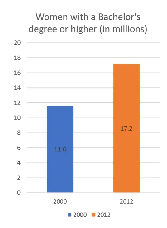
The level of education. Look at the data. Logically, the highest paying group of women are those with at least a Bachelor’s degree, right? Well, in 2000 the number of women with these qualifications in a full-time job and over 25 was 11.6 million. Twelve years later this number has jumped to 17.2 million (the data is coming from the same census). That’s a 48% increase. Now, increasing the proportion of the population in the group that pays the most by this much, is enough to increase the overall average. Their absolute numbers are a lot larger. This holds true even if the by-group income averages experience a drop, women with Bachelor’s and more included.
As to why the group average of women with Bachelor’s or higher has fallen… It's speculative, but it is probably safe to assume that as the number of highly qualified employees increases, their starting salary becomes less competitive. In addition, the new women in the cohort have lower seniority, which also affects their starting compensation packages.
Right.
What this serves to teach us is that premature conclusions, even apparently data-driven ones, are dangerous. For example, the wage data we just examined was used by critics to ask Big Questions, like “Why do wages for college graduates stagnate over the years?” or “Should young professionals even pursue higher education?”
The answer is yes. What this data doesn't take into account is that there is a generational trend: 40 years ago, a college degree constituted a competitive advantage in its own right. As higher education became more accessible, a Master’s degree began to make the difference, then PhD, an MBA, and so on. But it’s important to remember that as the proportion of college graduates increases, the competitive advantage of non-graduates decreases.
Practical implications
Real-life situations
Simpson's paradox is everywhere around us. Therefore, any data enthusiast ought to know how to recognize it and sidestep its misguiding interpretations, especially if a career in data science is what you aim for.
Medical trials
Imagine the following scenario. You’re testing a drug you hope will cure racism, Decentril. You test 800 people who have “contracted the disease”, 400 of which are randomly allocated to a Placebo condition. The results look like this. 
At a glance, it looks like the data proves the Decentril is working. Racism is cured in 50% of those who have taken the drug, whereas only 40% of the placebo patients have improved. However, taking a closer look at the results shows they tell a different story.

The recovery rate for both men and women taking the placebo is higher. As you have probably noticed, there is once again a difference in sample sizes, which gives rise to the misleading overall positive result of the drug.
Unfortunately, the medical industry is not immune to the Simpson's paradox, and even though this is a fictitious example with simplified data, there are many real-life cases which corroborate the danger of taking statistical significance at face value.
When possible, stratify (drill into) your results.
Voting (Gerrymandering)
As you probably know well, in politics, and particularly in recent US history, winning a higher percentage of votes in multiple areas doesn’t automatically translate to winning the presidency. You can still lose the overall vote. This happened in 2000 in the George W. Bush – Al Gore election, and more recently with Hillary Clinton and President Trump.
A classic case of Simpson's paradox. In fact, the root cause of the phenomenon lies in the U.S. electoral college model. For example, in the 2000 election, if the popular vote had been what determines how many electoral votes must be allotted for each candidate in each state, Al Gore would have won. However, the electoral college works by allotting votes equal to the number of legislators a state has in Congress. Then, whoever wins the state, also wins all the votes (fine, except Nebraska and Maine). So, in hindsight, it was irrelevant that Al Gore got over 500,000 more votes nationwide when he was short 5 electoral votes. It also didn’t matter he won New York and California with well over a million. One vote’s margin would have sufficed in each.
Avoiding the paradox in data science
Simpson’s paradox arises when one fails to consider possible confounding variables. In data science, this is especially catastrophic if it happens during study design. A lurking confounding variable can render any obtained results irrelevant, even if they’re significant at the appropriate α-level.
If you, the statistician, are the person designing the study, consider possible confounds before data collection starts. Think about what sample sizes you need, what your demographic is, how to diversify (or not), etc. If you won’t be the person who carries out the analysis, call a statistician! Their help in designing a data-solid study will be invaluable.
To quote R.A. Fisher (c. 1938)[1]:
“To call in the statistician after the experiment is done may be no more than asking him to perform a postmortem examination: he may be able to say what the experiment died of.”
If you’re already at the analysis, double check if your overall results hold up in the data subsets. And in case of a sampling problem, weigh your data according to sample sizes.
If your data are binary, do stratified 2x2 tables and compare with the combined table.
Check for interactions between confound and both the outcome and the factors you are interested in.
Be smart. Do not take frequency data at face value: interpret sensibly.
Thanks for reading our full article! Interested in another great read? Take a look at our piece comparing the two types of statistical errors: false positive and false negative.
Enroll in our Statistics course to enhance your skills.
[1] Norton, H. J. and Divine, G. (2015), Simpson's paradox … and how to avoid it. Significance, 12: 40–43. doi:10.1111/j.1740-9713.2015.00844.x


