
Microsoft Excel is a very powerful tool to leverage when working with data. It has a well-established reputation in the data science community and mastering its advanced functionalities, such as VLOOKUP, Pivot Tables, and Power Query is still a top priority for aspiring professionals in the field.
So, if you already have experience in the software but need inspiration on how to use it to enhance your portfolio, keep reading to discover 10 Excel spreadsheet project ideas you can start working on today!
Excel Projects Prepared for You
Before we get into these Excel project ideas, we want to let you know that we have a variety of preset projects available on our platform. These projects, which are included as part of the normal subscription, are designed to cater to all skill levels, from beginners who are just getting their feet wet in data science to advanced users who are looking to further hone their skills.
By taking advantage of our projects, you can tackle real-world challenges today without the hassle of designing the project and searching for data. Our preset projects cover a wide range of sectors—from retail to sports—offering you the opportunity to apply your Excel skills in various real-world contexts. Whether you're interested in analyzing sales data for a retail company or digging into player stats in sports, you're sure to find a project that suits your interests and goals.
Here are the projects we've prepared for you:
- Customer Engagement Analysis (beginner)
- Football Transfers Analysis (intermediate)
- Regression Analysis (intermediate)
- Analysis and Visualization of P&L Data (advanced)
- Baby Care Product Analysis Using Pivot Tables (advanced)
- Tracking User Engagement with SQL, Excel, and Python (advanced)
These Excel project ideas not only provide a great opportunity for learning and enhancing your skills, but they can also be prominently showcased in your portfolio. By demonstrating your ability to handle real-world, industry-specific challenges, you make yourself a more attractive candidate to potential employers.
Now, let's take a look at some more Excel project ideas that you can prepare easily on your own.
10 Excel Project Ideas for Your Data Science Portfolio
- Creating a personal spending budget
- Import/Transform Data to Excel via Power Query
- Experiment with Pivot Tables
- Utilize VLOOKUP
- Create a Tree Map
- Create a Histogram
- Create a Scatterplot
- Make a Forecast model in Excel
- Manage a Data Model
- Develop an Interactive Dashboard
1. Create a Personal Spending Budget
The best data science projects are rooted in identifying an area where value can be added by your analysis. Developing a personal daily/weekly/monthly budget in Excel is a great first step that allows for real-world application. A way to expand on this is to have variable inputs that can be adjusted to change the target budget value.
2. Import/Transform Data to Excel via Power Query
A great opportunity to experiment with obtaining data from various sources is by creating a workbook data connection in Excel via Power Query. Power Query can be used to import data from sources such as text files, online services, and databases. Once data is imported you can perform additional steps beginning with renaming columns and changing data types, and eventually moving on to advanced techniques such as adding conditional formatting, creating Pivot Tables, as well as combining different functionalities like the often paired INDEX and MATCH to retrieve specific data values. Overall, an Excel project centered on importing and transforming information is an excellent way to practice data collection, and cleaning, widely applicable in data science.
3. Experiment with Pivot Tables
Pivot Tables are an essential tool for Data Analytics in Excel. They allow you to summarize data while easily highlighting points of interest.
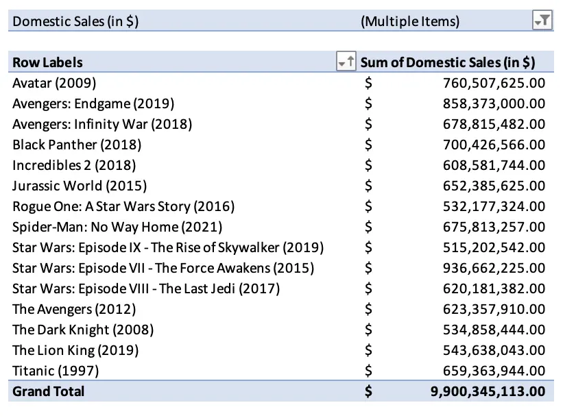
The above is an example of a Pivot Table created from a dataset containing information on the top 1000 highest-grossing Hollywood films. With it, we’ve obtained the top 15 movies in terms of Domestic Sales quickly and efficiently. This type of analysis can be done on any dataset that interests you.
4. Utilize VLOOKUP
VLOOKUP works well when trying to create new, smaller tables from a large dataset. It’s a great function that allows you to find more targeted, cleaner data to work with. Using VLOOKUP will allow you to make information easier to analyze and will help in many of the projects further down this list.
Check out our VLOOKUP COLUMN and ROW tutorial for more details on how to use VLOOKUP to handle large data tables with ease.
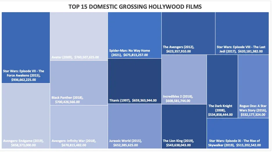
5. Create a Tree Map
A tree map is a data visualization chart that is often used in dashboards. Excel offers a great opportunity to become familiar with this tool and to apply your skills in practice. With Excel you can develop multiple Tree Maps that highlight different points of interest in your data, all the while adjusting formatting and customizing the chart to your liking. The example below is based on the aforementioned dataset containing information about the top 1000 highest-grossing Hollywood films.
6. Create a Histogram
Histograms are tools used in statistical data analysis whenever we want to visualize the normality of the distribution of data. A potential Excel project involving histograms could take as its starting point researching different types of real-world data (such as the outcome of rolling dice or flipping a coin) and utilizing a histogram to visualize their distributions and determining what they would be classified as. An example of this would be the below visualization which was created using the RANDBETWEEN function in Excel to simulate 1000 coin flips.
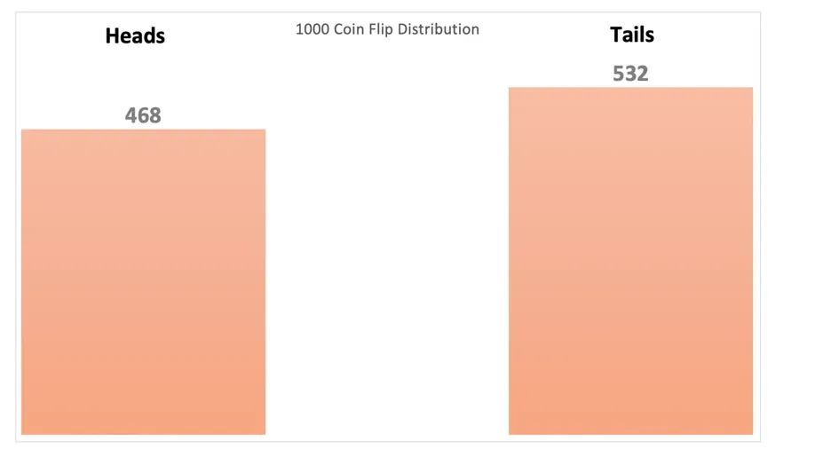
After analyzing the Histogram, we can establish that a coin flip follows a Binomial Distribution logic due to there only being two possible outcomes, heads or tails.
7. Create a Scatter Plot
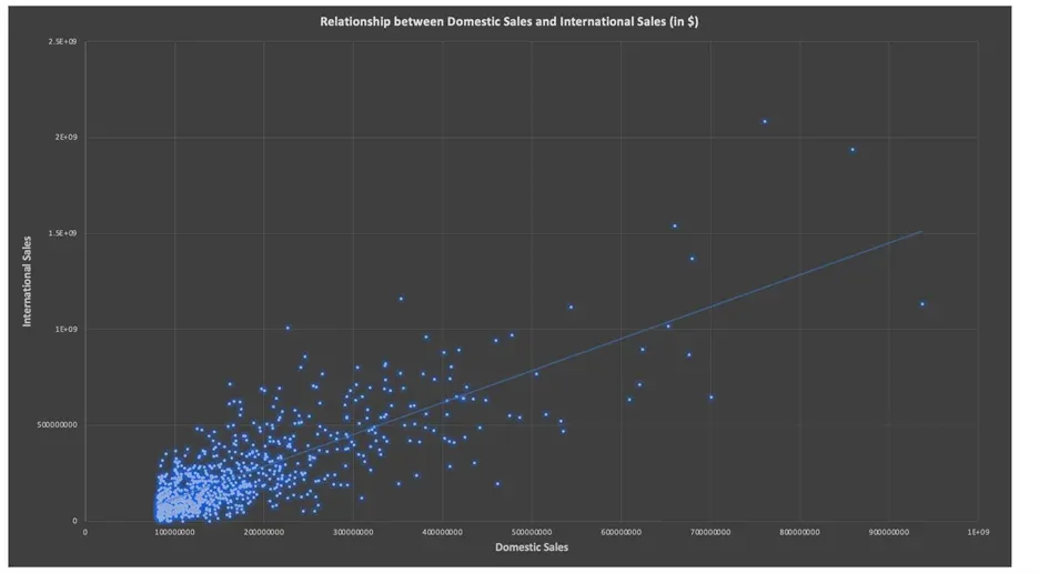
Scatter plots fall in line with contingency tables, and histograms as being very useful in statistical data analysis. They are an often-used tool for visualizing the relationship between two variables in data. Like other fun Excel projects on this list, this one would work best with a dataset that holds particular interest to you. Once you have picked a dataset, it’s time to start charting relationships between variables of interest and digging into what you find. An example of a scatter plot made from the previously mentioned top 1000 highest grossing Hollywood films dataset can be found below.
8. Make a Forecast Model in Excel
Excel has a built-in forecast functionality that can be used to create a prediction on time-related data such as the number of sales of specific products. In order to create a forecast in Excel, you’ll need to select data with a date tied to it and the corresponding values for that date. Forecasting is an area of particular interest for data analysts and experimenting with it in Excel is a chance to get business-applicable experience. Excel also allows you to customize your forecast and set parameters such as the confidence interval, seasonality pattern, and timeline range.
9. Manage a Data Model
Excel enables you to integrate data from multiple tables which can then be connected by defining relationships. An Excel data model is in some ways similar to a relational database and is perfect for visualizing and extracting insights from several different sets of related data. The diagram view in particular is a wonderful way to see the relationships in the model you create.
10. Develop an Interactive Dashboard
The final suggestion on this list is a way to combine everything else we covered so far into one extensive Excel project. Each of the previous examples can be practiced in isolation, but it would also be beneficial to use them together to develop a dashboard for displaying your data and highlighting your data science capabilities in Excel. In order to make a dashboard interactive, it needs to have elements of Pivot Tables, VLOOKUP, relational data, and the chart types mentioned earlier. Adding Slicers to the worksheet will enable users to select their own filters and can ensure that an Excel dashboard is able to rival one built in Tableau or Power BI. Moreover, it comes with the added bonus of being in a format that more people are familiar with, as Excel is more widely used than those tools.
How do I build a project in Excel?
Building a project in Excel follows three easy steps:
- Identify the area of your project and the desired outcomes,
- Find the best functionalities to execute your project,
- Create and share your exciting new project.
The most important thing when starting off with any Excel project is to identify the range, scope, and potential value of your idea: do you want to create something fun and exciting for your personal use or something professional to add to your data science portfolio? Are you trying to solve a particular problem, or are you just playing around? How much time, effort, and money will it take to complete this project? What will its benefits be?
After getting those out of the way, you can look into finding appropriate data sets to work with and researching the functionalities you will be using. Some projects can be executed on a 10-by-10 spreadsheet with very basic Excel knowledge, but for others you will be working with huge amounts of data and leveraging advanced functions.
Finally, once your project is done, don’t forge to share it with the world. Add it to your Kaggle profile and plug it into all your data science job applications. After all, a project is only as important and valuable as you make it out to be!
10 Excel Project Ideas for Data Scientists: Next Steps
Now that you have several projects to choose from, the next step would be to start your journey in performing data analytics in Excel. Explore more of the advanced functionalities of the software, such as the INDIRECT function that you can combine with VLOOKUP to create dynamic lookup tables. Or if you’re confident in your Excel skills, dive into the ML capabilities of the software and take your portfolio of projects to the next level with our Machine Learning in Excel course. Curious to learn more? The 365 Data Science Program offers 40+ self-paced courses led by renowned industry experts. Starting from the very basics all the way to advanced specialization, you will learn by doing with a myriad of practical exercises and real-world business cases. If you want to see how the training works, start with a selection of free lessons by signing up below.
FAQs