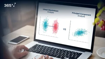

Did you know that you can combine Principal Components Analysis (PCA) and K-means Clustering to improve segmentation results?
In this tutorial, we’ll see a practical example of a mixture of PCA and K-means for clustering data using Python.
Why Combine PCA and K-means Clustering?
There are varying reasons for using a dimensionality reduction step such as PCA prior to data segmentation. Chief among them? By reducing the number of features, we’re improving the performance of our algorithm. On top of that, by decreasing the number of features the noise is also reduced.
In the case of PCA and K-means in particular, there appears to be an even closer relationship between the two.
This paper discusses the exact relationship between the techniques and why a combination of both techniques could be beneficial. In case you’re not a fan of the heavy theory, keep reading. In the next part of this tutorial, we’ll begin working on our PCA and K-means methods using Python.
1. Importing and Exploring the Data Set
We start as we do with any programming task: by importing the relevant Python libraries. In our case they are:

The second step is to acquire the data which we’ll later be segmenting. We’ll use customer data, which we load in the form of a pandas’ data frame.

The data set we’ve chosen for this tutorial comprises 2,000 observations and 7 features.
More specifically, it contains information about 2,000 individuals and has their IDs, as well as geodemographic features, such as Age, Occupation, etc.
Lastly, we take a moment to visualize the raw data set on the two numerical features; Age and Income.

The graph represents all points in our current data set, which our K-means algorithm will aim to segment.
Another observation from the graph concerns the domains of the two variables Age and Income. We understand that the domain for Age is from around 20 to 70, whereas for Income it is from around 40,000 to over 300,000. Which points to a vast difference between the range of these values. Therefore, we must incorporate an important step in our analysis, and we must first standardize our data.
Standardization is an important part of data preprocessing, which is why we’ve devoted the entire next paragraph precisely to this topic.
2. Data Preprocessing
Our segmentation model will be based on similarities and differences between individuals on the features that characterize them.
We’ll quantify these similarities and differences.
Well, you can imagine that two persons may differ in terms of ‘Age’. One may be a 20-year-old, while another – 70 years old. The difference in age is 50 years. However, it spans almost the entire range of possible ages in our dataset.
At the same time, the first individual may have an annual income of \$100,000; while the second may have an annual income of \$150,000. Therefore, the difference between their incomes will be \$50,000.
If these numbers were to go into any of our segmentation models as they are, the algorithm would believe that the two differ in terms of one variable by 50; while in terms of another by 50,000. Then, because of the mathematical nature of modeling, it would completely disregard ‘Age’ as a feature. The reason is that the numbers from 20 to 70 are insignificant when compared with the income values around 100K.
Why?
Because the model is not familiar with our context. So, it defines one as age, while the other as income.
Therefore, it will place a much bigger weight on the income variable.
It is obvious that we must protect ourselves from such an outcome. What’s more, in general, we want to treat all the features equally. And we can achieve that by transforming the features in a way that makes their values fall within the same numerical range. Thus, the differences between their values will be comparable. This process is commonly referred to as standardization.
For this tutorial, we’ll use a Standard Scaler to standardize our data, which is currently in the df segmentation data frame:

After data standardization, we may proceed with the next step, namely Dimensionality Reduction.
3. How to Perform Dimensionality Reduction with PCA?
We’ll employ PCA to reduce the number of features in our data set. Before that, make sure you refresh your knowledge on what is Principal Components Analysis.
In any case, here are the steps to performing dimensionality reduction using PCA.
First, we must fit our standardized data using PCA.

Second, we need to decide how many features we’d like to keep based on the cumulative variance plot.

The graph shows the amount of variance captured (on the y-axis) depending on the number of components we include (the x-axis). A rule of thumb is to preserve around 80 % of the variance. So, in this instance, we decide to keep 3 components.
As a third step, we perform PCA with the chosen number of components.
For our data set, that means 3 principal components:

We need only the calculated resulting components scores for the elements in our data set:

We’ll incorporate the newly obtained PCA scores in the K-means algorithm. That's how we can perform segmentation based on principal components scores instead of the original features.
4. How to Combine PCA and K-means Clustering?
As promised, it is time to combine PCA and K-means to segment our data, where we use the scores obtained by the PCA for the fit.
Based on how familiar you are with K-means, you might already know that K-means doesn’t determine the number of clusters in your solution. If you need a refresher on all things K-means, you can read our dedicated blog post.
In any case, it turns out that we ourselves need to determine the number of clusters in a K-means algorithm.
In order to do so, we run the algorithm with a different number of clusters. Then, we determine the Within Cluster Sum of Squares or WCSS for each solution. Based on the values of the WCSS and an approach known as the Elbow method, we make a decision about how many clusters we’d like to keep.
First, however, we must decide how many clustering solutions we’d test.
There is no general ruling on this issue. It really depends on the data. In our case, we test an algorithm with up to 20 clusters.

The next step involves plotting the WCSS against the number of components on a graph.

And from this graph, we determine the number of clusters we’d like to keep. To that effect, we use the Elbow-method. The approach consists of looking for a kink or elbow in the WCSS graph. Usually, the part of the graph before the elbow would be steeply declining, while the part after it – much smoother. In this instance, the kink comes at the 4 clusters mark. So, we’ll be keeping a four-cluster solution.
All left to do is to implement it.

Here, we use the same initializer and random state as before. Subsequently, we fit the model with the principal component scores.
And now we’ve come to the most interesting part: analyzing the results of our algorithm.
5. How to Analyze the Results of PCA and K-Means Clustering
Before all else, we’ll create a new data frame. It allows us to add in the values of the separate components to our segmentation data set. The components’ scores are stored in the ‘scores P C A’ variable. Let’s label them Component 1, 2 and 3. In addition, we also append the ‘K means P C A’ labels to the new data frame.

We’re all but ready to see the results of our labor.
One small step remains: we should add the names of the segments to the labels.
We create a new column named ‘Segment’ and map the four clusters directly inside it.

6. How to Visualize Clusters by Components?
Let’s finish off by visualizing our clusters on a 2D plane. It's a 2D visualization, so we need to choose two components and use them as axes. The point of PCA was to determine the most important components. This way, we can be absolutely sure that the first two components explain more variance than the third one.
So, let’s visualize the segments with respect to the first two components.

The X-axis here is our ‘Component 2’. The y-axis, on the other hand, is the first ‘Component 1’.
We can now observe the separate clusters.
For comparison, if we run only the k-means algorithm without the PCA step, the result would be the following: 
In this instance, only the green cluster is visually separated from the rest. The remaining three clusters are jumbled all together.
However, when we employ PCA prior to using K-means we can visually separate almost the entire data set. That was one of the biggest goals of PCA - to reduce the number of variables by combining them into bigger, more meaningful features.
Not only that, but they are ‘orthogonal’ to each other. This means that the difference between components is as big as possible.
There is some overlap between the red and blue segments. But, as a whole, all four segments are clearly separated. The spots where the two overlap are ultimately determined by the third component, which is not available on this graph.
Combining PCA and K-Means Clustering: Overview
Finally, it is important to note that our data set contained only a few features from the get-go. So, when we further reduced the dimensionality, using ‘P C A’ we found out we only need three components to separate the data.
That’s the reason why even a two-dimensional plot is enough to see the separation.
This might not always be the case. You may have more features and more components respectively. Then you might need a different way to represent the results of PCA.
We hope you’ll find this tutorial helpful and try out a K-means and PCA approach using your own data.
If you’re interested in more practical insights into Python, check out our step-by-step Python tutorials.
In case you’re new to Python, this comprehensive article on learning Python programming will guide you all the way. From the installation, through Python IDEs, Libraries, and frameworks, to the best Python career paths and job outlook.
Ready to Take the Next Step Towards a Data Science Career?
Check out the complete Data Science Program today. Start with the fundamentals with our Statistics, Maths, and Excel courses. Build up step-by-step experience with SQL, Python, R, and Tableau; аnd upgrade your skillset with Machine Learning, Deep Learning, Credit Risk Modeling, Time Series Analysis, and Customer Analytics in Python. If you still aren’t sure you want to turn your interest in data science into a solid career, we also offer a free preview version of the Data Science Program. You’ll receive 15 hours of beginner to advanced content for free. It’s a great way to see if the program is right for you.