Why GGPlot2 Scatter Plot?
Data visualization is one of the most important steps in data analysis. It helps us gain insight from the data, which would be hard-gained with data as pure numbers. One of the major advantages of visualizing data is that we can relay our findings to an audience, irrelevant to its members’ technical expertise.
As for which environment we choose for data visualization, there is no shortage of available options. From high-level software Tableau and Power BI to leveraging the data viz properties of data science programming languages such as Python and R.
Though overshadowed in recent years by Python, R remains one of the most important tools in data science-related fields, and especially in statistics related professions. Which is why we choose to dedicate this tutorial to charts with none other the R programming language.
And if you’re using R for data visualization, you can’t go far without the ggplot2 package.
ggplot2 is a data visualization package, created by Hadley Wickam in 2005. It relies on a concept known as the grammar of graphics, which is a set of rules for dividing each plot into components or layers.
Moreover, ggplot2 is a high-level visualization library and is one of the most popular packages in R. It’s considered a staple for any data scientist working in R.
But hold on Python users, don’t go anywhere! Due to its overall popularity, there is even a ggplot package available in Python. Here, it’s important to note, that ggplot is closely related to pandas. So, you might wish to store your data as a pandas data frame when using ggplot in Python.
This also means, that once you’ve become a master of ggplot, you’d be able to conjure up plots in both R and Python! Killing two birds with one stone. So, let’s dive straight into ggplot and introduce the grammar of graphics!
How To Make a GGPlot2 Scatter Plot in R: What is the Grammar of Graphics?
The ‘grammar of graphics’ is the basis for how each GG plot is created. You can think of it as a way of dividing each plot into layers, where each layer is responsible for a specific element of the chart. There are seven layers we can use when creating a ‘GG plot’.
So, below, I’ll give you an overview of each of these 7 layers that constitute the ‘grammar of graphics’. Then, to put what you’ve learned into practice, I’ll show you how to create your very own scatter plot using a ggplot.
First, to the ggplot2 layers: The first three layers are mandatory, while the remaining four are optional.
How To Make a GGPlot2 Scatter Plot in R: Mandatory Layers
GGPlot2 Data Layer
Let’s start with the first layer, also known as the data layer. Creating a chart, naturally, means we require some data. Otherwise, our chart wouldn’t have anything to display. Therefore, it is only logical that data is the first and most important layer.
GGPlot2 Aesthetics Layer
Next, we must decide how the data will be visually organized onto different axes. This is where the second layer comes in: it is called the aesthetics layer. Here we specify the mapping to the x and y axes.
GGPlot2 Geometry Layer
The last required layer is the geometry layer. Through geometry, we specify what shape our data will take. In other words, will the points take the form of bars, circles, dots, etc? These three layers alone are all it takes to create a chart in R. The remaining four layers are optional. However, if you’d like to be proficient at visualizing data in R, it pays off to master them, too!
An important distinction between the mandatory and optional layers concerns the order in which they appear.
For the first three layers, we must start with data, continue with aesthetics and, as a third step, determine the geometries.
The remaining four layers don’t need to appear in strict order. In fact, we don’t have to include any of them in our plot, hence the optional part.
In this tutorial, we list the optional layers in a specific order simply for convenience. But it is not necessarily the order in which they should appear in a ‘GG plot’.
How To Make a GGPlot2 Scatter Plot in R: Optional Layers
GGPlot2 Facets Layer
With that in mind, let’s continue with the fourth layer: the ‘Facets’ layer. The ‘Facets’ layer enables us to split our visualization into subplots, according to a categorical variable or variables. Subsequently, each subplot corresponds to a subset of categories of the variables. For instance, say we have an engine type variable in our data, containing diesel, petrol, and electric engine cars. Using the ‘facets’ layer would allow us to divide our data set into three plots, each containing one of the three categories:
- diesel,
- petrol,
- and electric cars.
GGPlot2 Statistics Layer
Moving on to the fifth layer which is: ‘Statistics’. This layer represents the statistical transformations we might perform on our data. It can be used for various purposes, such as determining the number of bins when plotting a histogram or smoothing lines when drawing a regression line.
GGPlot2 Coordinates Layer
The sixth layer is the ‘Coordinates’ layer. The coordinates layer, as the name suggests, is connected to the coordinates or boundaries of our graphs. This layer can be used to zoom in or out of a plot. Apart from this, it could be used to perform transformations on the coordinate system – for instance, switch to polar coordinates.
GGPlot2 Themes Layer
Finally, we arrive at the seventh layer: ‘Themes’. The ‘Themes layer’ has a sole purpose – to polish the appearance of our plot. This is the place that controls the overall style of our graph. For instance, we can choose from darker or lighter themes. Not only that, with the aid of the ‘themes’ layer we can use predefined templates or recreate the visuals and style of well-known publications such as the BBC or the Economist, among others.
And that’s all the seven layers of a ggplot!
Alright, so far, this all has been theoretical. But we’re ready to proceed with a practical example. Next up, you’ll learn how to implore your newly gained knowledge to create your very own ggplot2 scatter plot.
How to Create a Simple GGplot2 Scatter plot?
We’ll be using ‘GG plot 2’ - one of the most popular visualization libraries in R.
To use a library in R, we need to include it in our script. We achieve it by writing ‘library’. Then, in the round brackets include the name of the library, in our case ‘GG Plot 2’.
![]()
Next, you’d need some data. In this example, we’re using a data set, containing information on California real estate.

Of course, you can use your data for plotting. Once you have it, you require the ggplot function. For a complete plot, we require all three mandatory layers.
Nonetheless, as this is an introductory tutorial, let’s examine where acquiring each individual layer gets us. We begin with:
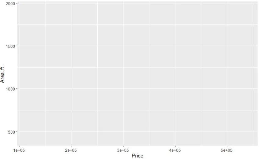
- Data layer. Creating a ggplot with only the data layer results in an empty plot.


- Aesthetics. Here, we specify the x and y axes. This allows us to assign the variables to their corresponding axis.


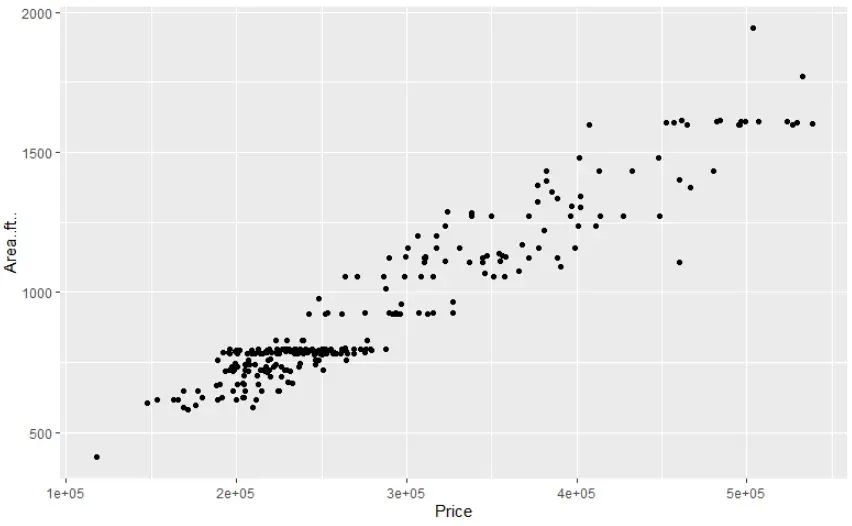
- Lastly comes the geometry. For a scatter plot, the required geometry is geom_point, as each data entry is displayed as a point on our plot.


And that’s all you need to make a ggplot2 scatter plot. For more awesome tips and tricks, you should most definitely check out the ggplot2 cheat sheet. It is a superb resource!
Some final words on GGPlot2 Scatter Plot...
You already have the tools necessary to make a gg plot2 scatter plot. But this tutorial is only the beginning. R programming and the ggplot2 library offer a variety of options for visualizing and styling exceptional charts. We encourage you to explore the ggplot package on your own and try your hand at crafting ggplots. Bet you’ll come up with some great ideas!
Ready to take the next step towards a data science career?
Check out the complete Data Science Program today. Start with the fundamentals with our Statistics, Maths, and Excel courses. Build up a step-by-step experience with SQL, Python, R, Power BI, and Tableau. And upgrade your skillset with Machine Learning, Deep Learning, Credit Risk Modeling, Time Series Analysis, and Customer Analytics in Python. Still not sure you want to turn your interest in data science into a career? You can explore the curriculum or sign up 12 hours of beginner to advanced video content for free by clicking on the button below.
