If you have ever heard of statistics, you have probably heard the term ‘histogram’ as well. This is because visualizing data is a key concept in statistics. Whenever you need to visualize numerical data, you are likely to use a histogram. In this tutorial, we will teach you exactly how to achieve that step by step. When it comes to categorical data, however, it’s a whole new ball game. Don’t worry if you don’t know how to visualize such data, because we already have a tutorial on that topic. If you don’t know the difference between categorical and numerical data, this tutorial should make it clear. Now, let’s focus on the numerical variables.
Creating a Frequency Distribution Table
Whenever we want to plot data, it is best to first order it in a table. So, as it’s usually done with categorical variables, let’s start by creating a frequency distribution table.
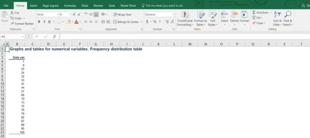
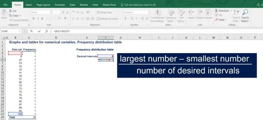
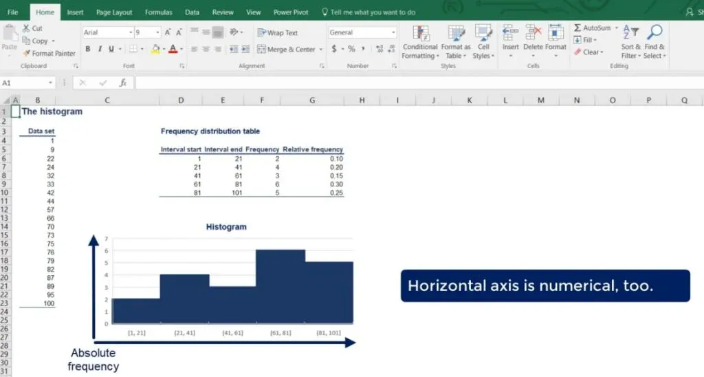
In the picture below, you can see a list of 20 different numbers.
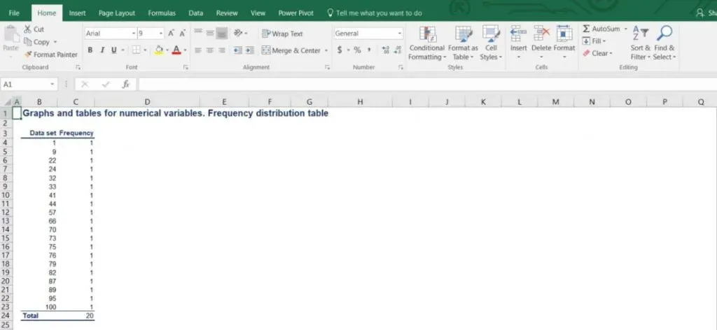
After arranging them in a frequency table, we obtain a table with 20 rows. Each of them represents one number with a corresponding frequency of 1, as each number occurs exactly one time. However, as shown in the picture below, this table seems impractical for any analysis.
Grouping the Data into Intervals
Well, when we deal with numerical variables, it makes much more sense to group the data into intervals and then find the corresponding frequencies. In this way, we make a summary of the data that allows for a meaningful visual representation.
How to Choose the Intervals
Generally, statisticians prefer working with groups of data that contain 5 to 20 intervals. This way the summary can be useful. However, this varies from case to case and the correct choice of intervals largely depends on the amount of data we are working with. In our example, we will divide the data into 5 intervals of equal length.
The Formula
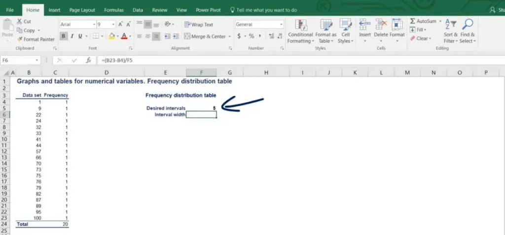
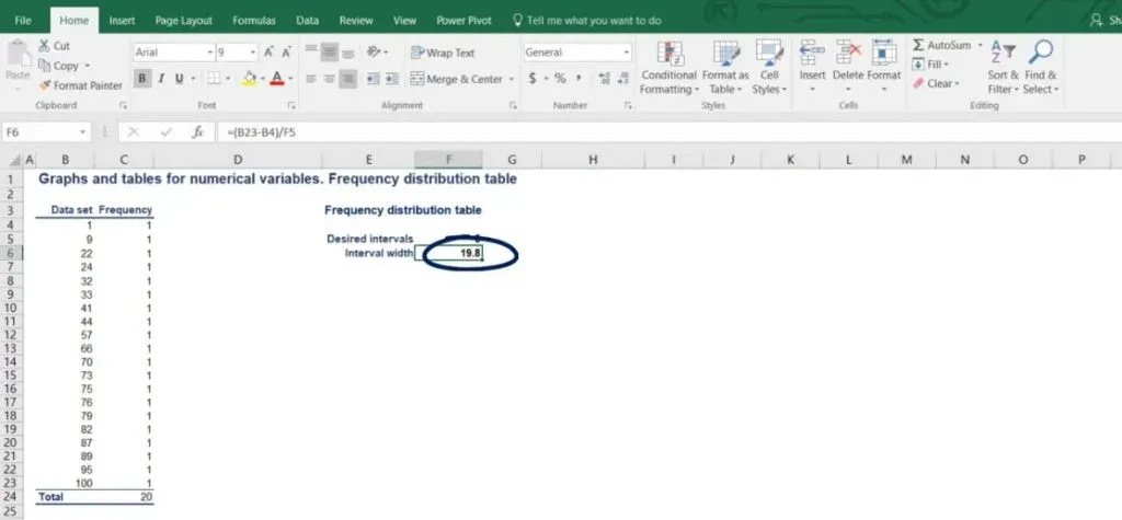
The simple formula that we use is as follows: the interval width is equal to the largest number minus the smallest number, divided by the number of desired intervals.
In our case, the length of the intervals should be (100 - 1) / 5. The result is 19.8.
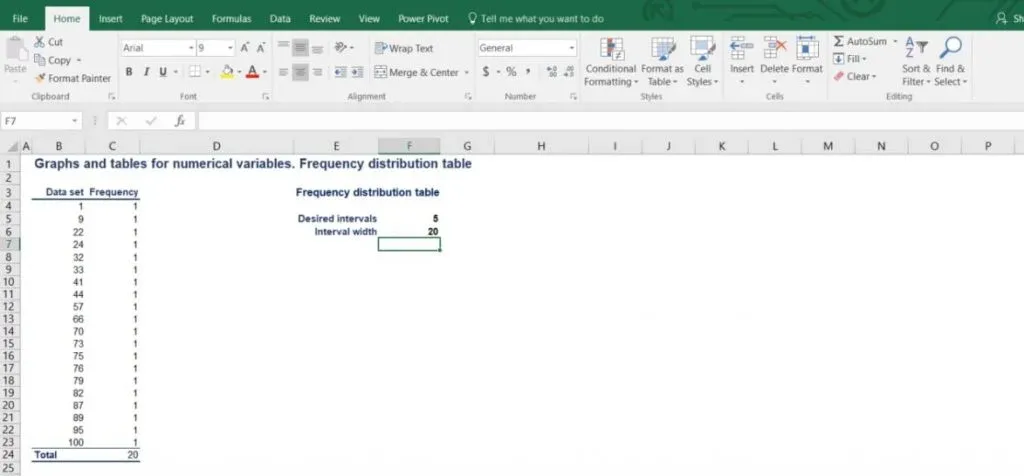
Now we want to round this number up in order to reach a neater representation.
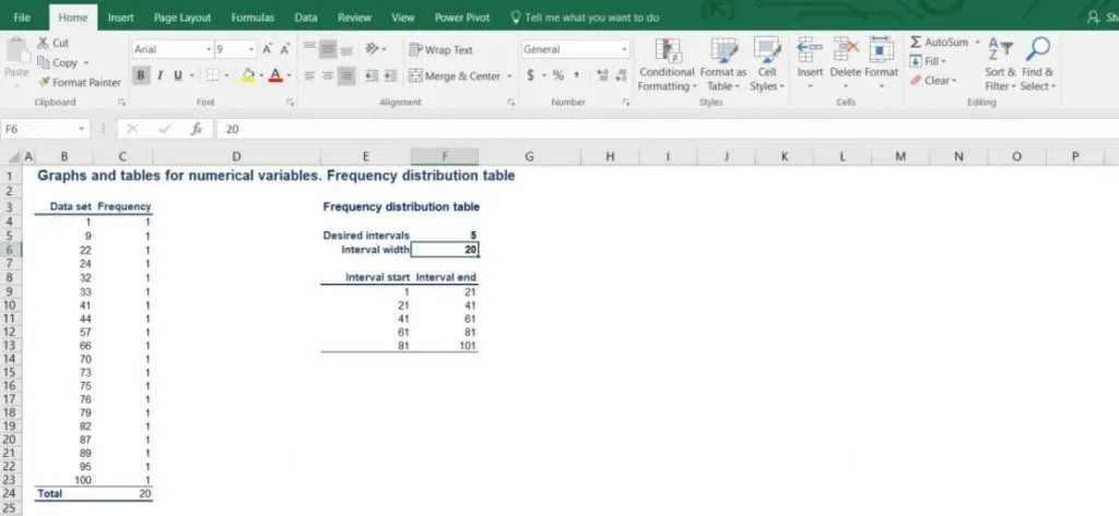
Therefore, our intervals will be as follows: 1 to 21, 21 to 41, 41 to 61, 61 to 81 and 81 to 101.
Each interval has a width of 20.
Constructing the Frequency Distribution Table
Let’s try to construct the frequency distribution table!
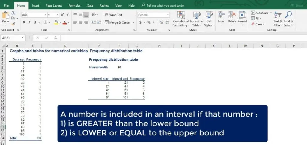
A number is included in a particular interval, if that number is greater than the lowest bound and equal to or less than the largest bound.
As we can see from the picture below, there are 2 numbers in the first interval. Then, there are 4 in the second, 3 in the third, 6 in the fourth and 5 in the fifth interval.
Relative Frequency
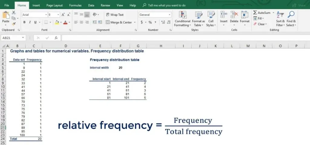
For many analyses, it is useful to calculate the relative frequency of the data points in each interval. The relative frequency is the frequency of a given interval as part of the total.
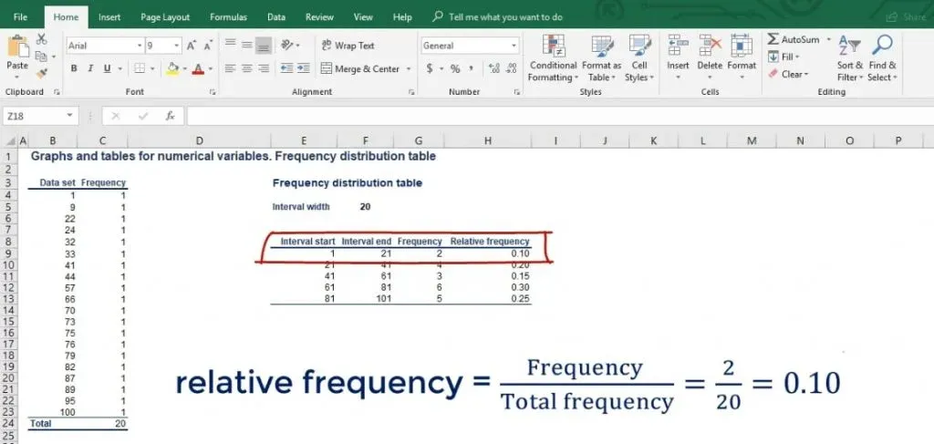
Let’s add another column to our table and name it relative frequency. So, the interval from 1 to 21 has an absolute frequency of 2. But its relative frequency is 2 divided by the total of 20 numbers, which gives us 10%.
And so on, until we fill the table. Now that we have summarized the raw data, we can start plotting it.
Introducing Histograms
The most common graph used to represent numerical data is the histogram.
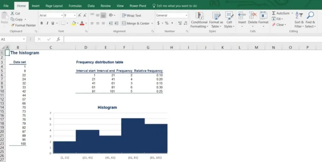
First, we’ll learn how to create it. Then, we’ll provide a description of the way the data is represented. We are going to use the frequency distribution table we created earlier to help us out. Let’s see what an actual histogram looks like, in the picture below.
The Differences between Histograms and Bar Charts
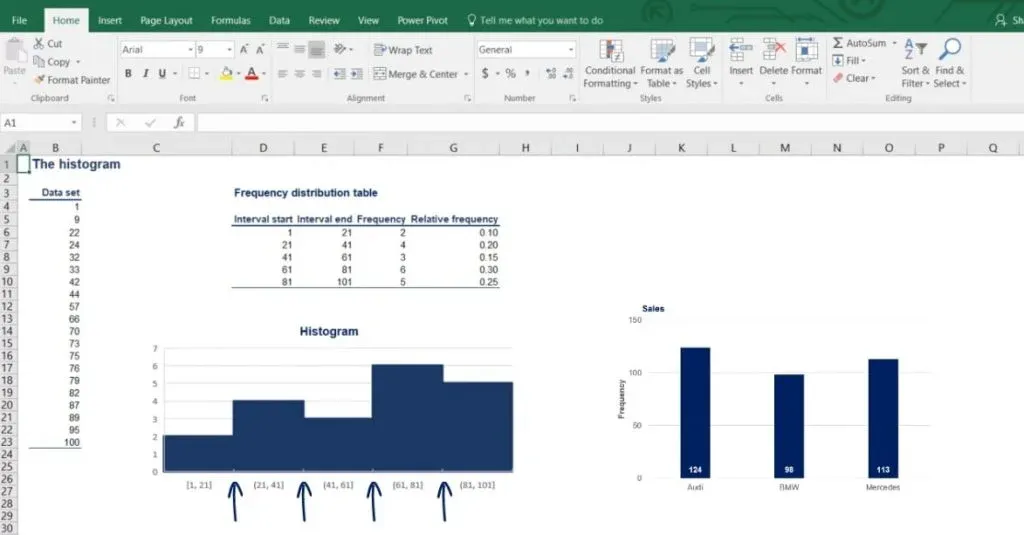
It may look like a bar chart, but it actually conveys very different information. As in the bar chart, the vertical axis is of numerical type and shows the absolute frequency. This time, though, the horizontal axis is numerical too.
So, each bar has an equal width to the interval and height equal to the frequency. Notice how the different bars are touching. This is to show that there is continuity between the intervals – each interval ends where the next one starts. In the bar chart, different bars represent different categories, so the bars are completely separate.
Another Way to Plot the Intervals
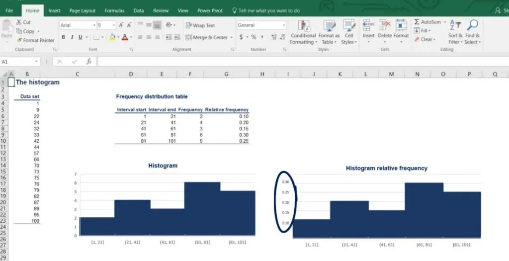
Sometimes, it is useful to plot the intervals against the relative, rather than the absolute frequency. As you can tell from the picture below, the histogram looks the same but gives different information.
Side note: Relative frequency is made up of percentages. There is no way to do that in Excel but it is a useful piece of information.
Using Unequal Intervals
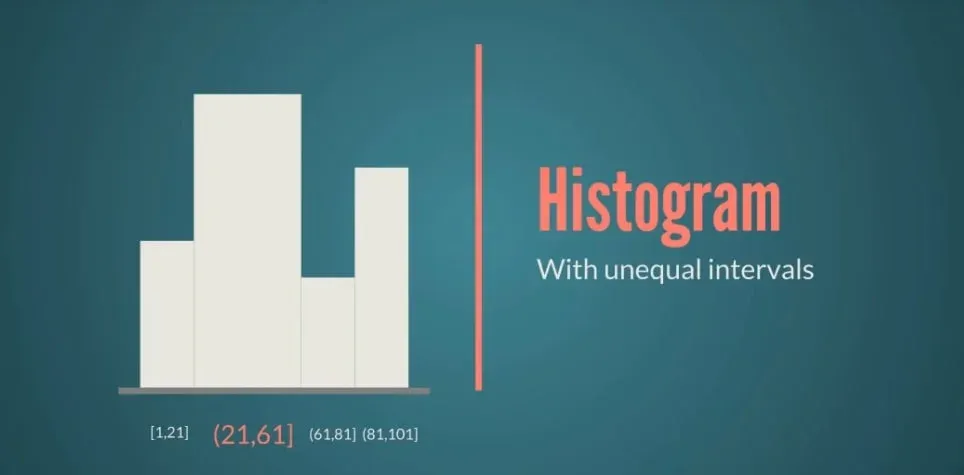
There is one last thing to note here. We could create a histogram with unequal intervals.
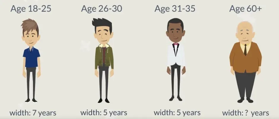
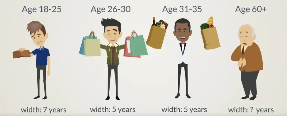
Age groups are a good case in point. You’ve likely completed some survey where you were asked about your age and the possible answers were: 18 to 25, then 26 to 30, 31 to 35, and so on until 60 plus. Clearly, the interval widths vary and reflect different focus groups for the experiment at hand.
The Reason
An explanation for the choice may be: young adults under 25 cannot afford the product, while adults over 60 have no interest in the product.
In any case, you should be quite experienced to accurately design and interpret such groups. It is highly recommended that you stick with the equal width intervals until you gain enough experience.
Representing Numerical Data
To sum up, the process of visualizing numerical data follows a few simple steps.
- First, you should create a frequency distribution table.
- Then, you have to choose the intervals and use the basic formula.
- After that, you can calculate the relative frequency and construct the table.
- Finally, you can create a histogram with the help of the table.
Visualizing one variable is fun, isn’t it? What if we add a second one? Can we still use a histogram? Find the answers to these questions in the next tutorial.
***
Interested in learning more? Advance your statistics knowledge and build data visualization skills with our comprehensive training courses.
Next Tutorial: Visualizing Data with Contingency Tables and Scatter Plots

