In statistics, there are numerous ways to visualize your data, however, some of the most common ones are bar, pie, and Pareto charts. In order to achieve that, you should know the data type and its measurement level. Sure, you can create beautiful charts without this knowledge, but intrinsically the whole visualization process is governed by these classifications.
Here’s the plan.
We will explore different graphs and tables, which will allow us to visually represent the data we are working with. Visualizing data is the most intuitive way to interpret it, so it’s an invaluable skill.
How to Visualize Categorical Variables?
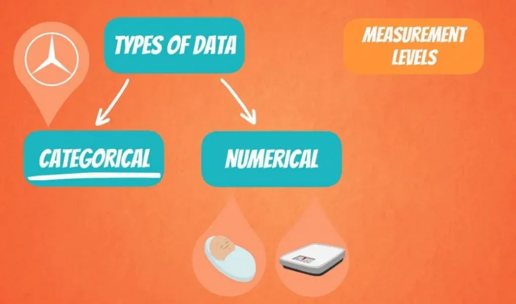
As you may know, there are two types of variables – categorical and numerical.
In this tutorial, we will focus on categorical variables.
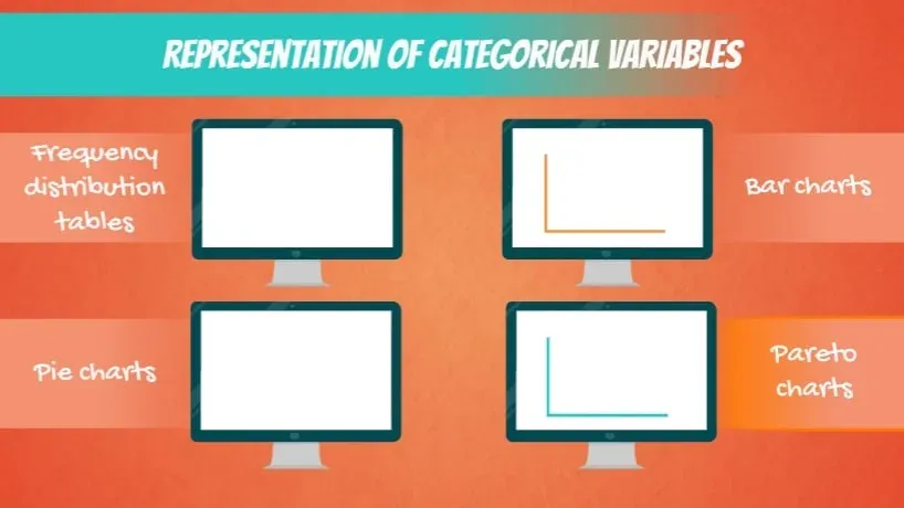
Some of the most common ways to visualize them are frequency distribution tables, bar, pie, and Pareto charts.
Frequency Distribution Tables
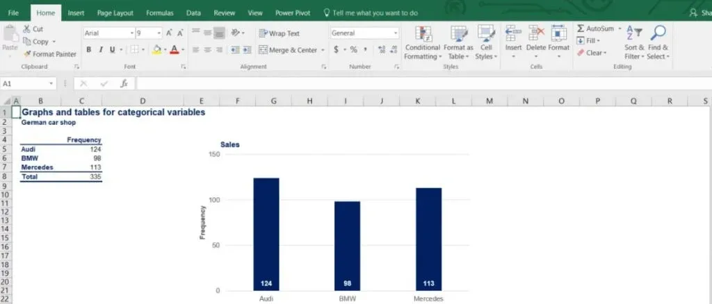
First, let’s see what a frequency distribution table looks like. As you can see in the picture below, it has two columns – the category itself and the corresponding frequency.
Imagine you own a car shop and you sell only German cars. The table below shows the categories of cars: Audi, BMW and Mercedes. It also displays their frequency, or in plain English – the number of units sold. By organizing your data in this way, you can compare the different brands and see that Audis have sold the most.
Bar Charts
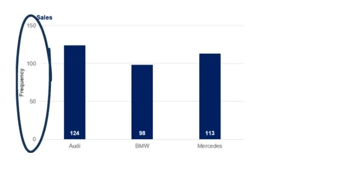
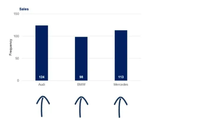
Using the same table, we can construct a bar chart, also known as a column chart.
The vertical axis shows the number of units sold.
Whereas each bar represents a different category, indicated on the horizontal axis.
In this way, it is much clearer to see that Audi is the bestselling brand! Oh, and by the way, you can create a Bar Chart in Python using Matplotlib.
Pie Charts
Now, let’s try representing the same data as a pie chart. In order to build one, we need to calculate what percentage of the total each brand represents.
In statistics, this is known as relative frequency. Naturally, all relative frequencies add up to 100%. Pie charts are especially useful when we want to not only compare items to each other but also see their share of the total.
Market Share
This example could be easily transformed into a business example of market share. Market share is so predominantly represented by pie charts that if you search for ‘market share’ in Google Images, you would get only pie charts!
Imagine that the data in our table is representing the sales of Audi, BMW and Mercedes in a single German city, say Bonn. The chart will show us the market share that each of these brands has.
Pareto Charts
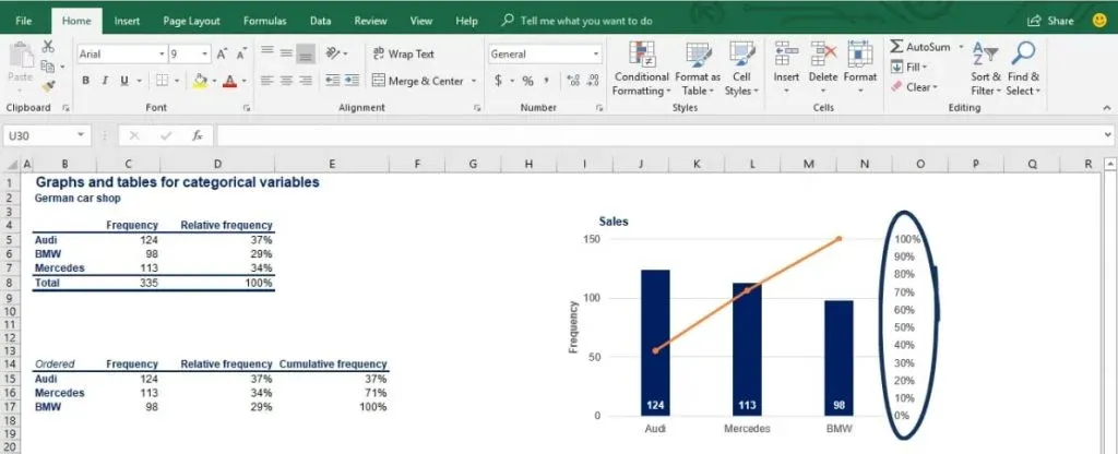
Lastly, we have the Pareto chart. In fact, a Pareto chart is nothing more than a special type of bar chart, where categories are shown in descending order of frequency.
By frequency, statisticians mean the number of occurrences of each item. As we said earlier, in our example, that’s the exact number of units sold.
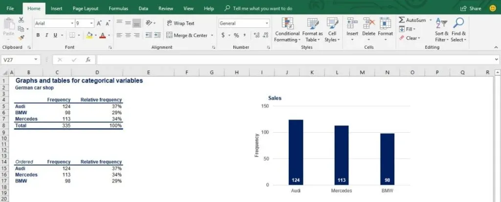
Let’s go back to our frequency distribution table and order the brands by frequency.
Now, we can create the bar chart based on the reordered table.
What is shown in the picture is almost a Pareto chart.
Cumulative Frequency
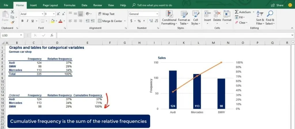
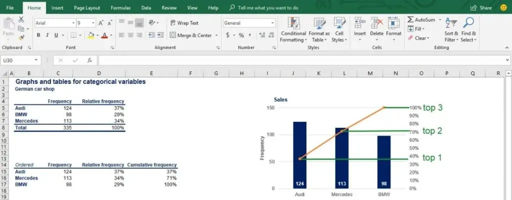
There is one last touch to make it one – a curve on the same graph, showing the cumulative frequency.
The cumulative frequency is the sum of the relative frequencies. It starts at the frequency of the first brand, then we add the second, the third and so on until it finishes at 100%.
The polygonal line you see in the picture above is measured by a different vertical axis on the right of the graph. At each of its vertices it shows the subtotal of the categories to its left.
What Do Pareto Charts Consist of?
You might have noticed how the Pareto chart combines the strong sides of the bar and the pie chart – it is easy to compare the data both between categories and as a part of the total. Furthermore, if this was a market share graph, you could easily see the market share of the top two or top five companies.
The Pareto Principle
One final note, it is named after Vilfredo Pareto. You may have heard of another idea of his – the Pareto principle, also known as the 80-20 rule.
It states that 80% of the effects come from 20% of the causes.
A real-life example is a statement by Microsoft that by fixing 20% of its software bugs, they managed to solve 80% of the problems customers experienced.
A Pareto chart can reveal information like that. It is designed to show how subtotals change with each additional category and provide us with a better understanding of our data.
If you would like to read more about Charts and graphs, then have a read of our article on them here.
Different Ways to Visualize Data
In conclusion, we went over the main ways to visually represent categorical data. Now, you should know when to use a simple table or one of the charts we discussed, depending on the desired result. Pareto charts have an edge over the other 2 charts because they give much more information.
What about visualizing numerical data? Well, you may be surprised, but there are actually a few ways you can achieve that. You can get acquainted with the most useful graphs and tables for numerical data by jumping onto the linked tutorial.
***
Interested in learning more? You can take your skills from good to great with our statistics tutorials and Statistics course.
Next Tutorial: How to Visualize Numerical Data with Histograms

