“A picture is worth a thousand words.”
In data science, a picture may actually be worth tens of thousands of data entries!
Eyesight started developing 500 million years ago to become one of the most important human abilities to date. In the digital era of today, the abundance of information has made it very difficult for working professionals to “see” the true beauty of data and find the actionable insights they are looking for. That’s why they employ various visualization techniques to summarize and interpret it effectively.
In this article, we will provide a general overview of the most popular data visualization instruments and the key drivers for choosing them!
First Things First: What Is Data Visualization?
Data visualization is the medium we use to communicate our message to various stakeholders, such as employees, suppliers, investors, and even the media. It enables people to “look” beyond raw numbers and find significant trends.
A brief data visualization definition would be the representation of information by means of:
- Charts
- Graphs
- Diagrams
- Maps
- Infographics
- Histograms
- Plots
Such figures can turn a dataset with thousands of entries into a single digestible graphical representation, allowing us to gain valuable insights about the big picture and help the audience grasp the story we want to tell. Executives, for instance, look for a format that is easy to read and, quite importantly, gives them the essentials without having to reach out to the data scientist for more details.
Suppose that your manager requests a document showing the company’s profitability. In this case, you can use interactive data visualization which enables the user to manipulate the BI report directly, drilling down to the next level of detail, for example – the profitability per region, per branch, or even per customer.
Such reports are not only easy on the eyes – they are very convenient because they can be consulted online on mobile, tablet, or computer. In this way, business and data analysts can work with the latest information available on the spot.
What Is the Role of Data Visualization Tools?
A data visualization tool is specific software that enables users to present and interpret various statistics visually. Although platforms have diverse features, they all share some basic capabilities, offering you the chance to insert a dataset and visualize the outcome thereafter. Many of them even have built-in templates for you to work with.
Which Are the Top 3 Data Visualization Tools for Business?
Here are the 3 most popular tools people around the globe employ to represent data visually. What makes them stand out is their enhanced capability to help businesses meet the need for interactive exploration and real-time data streaming in their day-to-day activities. Not only that – these data visualization instruments can integrate AI and cross-platform support to spot visual relations.
1. Tableau
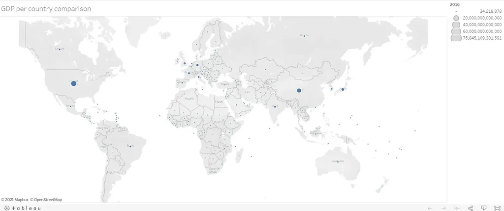
Tableau is ranked as one of the best data visualization tools in the world of business. It is BI software that enables you to visualize quantitative and qualitative information and use it in near real time. Back in the day, analysts would work closely with the IT team to collect and preprocess raw data. With the help of Tableau, they can now treat company statistics and generate visual content on their own. For example, when you work with geographical figures, the program can recognize the data entries as geographical locations – a powerful capability Excel is yet to catch up with. It then allows you to create a map to better track how a certain variable is distributed, such as gross domestic product (GDP) by country:

Besides, Tableau helps you combine several types of charts or tables and build up interactive dashboards, exploring the granularity of your findings. This makes it a smart solution for identifying patterns, spikes, and trends.
Although it offers some database management functionalities, Tableau isn’t the best tool for data creation and preprocessing. It does perform basic calculations, but it can’t serve as a spreadsheet tool for multi-layered operations. However, you can easily transfer any existing Excel data to Tableau and make it come to life with insightful visuals. Unlike Power BI, Tableau supports Python machine learning, which is another useful feature to consider.
If you want to learn how to work with this top-rated tool, you can download Tableau Public. It is one of the free data visualization tools you can find online, with most of its capabilities conveniently unlocked for you to explore. To get started, check out our free tutorial on how to create a Tableau visualization.
2. Power BI
If you want to visualize data, share findings, and embed those in different platforms, Power BI is your go-to tool. Most importantly, it pulls information from various sources together and processes it, turning it into intelligible insights.
Non-technical users usually feel comfortable working with this data visualization tool because its interface resembles that of Microsoft. In fact, Power BI is built on the foundation of Excel, so transitioning from one to the other is relatively easy.
Unlike Excel, however, it focuses on visualizing and highlighting data that matter to you in real time. You can drag and drop interactive visualizations in the platform, publish reports to the Power BI service, and collaborate with your team on various projects. You may even use your smartphone or tablet to check the insights!
Another interesting feature of Power BI has to do with processing diverse information in a fast, responsive manner – something that many other instruments fail to do. As such, this tool houses several software services and connectors. For a small data volume, Power BI visualization is probably the right tool for you.
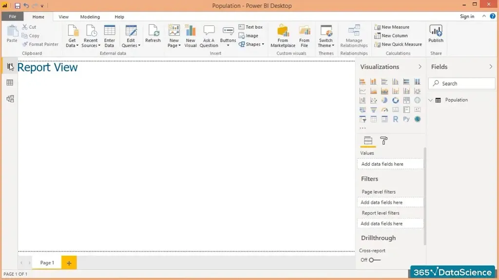
This business analytics service offers 3 views: Report View, Data View, and Model View. Data visualization usually happens in the Report View:

At the moment, the platform integrates with other business solutions such as SharePoint, Office 365, SalesForce, MailChimp, Google Analytics, and so on. Regardless of what data source you use, you can configure and apply various restrictions to ensure maximum security to end-users and developers.
3. Excel
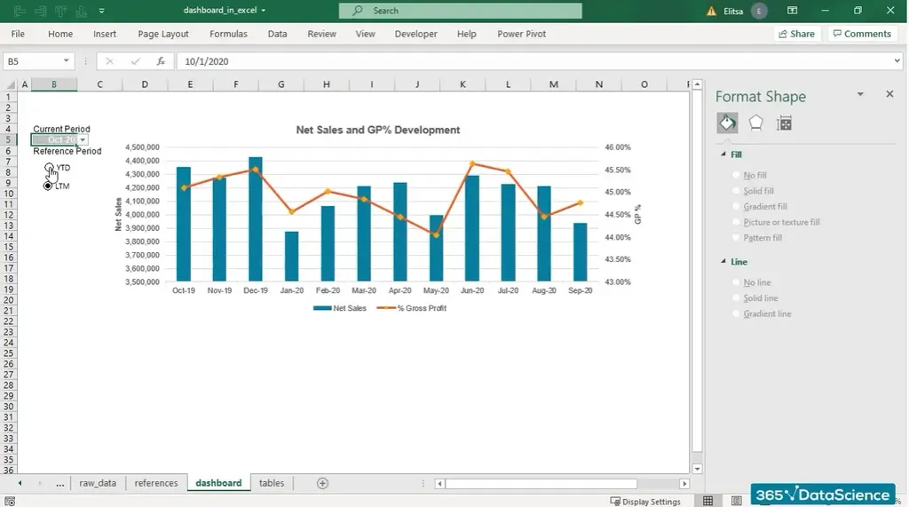
Although there are quite a few customizable data visualization tools available on the market, Excel continues to be the workhorse for organizations of all sizes. Naturally, the first thing that comes to mind when you hear the word Excel is analysis rather than visualization. Indeed, it is a great tool for information preprocessing, especially in terms of multi-layered calculations.
As for data analysis and visualizations, Excel can offer great flexibility, only if you know how to use it. In fact, there are plenty of options to try out, such as quick analysis functions, forecast sheet features, linked data types, Pareto charts, PivotTables, PivotCharts, Specialized Survey Charts, scatter plots and Contingency tables, and even sparklines.

For more enhanced Excel data visualizations, you can install some of its add-ins with a few extra steps. ChartExpo, for example, is an incredible add-in that helps professionals summarize data in no time!
Despite the seemingly attractive visualization features it offers, Excel is not primarily built as a dynamictool for visual content. A spreadsheet overload may easily cause your work to crash or get lost, thus we can’t rely on it to graphically represent big datasets. Because of these intricacies and greater human intervention, our visuals might be prone to error. Still, its broad range of functionalities makes it versatile enough for millions of users to choose Excel for presenting data.
Even though it remains most optimal for spreadsheet creation rather than for data visualization, businesses often consider Excel a reasonable, sometimes even preferred, alternative to Tableau and Power BI. Without a doubt, the fact that it’s been highly accessible and widely known among professionals for years has a significant role to play in ranking it as one of the most popular data visualization tools of today.
For an enhanced visual representation, though, a competent analyst requires both Excel and a specialized data visualization tool. Ultimately, Tableau and Power BI tools produce story-telling visuals and dashboards, while Excel is predominantly a spreadsheet program for multi-layered calculations.
Tableau, Power BI, or Excel: Which One to Choose?
Tableau, Power BI, and spreadsheet tools like Excel all enable us to represent data graphically. Yet, they serve different purposes. In reality, working with Tableau or Power BI won’t always preprocess data the way Excel does, and vice versa – Excel’s visualization options may not present your findings as optimally as a BI tool would.
Essentially, Tableau and Power BI are very smart in terms of visualization capabilities. Excel, by contrast, helps you organize statistics optimally on a preprocessing level. That’s why we can confidently say that Tableau, Power BI, and Excel are equally indispensable in the arsenal of most working professionals.
Why Does Data Visualization Matter?
Scientifically, the human brain is said to process visual content 60,000 times faster as compared to plain text and numbers. In a world full of data, visualization is, without a doubt, a needful simplification. It is a way for us to unveil what’s really behind all these numbers. Even more so – visual communication is a storytelling tool that’s both art and science.
With the rapid growth of data volumes available out there, organizations are starting to realize that analytics is a powerful source – not only for historical review but also for predictive and prescriptive analysis. In all situations, real-time data, both internally and externally sourced, enables a better evaluation of the current business environment for all cross-functional divisions. To improve analyses, interactive visualization tools are now the in-demand way for curating such a vast amount of information on the go.
Data visualizations make it possible for you to reap the rewards of data-driven decision making and showcase your expertise. Knowing how to represent your finding graphically is the first step towards successful data analytics.
To learn more about the power of visual content, check out The Complete Data Visualization Course with Python, R, Tableau, and Excel!


