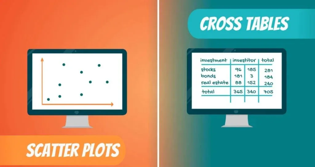
If you want to become a more advanced statistician, learning how to visualize data with contingency tables is essential. When it comes to visualizing one variable, it is simpler. We can use Bar charts, Pie charts, Pareto Diagrams, Histograms, and so on. How do we represent relationships between two variables, though?
In this tutorial, we’ll answer this question by exploring contingency tables and scatter plots.
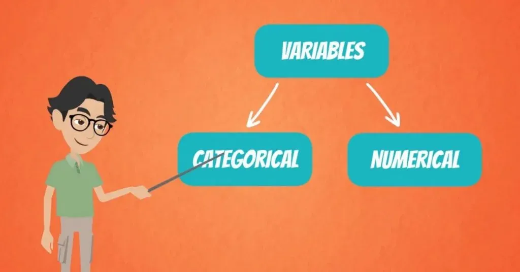
If you are familiar with different types of data, you might have guessed, we have a division between categorical and numerical variables.
How to Visualize Categorical Variables?
Let’s start with categorical variables.
The most common way to represent them is using contingency tables, or as some statisticians call them – cross tables.
Imagine you are an investment manager and you manage stocks, bonds and real estate investments for three different investors.
Each of the investors has a different idea of risk. Hence, their money is allocated in a different way among the three asset classes.
Using a Contingency Table
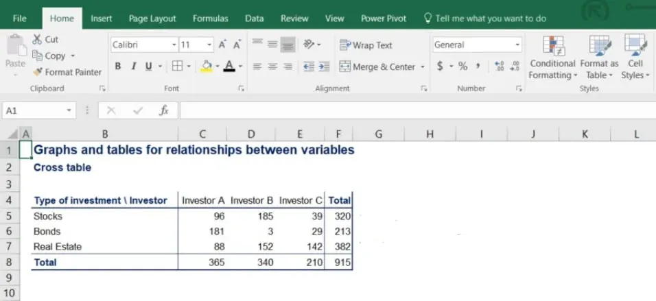
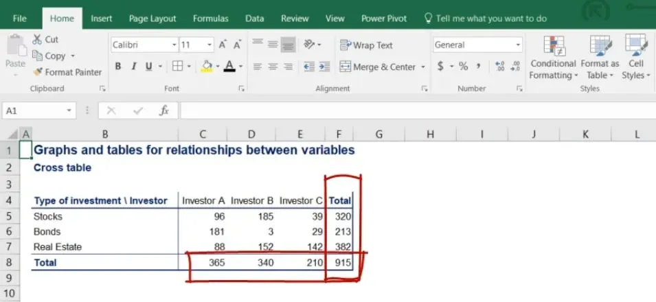
A contingency table representing all the data looks like the following.
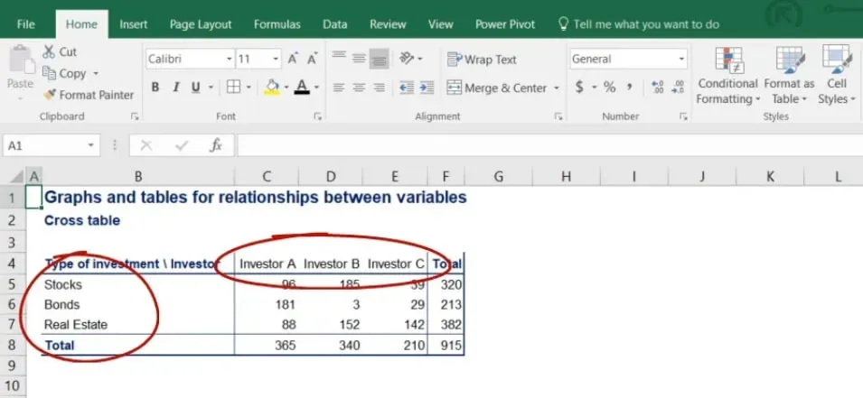
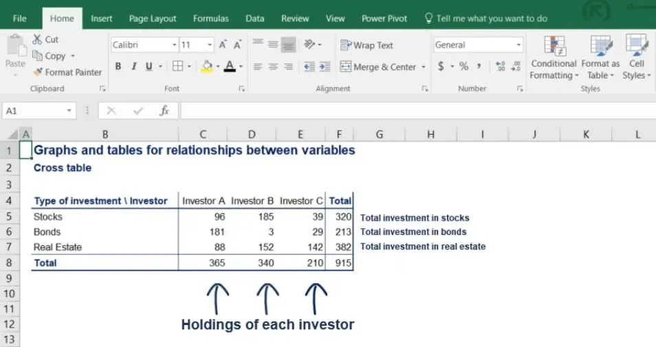
In the picture below, you can clearly see the rows showing the type of investment that’s been made and the columns with each investor’s allocation.
It is a good practice to calculate the totals of each row and column because it is often useful in further analysis.
Notice that the subtotals of the rows give us total investment in stocks, bonds and real estate.
On the other hand, the subtotals of the columns give us the holdings of each investor.
How to Visualize it
Once we have created a contingency table, we can proceed by visualizing the data onto a plane.
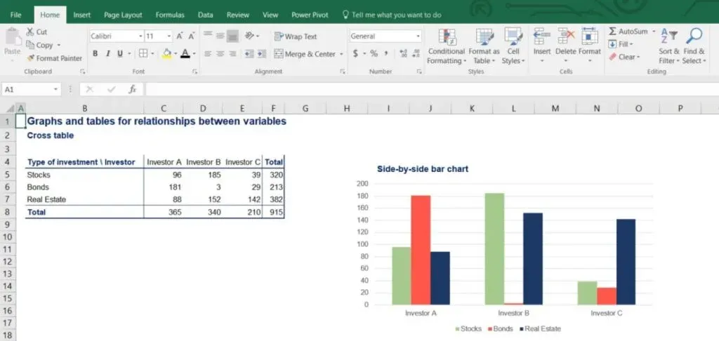
A very useful chart in such cases is a variation of the bar chart called the side-by-side bar chart. It represents the holdings of each investor in the different types of assets. As you can see in the picture below, stocks are in green, bonds are in red and real estate is in blue.
Why it is Called Side-by-Side Bar Chart
The name of this type of chart comes from the fact that for each investor, the categories of assets are represented side by side. In this way, we can easily compare asset holdings for a specific investor or among investors.
Important: All graphs are very easy to create and read after you have:
- identified the type of data you are dealing with
- decided on the best way to visualize it.
How to Visualize Numerical Variables?
Finally, we would like to conclude with a very important graph – the scatter plot.
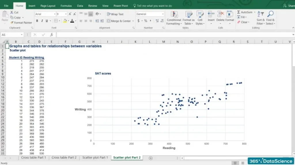
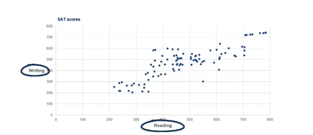
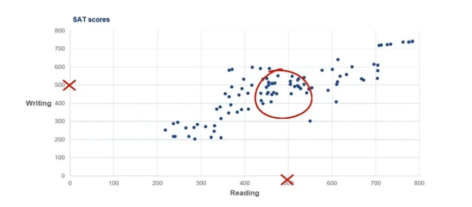
It is used when representing two numerical variables. For this example, we will be looking at the reading and writing SAT scores of 100 individuals.
So, let’s take a look at the graph before analyzing it.
Analyzing the Graph
- First, SAT scores by component range from 200 to 800 points. That is why our data is bound within the range of 200 to 800.
- Second, our vertical axis shows the writing scores, while the horizontal axis contains reading scores.
- Third, there are 100 students and their results correspond to a specific point on the graph. Each point gives us information about a particular student’s performance.
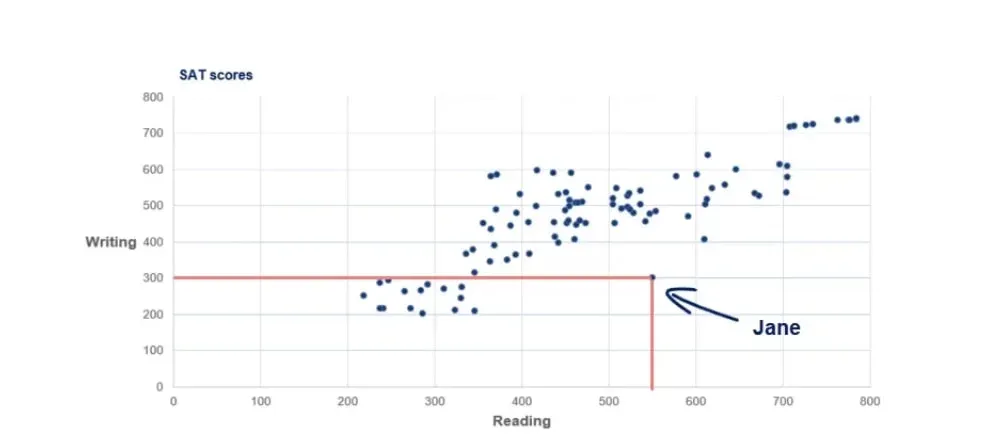
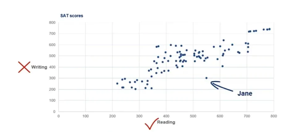
For example, the point in the picture below is Jane.
It is evident that she scored 300 on writing and 550 on the reading part.
How to Interpret a Scatter Plot?
Scatter plots usually represent lots and lots of observations. When interpreting a scatter plot, a statistician is not expected to look into single data points. He would be much more interested in getting the main idea of how the data is distributed.
First Observation
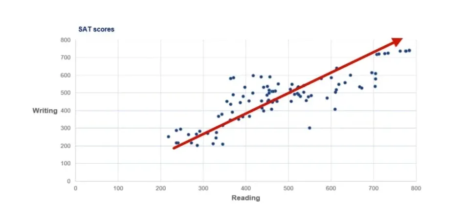
The first thing we see is that there is an obvious uptrend.
This is because lower writing scores are usually obtained by students with lower reading scores. Similarly, higher writing scores have been achieved by students with higher reading scores. This is because the two tasks are closely related.
Second Observation
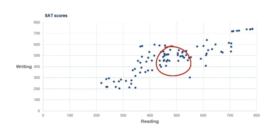
We notice a concentration of students in the middle of the graph with scores in the region of 450 to 550 on both reading and writing.
We already mentioned that scores can be anywhere between 200 and 800. Well, 500 is the average score one can get, so it makes sense that a lot of people fall into that area.
Third Observation
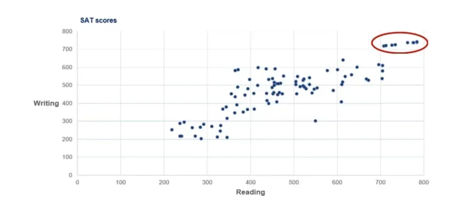
There is a group of people with both very high writing and reading scores. The exceptional students tend to be excellent at both components.
This is less true for bad students as their performance tends to deviate when performing different tasks. 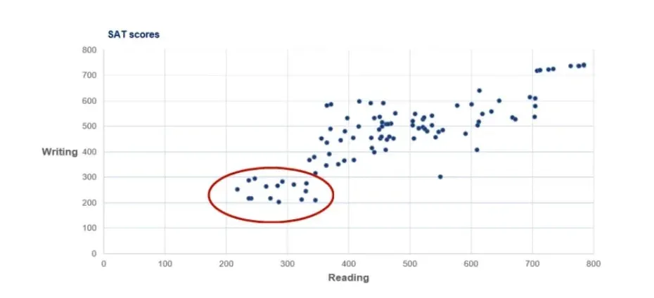
Fourth Observation
Finally, we have Jane from a few paragraphs ago. She is far away from every other observation as she scored above average on reading but poorly on writing. We call this observation an outlier as it goes against the logic of the whole dataset.
The Proper Ways to Visualize 2 Variables
To sum up, after reading this tutorial, representing the relationship between 2 variables should be like a walk in the park for you. If the variables are categorical, creating a contingency table should be a priority. After doing that, a side-by-side bar chart will be a great way to visualize the data.
On the other hand, if the variables are numerical, a scatter plot will get the job most of the time. It is extremely useful because it is quite easy to make observations based on it and it is a great starting point for more complex analyses.
So, these are the basics when it comes to visualizing 2 variables. Now, you are ready to dive into the heart of descriptive statistics. The first concept which you can master revolves around the measures of central tendency – mean, median, and mode. It’s a great place to start so check it out!
***
Interested in learning more? You can take your skills from good to great with our statistics tutorials and Statistics course.
Next Tutorial: Introduction to the Measures of Central Tendency

