
Are you excited to create a chart in Tableau?
As you already know, Tableau is an absolutely wonderful, highly intuitive software that is easy-to-understand even for data science beginners. In this tutorial, we will show you one of a variety of data visualization tools you can choose from. Moreover, you’ll be able to create your first chart in Tableau very quickly – just by dragging and dropping the relevant objects you see on the interface.
Having said all that, I am sure you are eager to create some fascinating visualizations.
To create a chart in Tableau, let’s load an Excel file in Tableau
First off, we need to learn how to connect Tableau with the data source we will be working with. There are two options. We can either make a connection to a file or to a server. Of course, we will choose one of the options depending on where the data is. Let’s connect Tableau to this Excel spreadsheet. This file is called GDP data. If you are new to Tableau, or you haven’t read our previous tutorial, you can learn how to load the file and get rid of the empty rows.
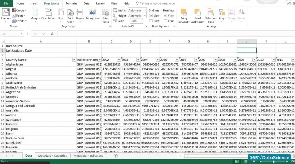
Let’s open the GDP Data Excel file for a second to make sure you are familiar with its structure.
Here it is. We have a few blank rows, then we have a column with country names, a column indicating that this is GDP data, and several columns with GDP figures for each of these countries. And this is the Datasheet we are using right now.
Working with the source file
Let's go back to Tableau and click on “Sheet 1”.
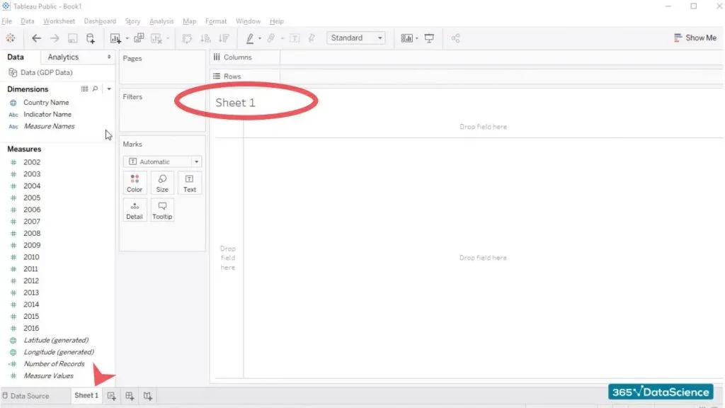
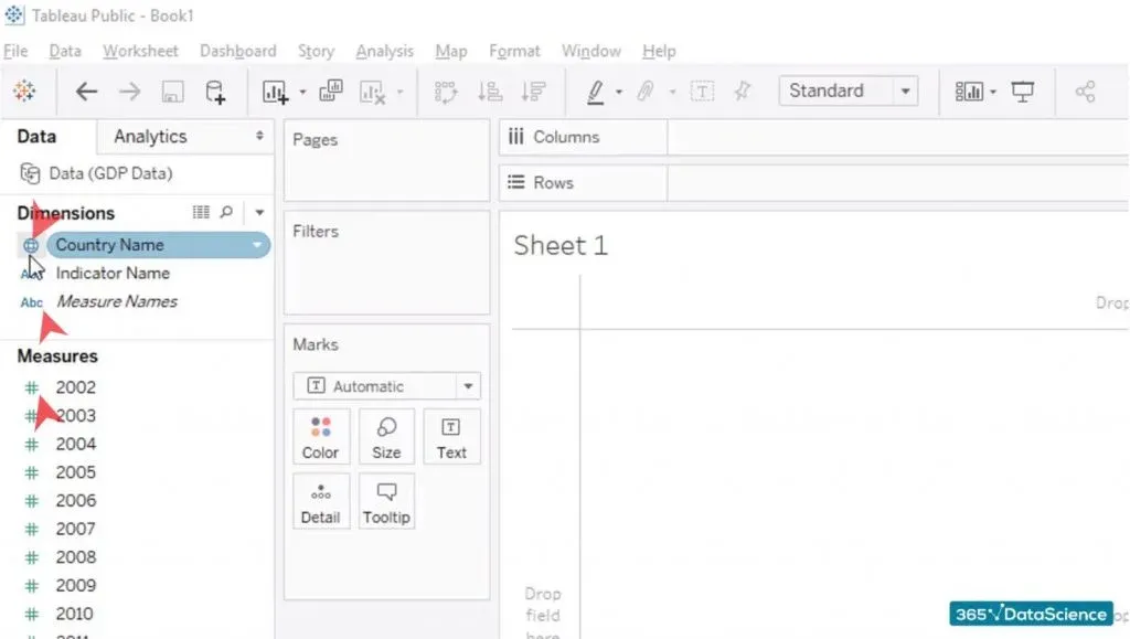
The way data is organized here is rather interesting. Our attention should be focused on the ‘dimensions and measures’ part of the screen.
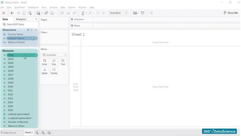
First off, Tableau is very smart and has managed to organize our data – categorical variables are right here under “dimensions”, while numerical data, such as the countries’ actual GDP, is under “measures”. “Dimensions” are colored in blue, and “measures” are in green.
Important Note
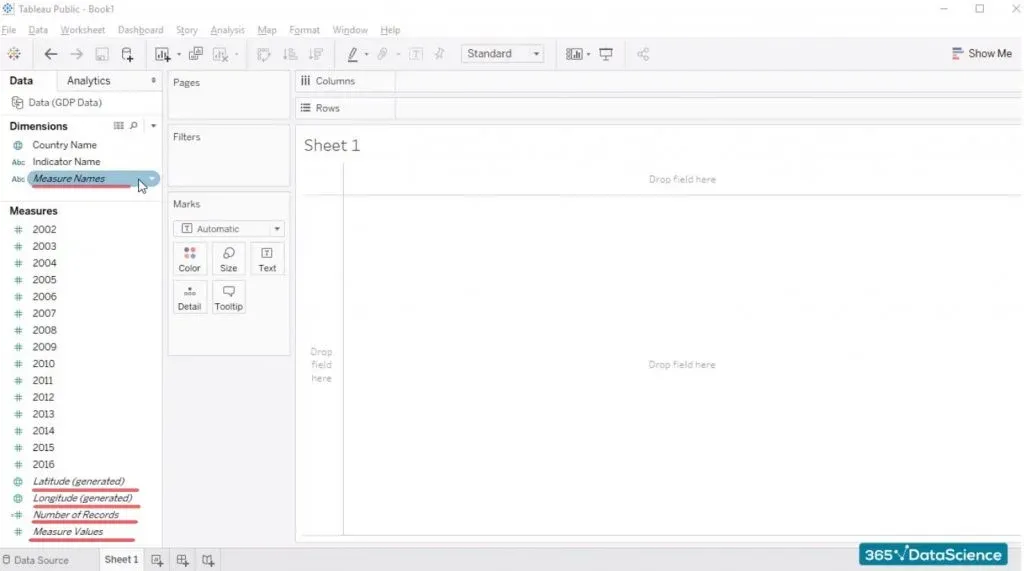
Some of the fields are in italics and others aren’t. The distinction between the two is that Tableau generates certain fields based on the data it finds. When Tableau generates its own fields such as the “Measure names” field, these are fields that are not contained in our original data source, but Tableau deems that these can be useful and creates them for us. The same thing is true for “Latitude”, “Longitude”, “Number of records”, and “Measure values” we see in green under “Measures”. The rest of the fields written without Italics are the ones we saw in the Excel file we loaded – “Country name”, “Indicator name”, and the years from 2002 to 2016, where we have countries’ GDP figures.
Important detail
Tableau adds an icon right next to each of the fields we have under “Dimensions” and “Measures”. This is what allows us to understand how Tableau reads the data. The first field under “Dimensions” is “Country name” and its icon is the globe. Tableau recognizes that this field is related to actual countries, and it is ready to help us out when we need to visualize such data. If we click on the icon, we’ll be able to see that this is a string and that its geographic role is of Country/Region, as it should be.
At the same time, the tiny “Abc” icon of the “Indicator name” field shows us that this is a text value. And in fact, when we click on it, we can see that this is a string. However, in contrast to what we have for the “Country name” field, the geographic role of “Indicator name” is “None”. That’s because this is purely a text value.
What about the year measures we have below?
Well, these are numerical values, right? Therefore, it comes as no surprise that when we click on their icon (designating numerical values), we will see these are numbers.
Let’s drag the “Country name” field into the workspace area. And...There it is!
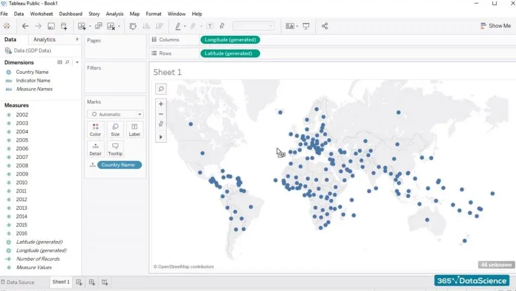
Tableau created a world map that shows us the location of each of the countries we have in our data source.
It is quite interesting to see that the field we see under Columns and Rows isn’t country name but are artificially generated Longitude and Latitude fields. At first, it may seem strange, but then when you think about it, it is intuitive. Tableau understands “Country name” is a geographical field. This is why it will do much more than simply create a row or a column containing a list of the countries we have in the Excel file.
No, the program is smarter than that. It reads the countries names and then creates the two fields “Longitude” and “Latitude” in order to map each country geographically. And hence the beautiful map we have here.
GDP per year
Now, let’s drag the year 2016 into the map.
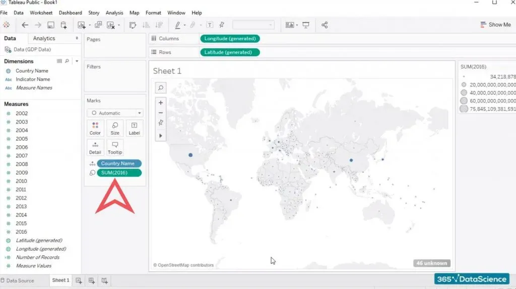
We can see that Tableau updates the chart, adding the 2016 GDP of each country... If we hover above each of the dots, we have a representing of the countries on our map. The US GDP for 2016 was more than 18 trillion dollars, while Canada’s GDP was around 1.5 trillion dollars.
Everything looks good. Our first chart in Tableau is almost ready.
One finishing touch to fully create a chart in Tableau
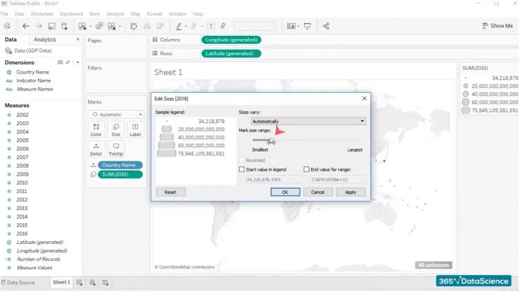
You can enlarge the bubbles indicating the size of a country’s GDP a bit. To do that, you can work with the newly appeared SUM(2016) pane on the right side of the screen. Just click on its tiny arrow and select “Edit Sizes”. The ‘edit sizes’ dialog box allows you to enlarge the bubbles you see in the visualization.
If you click “Apply”, you’ll see the bubbles in the visualization increased. This makes it a bit easier to compare the GDP of different countries.
The final touch will be to edit the name of this visualization. Double click on “Sheet 1” and simply type a title. Anything is better than “Sheet 1”. For example, you can simply type “GDP per country comparison”. And here we are.
That’s how you create a chart in Tableau
And that's just the beginning!
To sum up, Tableau’s goal is to help users present their data by offering a huge variety of data visualization tools to choose from. Now you know how to create your first Tableau chart just by dragging and dropping the relevant objects. Check out our Introduction to Tableau course to learn more.
In our next tutorial, we will learn how we can duplicate sheets in Tableau.
Stay tuned for more Tableau tutorials and insights of the Data Scientist’s life!


