If you want to become a better statistician, a data scientist, or a machine learning engineer, going over several linear regression examples is inevitable.
They will help you to wrap your head around the whole subject of regressions analysis.
So, to help you understand how linear regression works, in addition to this tutorial, we've also made a video on the topic. You can watch it below, or just scroll down if you prefer reading.
Regression analysis is one of the most widely used methods for prediction.
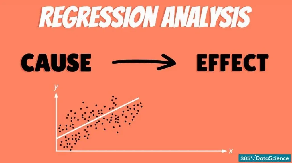
It is applied whenever we have a causal relationship between variables.
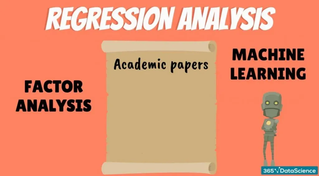
A large portion of the predictive modeling that occurs in practice is carried out through regression analysis. There are also many academic papers based on it. And it becomes extremely powerful when combined with techniques like factor analysis. Moreover, the fundamentals of regression analysis are used in machine learning.
Therefore, it is easy to see why regressions are a must for data science. The general point is the following.
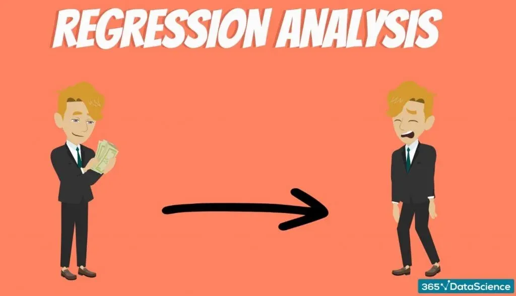
“The amount of money you spend depends on the amount of money you earn.”
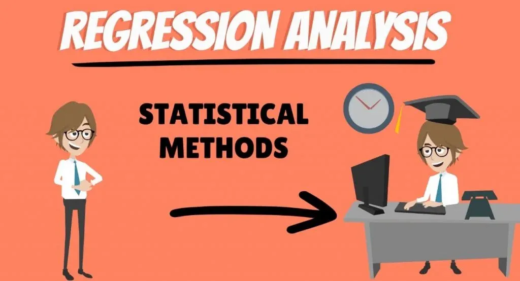
In the same way, the amount of time you spend reading our tutorials is affected by your motivation to learn additional statistical methods.
You can quantify these relationships and many others using regression analysis.
Regression Analysis
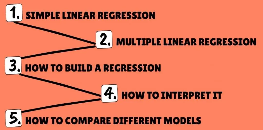
We will use our typical step-by-step approach. We’ll start with the simple linear regression model, and not long after, we’ll be dealing with the multiple regression model. Along the way, we will learn how to build a regression, how to interpret it and how to compare different models.
We will also develop a deep understanding of the fundamentals by going over some linear regression examples.
A quick side note: You can learn more about the geometrical representation of the simple linear regression model in the linked tutorial.
What is a Linear Regression
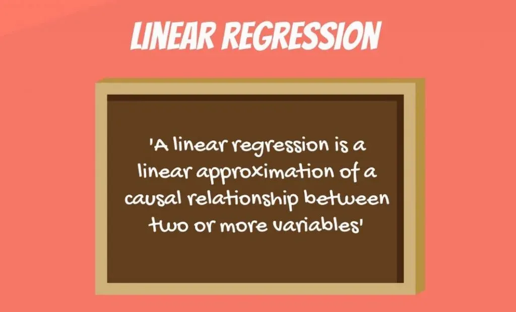
Let’s start with some dry theory. A linear regression is a linear approximation of a causal relationship between two or more variables.
Regression models are highly valuable, as they are one of the most common ways to make inferences and predictions.
The Process of Creating a Linear Regression
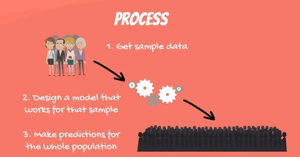
The process goes like this.
- First, you get sample data;
- Then, you can design a model that explains the data;
- Finally, you use the model you’ve developed to make a prediction for the whole population.
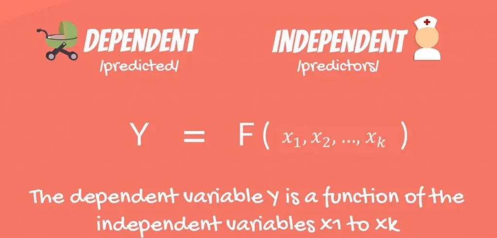
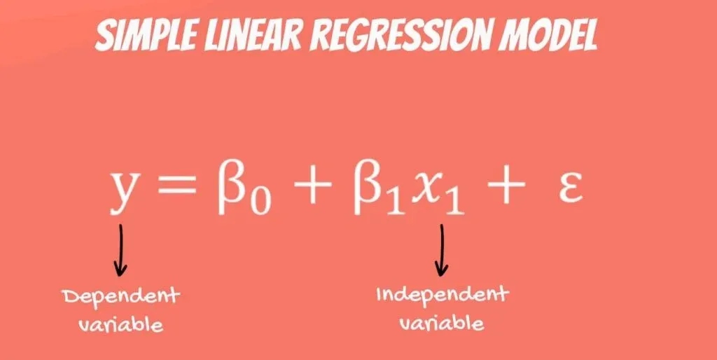
There is a dependent variable, labeled Y, being predicted, and independent variables, labeled x1, x2, and so forth. These are the predictors. Y is a function of the X variables, and the regression model is a linear approximation of this function.
The Simple Linear Regression
The easiest regression model is the simple linear regression:
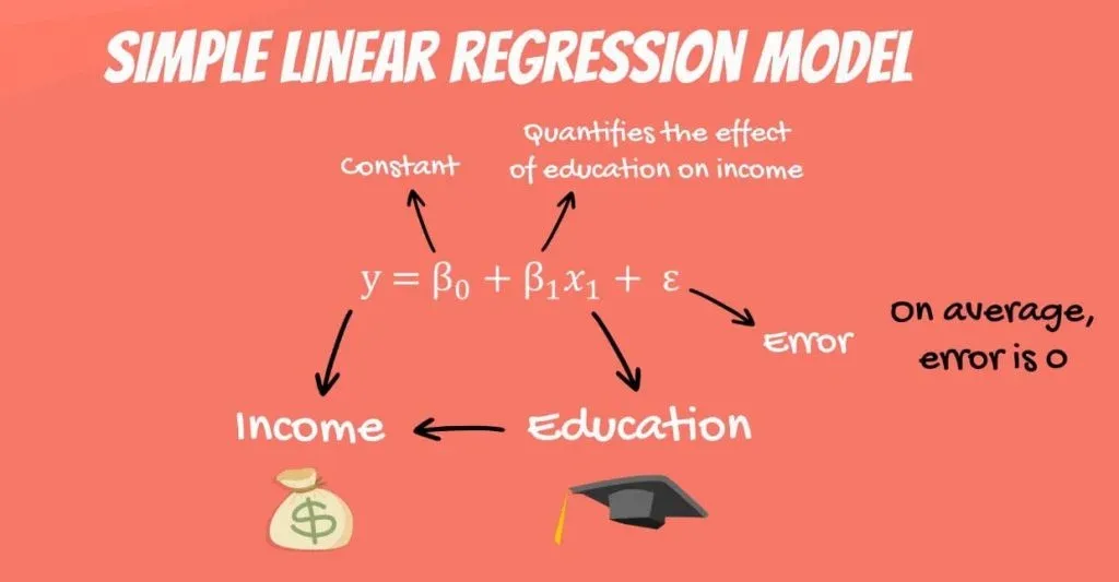
Y = β0 + β1 * x1 + ε.
Let’s see what these values mean. Y is the variable we are trying to predict and is called the dependent variable. X is an independent variable.
When using regression analysis, we want to predict the value of Y, provided we have the value of X.
But to have a regression, Y must depend on X in some way. Whenever there is a change in X, such change must translate to a change in Y.
Providing a Linear Regression Example
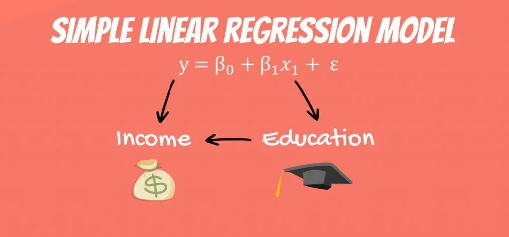
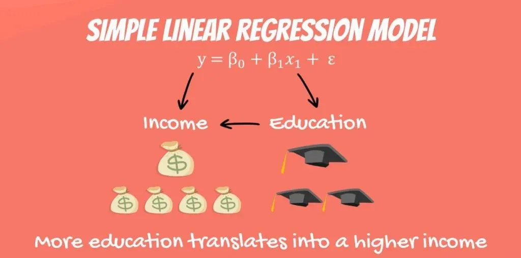
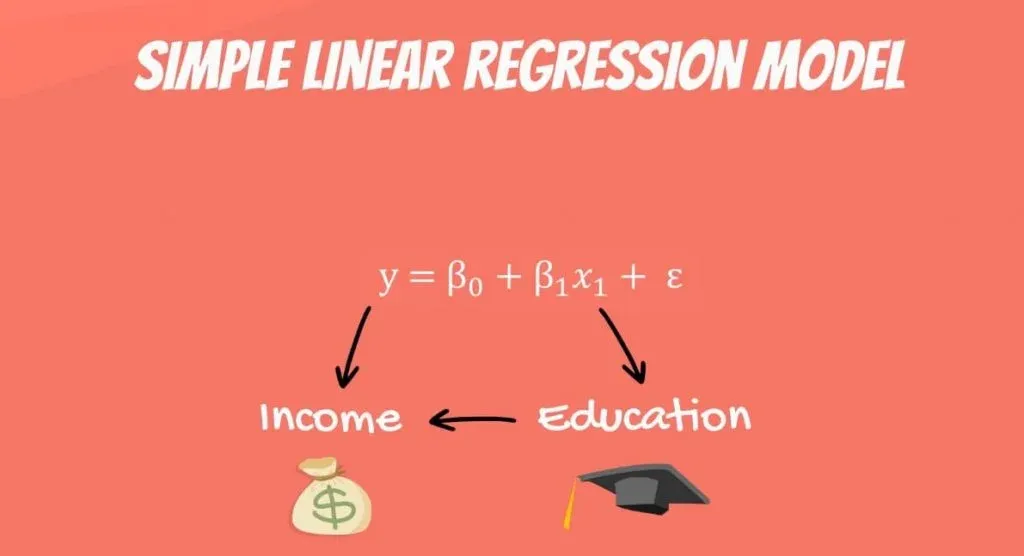
Think about the following equation: the income a person receives depends on the number of years of education that person has received. The dependent variable is income, while the independent variable is years of education.
There is a causal relationship between the two. The more education you get, the higher the income you are likely to receive. This relationship is so trivial that it is probably the reason you are reading this tutorial, right now. You want to get a higher income, so you are increasing your education.
Is the Reverse Relationship Possible?
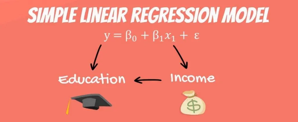
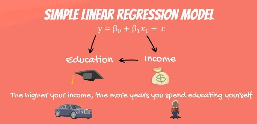
Now, let’s pause for a second and think about the reverse relationship. What if education depends on income.
This would mean the higher your income, the more years you spend educating yourself.
Putting high tuition fees aside, wealthier individuals don’t spend more years in school. Moreover, high school and college take the same number of years, no matter your tax bracket. Therefore, a causal relationship like this one is faulty, if not plain wrong. Hence, it is unfit for regression analysis.
Let’s go back to the original linear regression example. Income is a function of education. The more years you study, the higher the income you will receive. This sounds about right.
The Coefficients
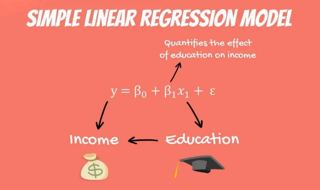
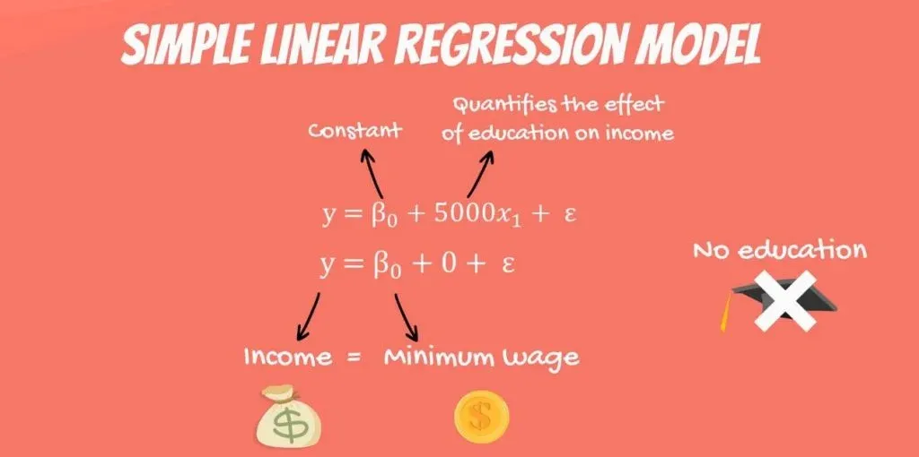
What we haven’t mentioned, so far, is that, in our model, there are coefficients. β1is the coefficient that stands before the independent variable. It quantifies the effect of education on income.
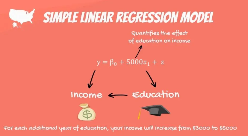
If β1 is 50, then for each additional year of education, your income would grow by $50. In the USA, the number is much bigger, somewhere around 3 to 5 thousand dollars.
The Constant
The other two components are the constant β0 and the error – epsilon(ε).
In this linear regression example, you can think of the constant β0 as the minimum wage. No matter your education, if you have a job, you will get the minimum wage. This is a guaranteed amount.
So, if you never went to school and plug an education value of 0 years in the formula, what could possibly happen? Logically, the regression will predict that your income will be the minimum wage.
Epsilon
The last term is the epsilon(ε). This represents the error of estimation. The error is the actual difference between the observed income and the income the regression predicted. On average, across all observations, the error is 0.
If you earn more than what the regression has predicted, then someone earns less than what the regression predicted. Everything evens out.
The Linear Regression Equation
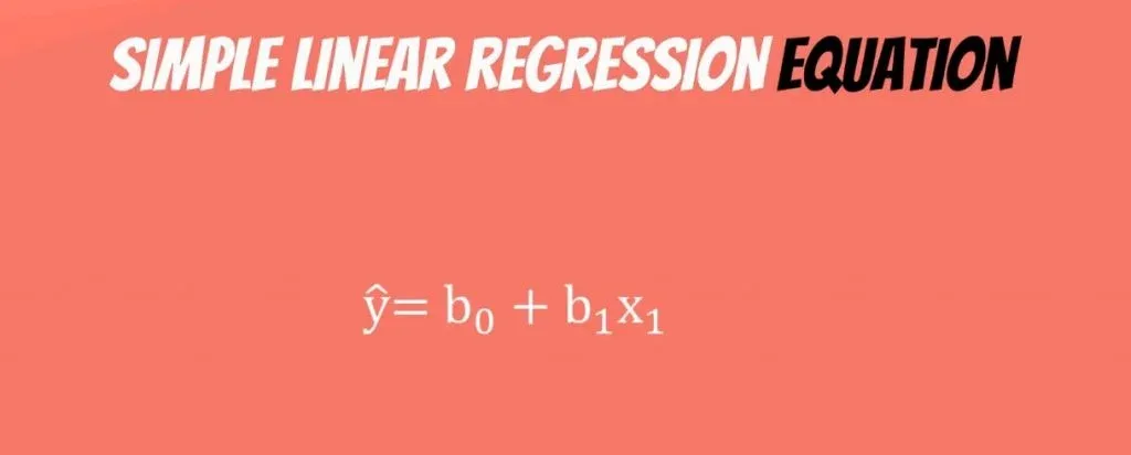
The original formula was written with Greek letters. This tells us that it was the population formula. But don’t forget that statistics (and data science) is all about sample data. In practice, we tend to use the linear regression equation.
It is simply ŷ = β0+ β1* x.
The ŷ here is referred to as y hat. Whenever we have a hat symbol, it is an estimated or predicted value.
B0 is the estimate of the regression constant β0. Whereas, b1 is the estimate of β1, and x is the sample data for the independent variable.
The Regression Line
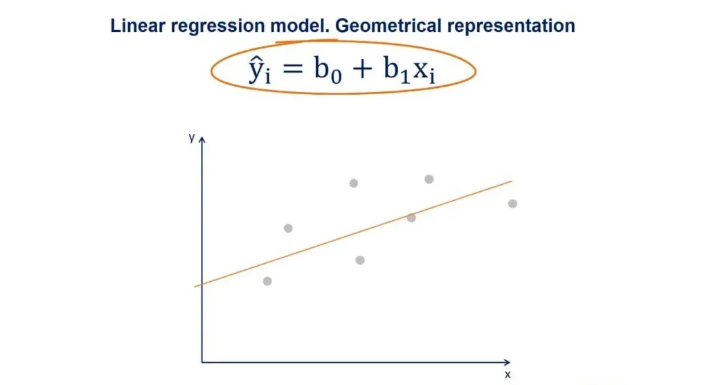
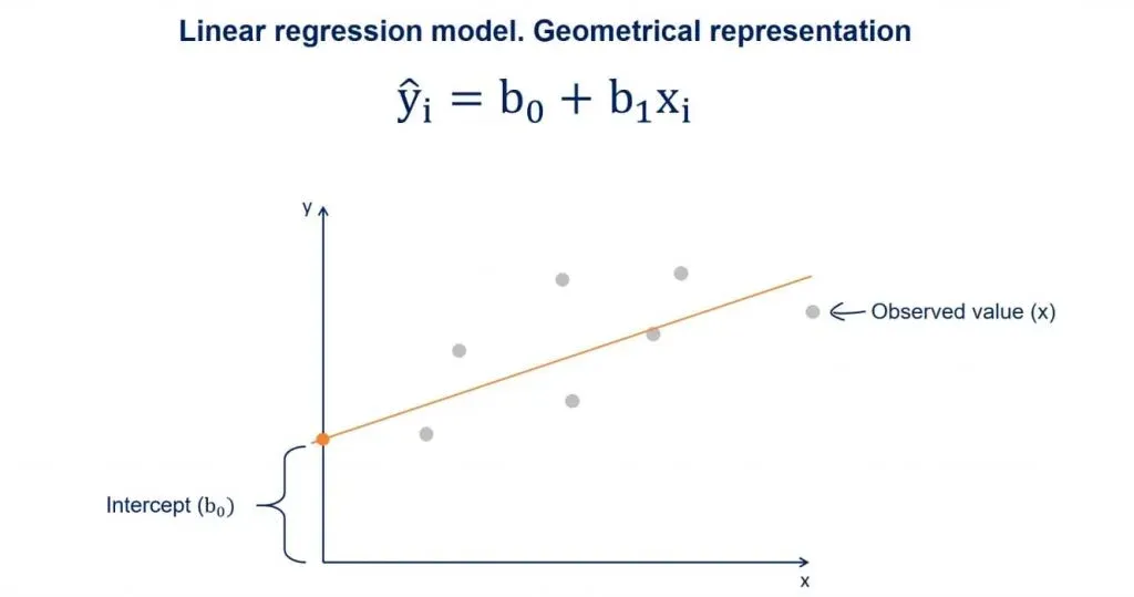
You may have heard about the regression line, too. When we plot the data points on an x-y plane, the regression line is the best-fitting line through the data points.
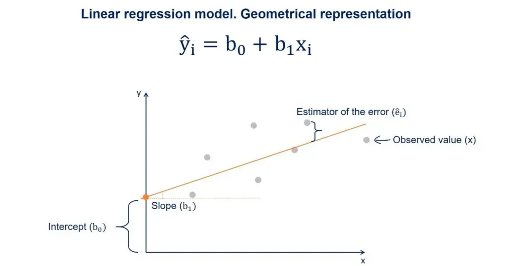
You can take a look at a plot with some data points in the picture above. We plot the line based on the regression equation.
The grey points that are scattered are the observed values. B0, as we said earlier, is a constant and is the intercept of the regression line with the y-axis.
B1 is the slope of the regression line. It shows how much y changes for each unit change of x. 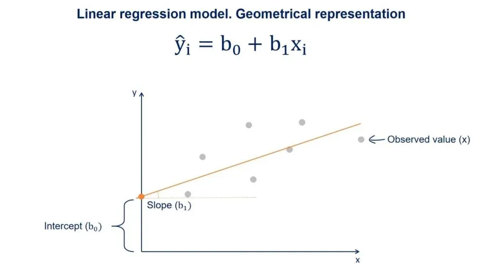
The Estimator of the Error
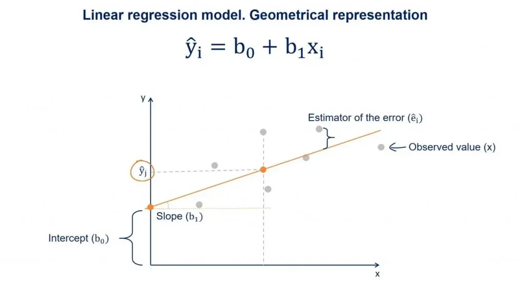
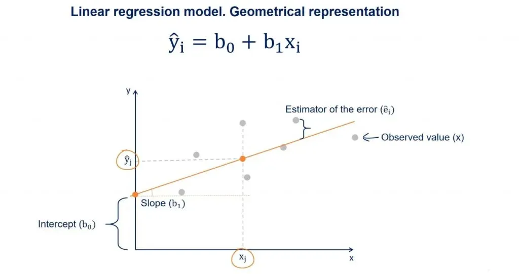
The distance between the observed values and the regression line is the estimator of the error term epsilon. Its point estimate is called residual.
Now, suppose we draw a perpendicular from an observed point to the regression line. The intercept between that perpendicular and the regression line will be a point with a y value equal to ŷ.
As we said earlier, given an x, ŷ is the value predicted by the regression line.
Linear Regression in Python Example
We believe it is high time that we actually got down to it and wrote some code! So, let’s get our hands dirty with our first linear regression example in Python. If this is your first time hearing about Python, don’t worry. We have plenty of tutorials that will give you the base you need to use it for data science and machine learning.
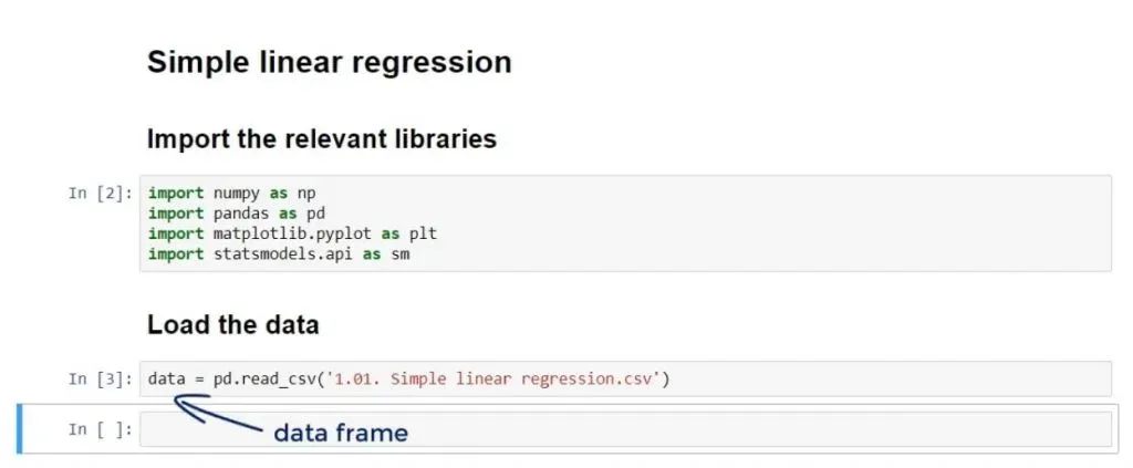
Now, how about we write some code? First off, we will need to use a few libraries.
Importing the Relevant Libraries
Let’s import the following libraries:
The first three are pretty conventional. We won’t even need numpy, but it’s always good to have it there – ready to lend a helping hand for some operations. In addition, the machine learning library we will employ for this linear regression example is: statsmodels. So, we can basically write the following code:
import numpy as np

import pandas as pd

import matplotlib.pyplot as plt

import statsmodels.api as sm
Loading the Data
The data which we will be using for our linear regression example is in a .csv file called: ‘1.01. Simple linear regression.csv’. You can download it from here. Make sure that you save it in the folder of the user.
Now, let’s load it in a new variable called: data using the pandas method: ‘read_csv’. We can write the following code:
data = pd.read_csv(‘1.01. Simple linear regression.csv’)After running it, the data from the .csv file will be loaded in the data variable. As we are using pandas, the data variable will be automatically converted into a data frame.
Visualizing the Data Frame
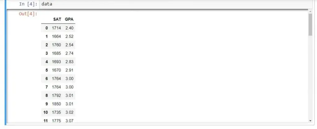
Let’s see if that’s true. We can write data and run the line. As you can see below, we have indeed displayed the data frame.
There are two columns - SAT and GPA. And that’s what our linear regression example will be all about. Let’s further check
data.describe()This is a pandas method which will give us the most useful descriptive statistics for each column in the data frame – number of observations, mean, standard deviation, and so on.
In this linear regression example we won’t put that to work just yet. However, it’s good practice to use it.
The Problem
Let’s explore the problem with our linear regression example.
So, we have a sample of 84 students, who have studied in college.
Their total SAT scores include critical reading, mathematics, and writing. Whereas, the GPA is their Grade Point Average they had at graduation.
That’s a very famous relationship. We will create a linear regression which predicts the GPA of a student based on their SAT score.
When you think about it, it totally makes sense.
- You sit the SAT and get a score.
- With this score, you apply to college.
- The next 4 years, you attend college and graduate receiving many grades, forming your GPA.
You can see the timeline below.
Meaningful Regressions
Before we finish this introduction, we want to get this out of the way. Each time we create a regression, it should be meaningful. Why would we predict GPA with SAT? Well, the SAT is considered one of the best estimators of intellectual capacity and capability.
On average, if you did well on your SAT, you will do well in college and at the workplace. Furthermore, almost all colleges across the USA are using the SAT as a proxy for admission.
And last but not least, the SAT stood the test of time and established itself as the leading exam for college admission.
It is safe to say our regression makes sense.
Creating our First Regression in Python
After we’ve cleared things up, we can start creating our first regression in Python. We will go through the code and in subsequent tutorials, we will clarify each point.
Important: Remember, the equation is:
Our dependent variable is GPA, so let’s create a variable called y which will contain GPA.
Just a reminder - the pandas’ syntax is quite simple.
This is all we need to code:
y = data[‘GPA’]

x1 = data[‘SAT’]- First, we write the name of the data frame, in this case data
- Then, we add in square brackets the relevant column name, which is GPA in our case.
Similarly, our independent variable is SAT, and we can load it in a variable x1.
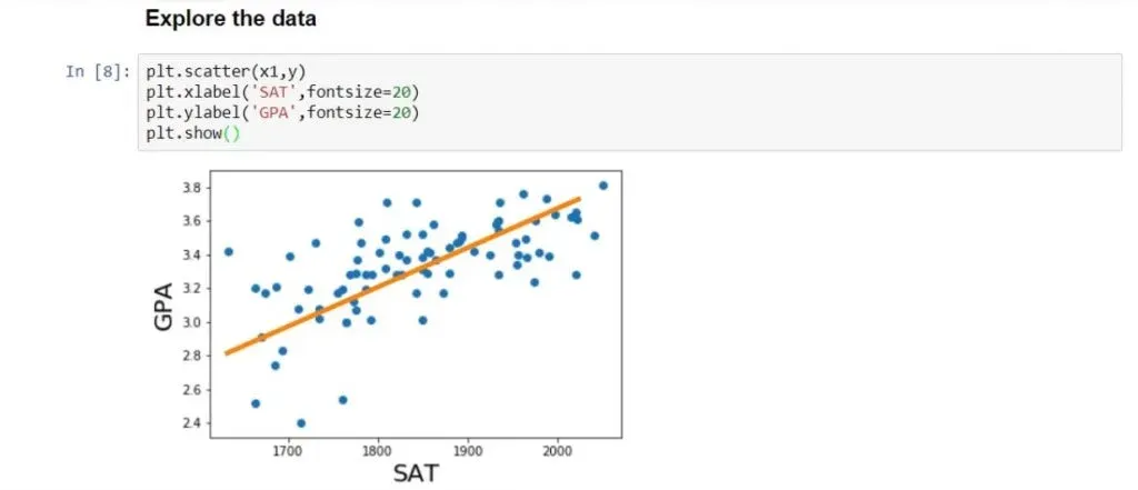
Exploring the Data
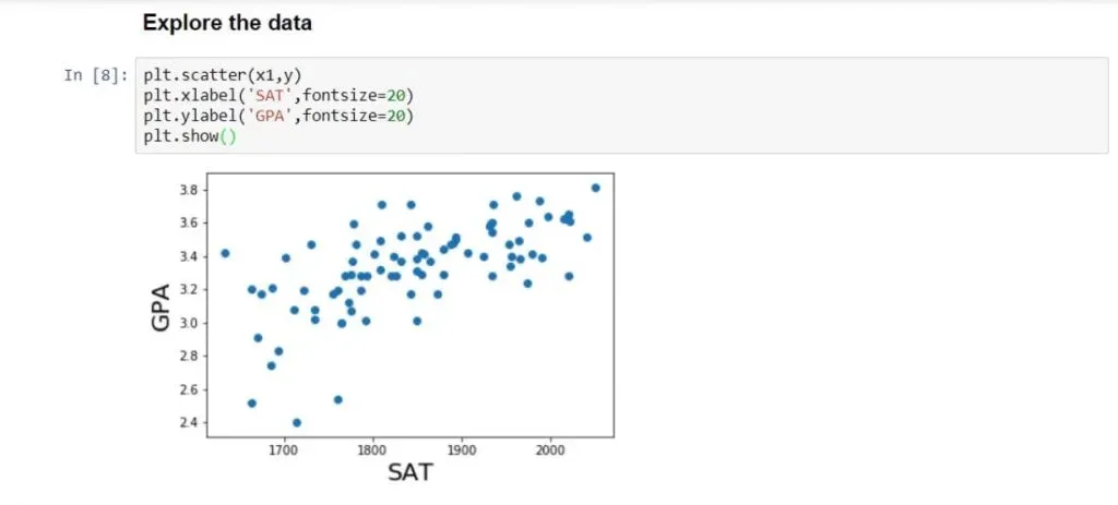
It’s always useful to plot our data in order to understand it better and see if there is a relationship to be found.
We will use some conventional matplotlib code.
plt.scatter(x1,y)

plt.xlabel(‘SAT’, fontsize = 20)

plt.ylabel(‘GPA’, fontsize = 20)

plt.show()
You can see the result we receive after running it, in the picture below.
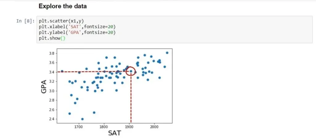
Each point on the graph represents a different student. For instance, the highlighted point below is a student who scored around 1900 on the SAT and graduated with a 3.4 GPA.
Observing all data points, we can see that there is a strong relationship between SAT and GPA. In general, the higher the SAT of a student, the higher their GPA.
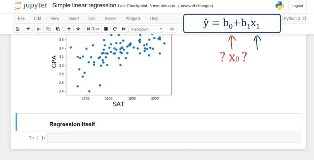
Adding a Constant
Next, we need to create a new variable, which we’ll call x.
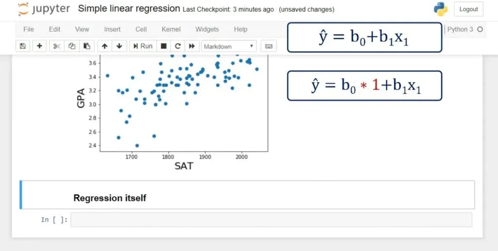
We have our x1, but we don’t have an x0. In fact, in the regression equation there is no explicit x0. The coefficient b0 is alone.
That can be represented as: b0 * 1. So, if there was an x0, it would always be 1.
It is really practical for computational purposes to incorporate this notion into the equation. And that’s how we estimate the intercept b0. In terms of code, statsmodels uses the method: .add_constant().
So, let’s declare a new variable:
x = sm.add_constant(x1)The Results Variable
Right after we do that, we will create another variable named results. It will contain the output of the ordinary least squares regression, or OLS. As arguments, we must add the dependent variable y and the newly defined x. At the end, we will need the .fit() method. It is a method that applies a specific estimation technique to obtain the fit of the model. 
That itself is enough to perform the regression.
Displaying the Regression Results
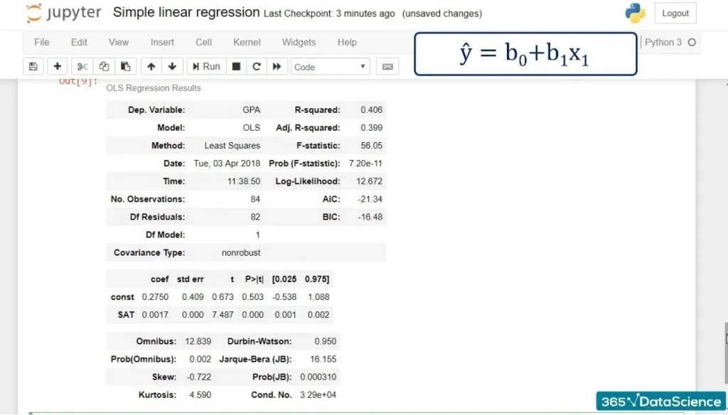
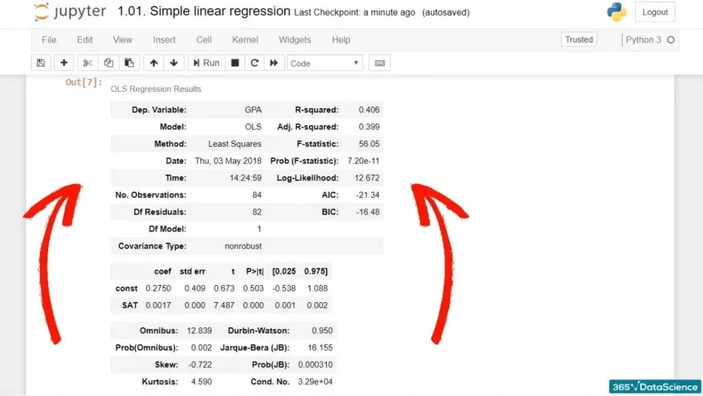
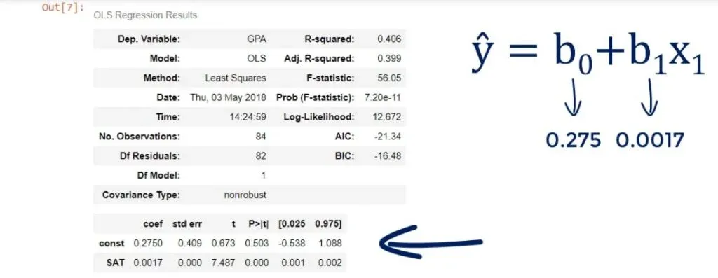
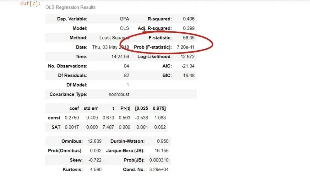
In any case, results.summary() will display the regression results and organize them into three tables.
So, this is all the code we need to run:
x = sm.add_constant(x1)

results = sm.OLS(y,x).fit()

results.summary()
And this is what we get after running it:
As you can see, we have a lot of statistics in front of us! And we will examine it in more detail in subsequent tutorials.
Plotting the Regression line
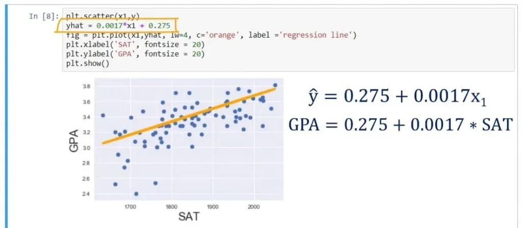
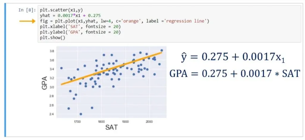
Let’s plot the regression line on the same scatter plot. We can achieve that by writing the following:
plt.scatter(x1,y)

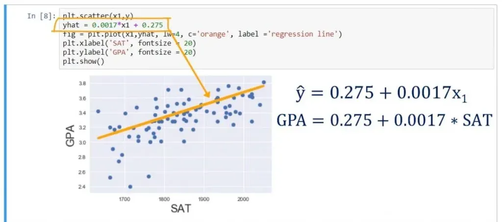
yhat = 0.0017*x1 + 0.275

fig = plt.plot(x1,yhat, lw=4, c=’orange’, label = ‘regression line’)

plt.xlabel(‘SAT’, fontsize = 20)

plt.ylabel(‘GPA’, fontsize = 20)

plt.show()
As you can see below, that is the best fitting line, or in other words – the line which is closest to all observations simultaneously. 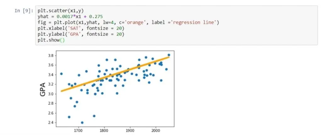
So that’s how you create a simple linear regression in Python!
How to Interpret the Regression Table
Now, let’s figure out how to interpret the regression table we saw earlier in our linear regression example.
While the graphs we have seen so far are nice and easy to understand. When you perform regression analysis, you’ll find something different than a scatter plot with a regression line. The graph is a visual representation, and what we really want is the equation of the model, and a measure of its significance and explanatory power. This is why the regression summary consists of a few tables, instead of a graph.
Let’s find out how to read and understand these tables.
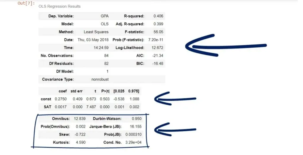
The 3 Main Tables
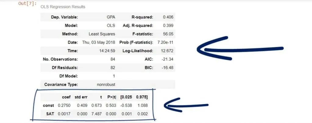
Typically, when using statsmodels, we’ll have three main tables – a model summary
a coefficients table
and some additional tests.
Certainly, these tables contain a lot of information, but we will focus on the most important parts.
We will start with the coefficients table.
The Coefficients Table
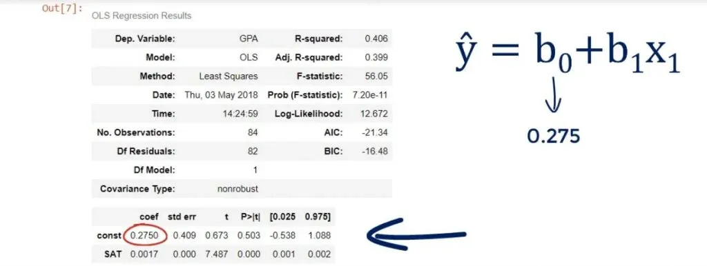
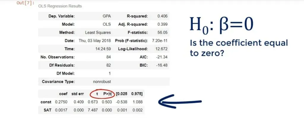
We can see the coefficient of the intercept, or the constant as they’ve named it in our case.
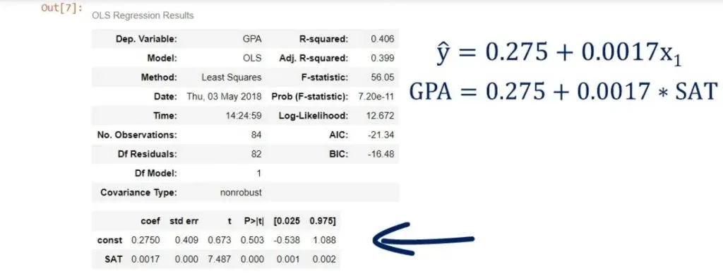
Both terms are used interchangeably. In any case, it is 0.275, which means b0 is 0.275.
Looking below it, we notice the other coefficient is 0.0017. This is our b1. These are the only two numbers we need to define the regression equation.
Therefore,
ŷ= 0.275 + 0.0017 * x1.
Or GPA equals 0.275 plus 0.0017 times SAT score.
So, this is how we obtain the regression equation.
A Quick Recap
Let’s take a step back and look at the code where we plotted the regression line. We have plotted the scatter plot of SAT and GPA. That’s clear. After that, we created a variable called: y hat(ŷ). Moreover, we imported the seaborn library as a ‘skin’ for matplotlib. We did that in order to display the regression in a prettier way.
That’s the regression line - the predicted variables based on the data.
Finally, we plot that line using the plot method.
Naturally, we picked the coefficients from the coefficients table – we didn’t make them up.
The Predictive Power of Linear Regressions
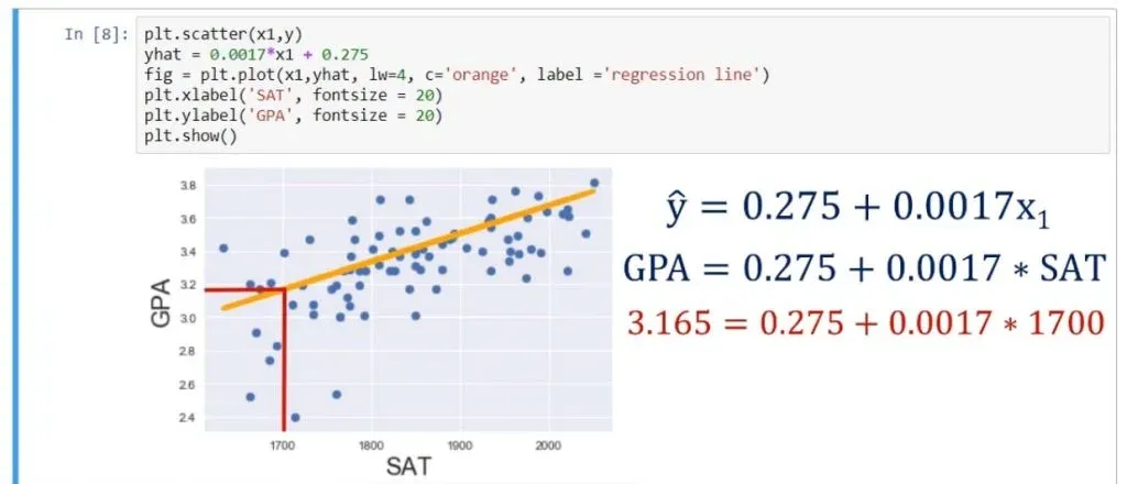
You might be wondering if that prediction is useful. Well, knowing that a person has scored 1700 on the SAT, we can substitute in the equation and obtain the following:
0.275 + 0.0017 * 1700, which equals 3.165. So, the expected GPA for this student, according to our model is 3.165.
And that’s the predictive power of linear regressions in a nutshell!
The Standard Errors
What about the other cells in the table?
The standard errors show the accuracy of prediction for each variable.
The lower the standard error, the better the estimate!
The T-Statistic
The next two values are a T-statistic and its P-value.
If you have gone over our other tutorials, you may know that there is a hypothesis involved here. The null hypothesis of this test is: β = 0. In other words, is the coefficient equal to zero?
The Null Hypothesis
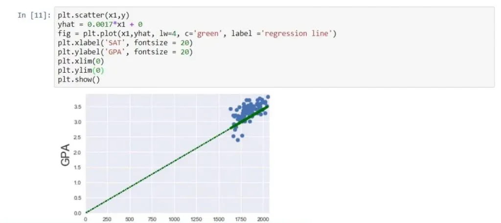
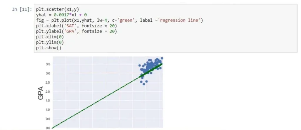
If a coefficient is zero for the intercept(b0), then the line crosses the y-axis at the origin. You can get a better understanding of what we are talking about, from the picture below.
If β1is zero, then 0 * x will always be 0 for any x, so this variable will not be considered for the model. Graphically, that would mean that the regression line is horizontal – always going through the intercept value.
The P-Value
Let’s paraphrase this test. Essentially, it asks, is this a useful variable? Does it help us explain the variability we have in this case? The answer is contained in the P-value column.
As you may know, a P-value below 0.05 means that the variable is significant. Therefore, the coefficient is most probably different from 0. Moreover, we are longing to see those three zeroes.
What does this mean for our linear regression example?
Well, it simply tells us that SAT score is a significant variable when predicting college GPA.
What you may notice is that the intercept p-value is not zero.
Let’s think about this. Does it matter that much? This test is asking the question: Graphically, that would mean that the regression line passes through the origin of the graph.
Usually, this is not essential, as it is causal relationship of the Xs we are interested in.
The F-statistic
The last measure we will discuss is the F-statistic. We will explain its essence and see how it can be useful to us.
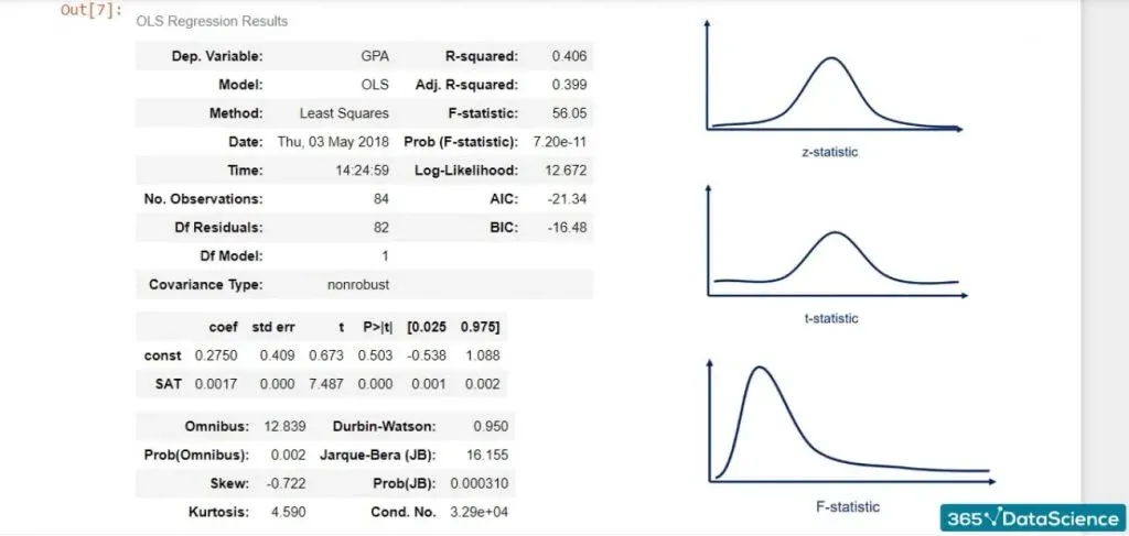
Much like the Z-statistic which follows a normal distribution and the T-statistic that follows a Student’s T distribution, the F-statistic follows an F distribution.
We are calling it a statistic, which means that it is used for tests. The test is known as the test for overall significance of the model.
The Null Hypothesis and the Alternative Hypothesis
The null hypothesis is: all the βs are equal to zero simultaneously.
The alternative hypothesis is: at least one β differs from zero.
This is the interpretation: if all βs are zero, then none of the independent variables matter. Therefore, our model has no merit.
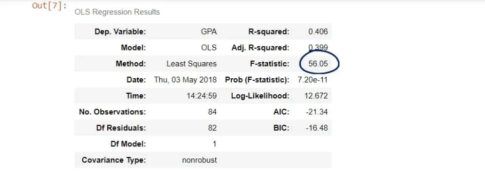
In our case, the F-statistic is 56.05.
The cell below is its P-value.
As you can see, the number is really low – it is virtually 0.000. We say the overall model is significant.
Important: Notice how the P-value is a universal measure for all tests. There is an F-table used for the F-statistic, but we don’t need it, because the P-value notion is so powerful.
The F-test is important for regressions, as it gives us some important insights. Remember, the lower the F-statistic, the closer to a non-significant model.
Moreover, don’t forget to look for the three zeroes after the dot!
Create Your Own Linear Regressions
Well, that was a long journey, wasn’t it? We embarked on it by first learning about what a linear regression is. Then, we went over the process of creating one. We also went over a linear regression example. Afterwards, we talked about the simple linear regression where we introduced the linear regression equation. By then, we were done with the theory and got our hands on the keyboard and explored another linear regression example in Python! We imported the relevant libraries and loaded the data. We cleared up when exactly we need to create regressions and started creating our own. The process consisted of several steps which, now, you should be able to perform with ease. Afterwards, we began interpreting the regression table. We mainly discussed the coefficients table. Lastly, we explained why the F-statistic is so important for regressions.
Next Step: Correlation
You thought that was all you need to know about regressions? Well, seeing a few linear regression examples is not enough. There are many more skills you need to acquire in order to truly understand how to work with linear regressions. The first thing which you can clear up is the misconception that regression and correlation are referring to the same concept.
***
Interested in learning more? You can take your skills from good to great with our Introduction to Python course! Try Introduction to Python course for free
Next Tutorial: The Differences between Correlation and Regression

