Humans have biologically evolved to be visual creatures. In fact, our sight is implicated in some of the most important activities we rely on to make sense of the world around us, such as reading, measuring distance, or interpreting information on screen. And yet, no matter how advanced our eyes are, people can rarely make sense of raw data just by looking at it. Think of large spreadsheets or Python notebooks that house overwhelming amounts of information. How do you even begin extracting valuable insights? Thankfully, there are powerful data visualization tools, like Tableau, that you can quickly get the hang of.
In this article, we’ll discuss the importance of visual analytics for decision-making, and why Tableau is the leading data viz platform. Before going on to explore some of the chart types you can create using the software.
Table of Contents
- Why Is Data Visualization Important?
- Why Tableau for Data Visualization?
- What Are the Types of Charts for Data Visualization in Tableau?
- Data Visualization in Tableau: Next Steps
Why Is Data Visualization Important?
Needless to say, data is a leading force in today’s economy. And being able to gather and preprocess it allows us to implement predictive modeling, machine learning, and other amazing data science tools to drive business growth. However, there is nothing more important than being able to interpret that data – especially for someone outside of the data science realm.
If you’re working at a company as part of its data team, it is highly likely that your audience would not be super technical. On the contrary, they will most likely be people whose job is to make strategic decisions based on your insights. More often than not, they won’t go out of their way to explore the underlying data unless you explain it to them in an easy-to-digest way. Remember, our brains take in and process visual information the fastest.
Data visualization helps people understand the numbers. As the person in charge of these visuals, you are the one to whom management turns when creating a focused business strategy.
In a way, we can say that data visualization is the “face of data science”. There may be hundreds of human hours behind gathering, preprocessing and analyzing the data, however, the key decision-makers in a business are likely to only trust the information they can visually make sense of.
So, polishs your skills with The Complete Data Visualization Course with Python, R, Tableau, and Excel course by 365.
Why Tableau for Data Visualization?
There are many tools you can choose from, like Excel, and Power BI (or even Python’s data visualization packages), to create charts and dashboards for your data. But Tableau stands out from the crowd as the preferred software that data analysts and BI analysts use in their day-to-day workflow.
So, why choose Tableau for data visualization? Here are just some of the reasons:
- Tableau Public is open-source and perfect for beginners in data visualization
- It has a user-friendly interface that is easy to navigate
- You can quickly integrate it with other software or programming languages like Python and SQL for more advanced analyses
There are many other benefits, including the fact that it is an extremely intuitive platform able to recognize data types and make suggestions based on the inputs. For example, it can offer appropriate chart types automatically. You then have the option to customize these further, and thus minimize workload while maximizing efficiency.
What Are the Types of Charts for Data Visualization in Tableau?
No data is the same, meaning each project will have its own unique requirements. To get the most out of your work, you need to understand what type of visualization will work best for every individual dataset. In this section, we’ll outline some of the more common chart types you’ll use when visualizing data in Tableau.
Bar Chart
Bar charts are one of the most popular ways to visualize your data, not just in Tableau. You’ll be pressed not to find one during business meetings, science seminars, or even news broadcasts. The reason is that bar charts are among the clearest and most straightforward visual representations of information. As such, they are also easily interpreted by an audience, regardless of their technical qualifications or background.
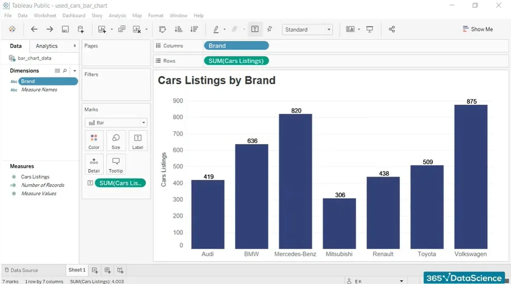
It is highly likely that you will use this particular form of visualization regularly on the job. Therefore, mastering the bar chart is one of the most fundamental skills you can gain. Luckily, Tableau is quite intuitive (as we previously said) and it will guide you through the process.
Pie Chart
Pie charts are another popular visualization type that represents your variables as parts of a circle. Keep in mind, though, that they are best suited for displaying data that sums up to 100%.
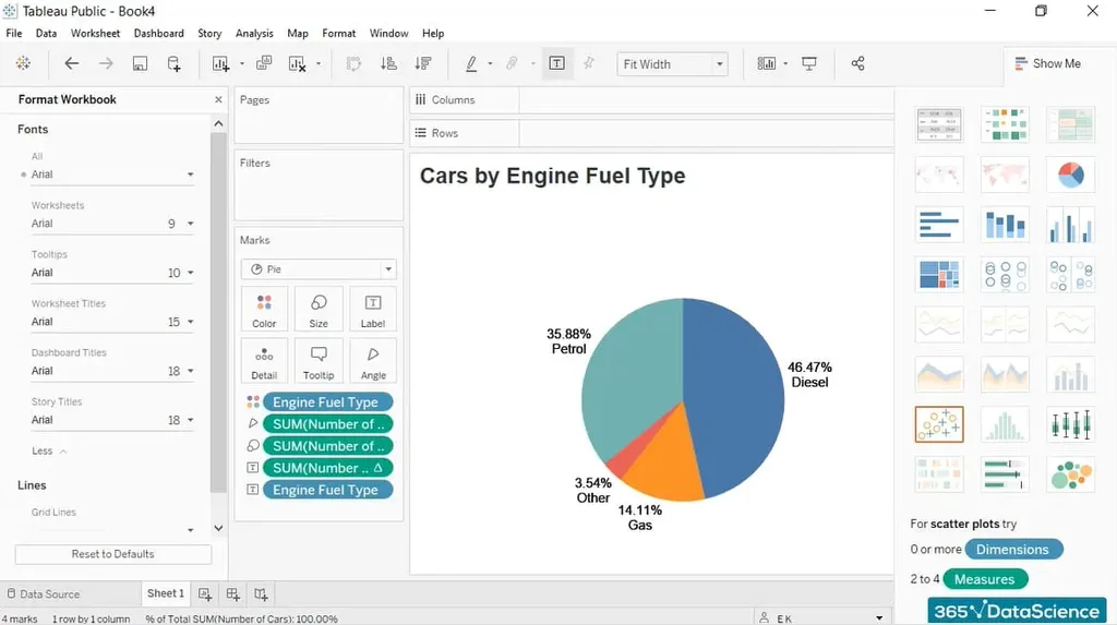
While they’re very common, we don’t recommend using pie charts. The reason for this is the human eye is just not great at determining the size of non-rectangular-shaped objects – it is often very difficult for the audience to visually compare the different slices and order them from largest to smallest. If you can, simply use a bar chart instead.
Now, although pie charts are usually not the best way to visualize data, being able to create one is a must if you’re working as a data analyst, Tableau developer, or in another data-visualization-related profession.
Line Chart
A line chart is exactly what it says on the tin – lines running across the graph that represent the data at hand. More precisely, they show the evolution of one or several quantities and their behavior over time. If your task is to follow a value’s timeline or identify trends in a dataset, then this is the chart for you.
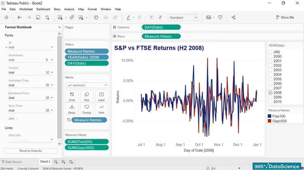
In data science terms, we can safely say that a line chart is most often used to represent time series data. A great example is the visualization of financial information – you’d be able to trace how stock market returns changed over a specific timeframe.
Histogram
First and foremost, you shouldn’t confuse this with a bar chart – the 2 types serve different purposes. In essence, a histogram shows the distribution of a numeric variable. The range of values is split into intervals, represented by different bars, more commonly known as bins.
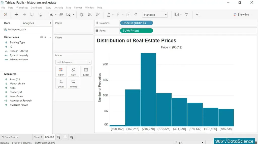
Meanwhile, the height of these bins shows the number of observations within an interval. Depending on the data, the histogram might skew to the left, the right, or peak at the center.
It may sound complicated, but this is one of the most fundamental and useful tools for understanding numerical data.
Scatter Plot
A scatter plot shows the relationship between 2 numerical features. The observations are displayed as points on the graph where the “X coordinate” is one of the variables, while the “Y coordinate” is the other.
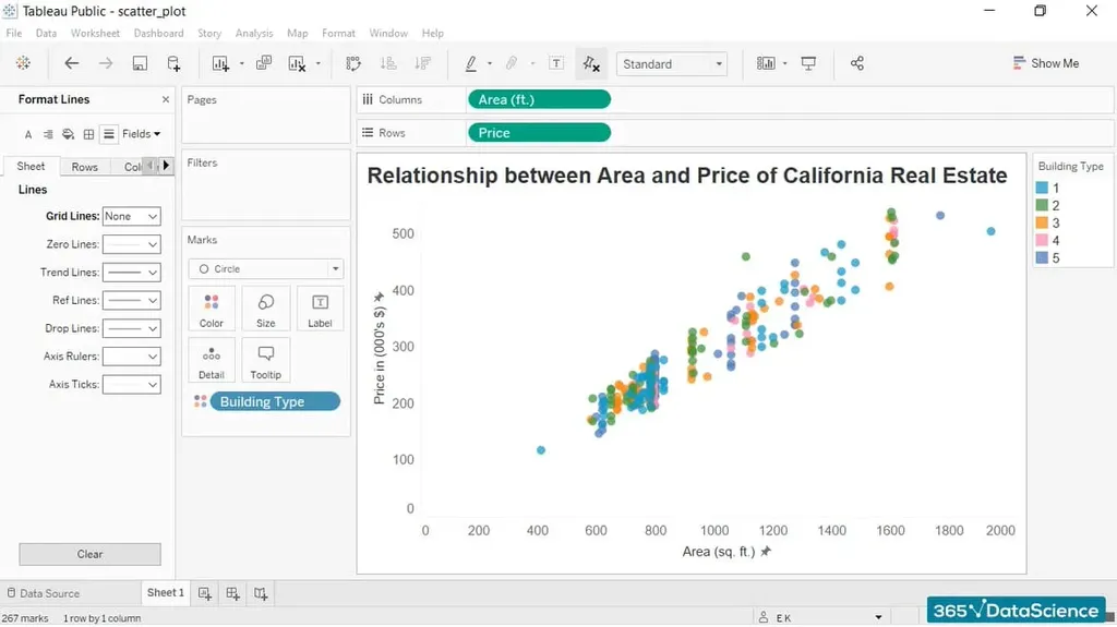
This chart is extremely useful and has one big advantage: scatter plots, unlike other visualizations, are able to display a large number of points. Whereas some graphs are limited to clearly showing just a few elements, in a scatter you can easily display a few hundred. Most notably, each observation is a distinct data point on that scatter.
Q&A
Data Visualization in Tableau: Next Steps
Visual analytics add value and help businesses convert insights into revenue. You will become an indispensable part of any data team by showing you know how to extract meaning out of a company’s reserves. Thus, Tableau is an extremely useful skill for someone looking to create compelling visualizations that help others “see” the connections within their data.
To become a visual analytics expert, first you’ll need technical know-how to make the most of the information at hand. Our 365 Data Science Program offers self-paced courses led by renowned industry experts on data visualization fundamentals. Starting from an introduction to Tableau all the way to advanced topics like integrating the software with SQL and Python for data science and machine learning specialization, you will learn by doing with a myriad of practical exercises and real-world business cases. If you want to see how the training works, start with a selection of free lessons by signing up below.


