If you want to become a business intelligence analyst, a great way to start is to solve a business task in SQL. As the saying goes:
“Knowledge that is not put into practice is like food that is not digested.”
So, it’s time to get our hands dirty and start writing some code! Moreover, we will learn how to visualize the solution of the task in Tableau. We will be working with the ‘employees_mod’ database.
(You can obtain more in-depth knowledge and practical skills with the help of our SQL + Tableau course.)
The Task
Now, let’s see what business task in SQL we are going to be dealing with:
Compare the number of male managers to the number of female managers from different departments for each year, starting from 1990.
The First Step to Solve a Business Task in SQL
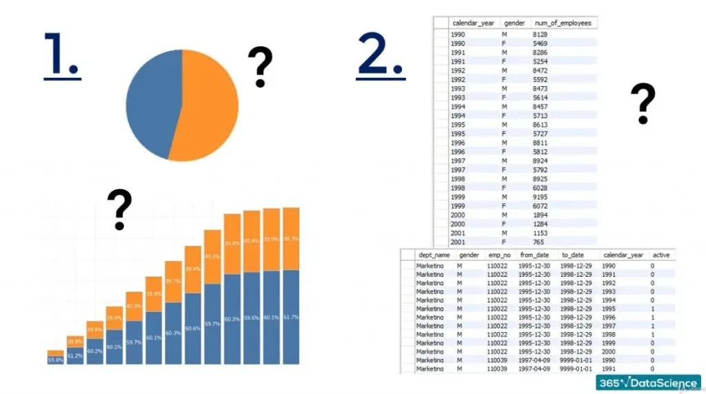
First, you should imagine a type of visualization that could respond to the problem clearly, and then you should figure out a way to retrieve a set from the ‘employees_mod’ database containing the data that will let you obtain the desired graph.
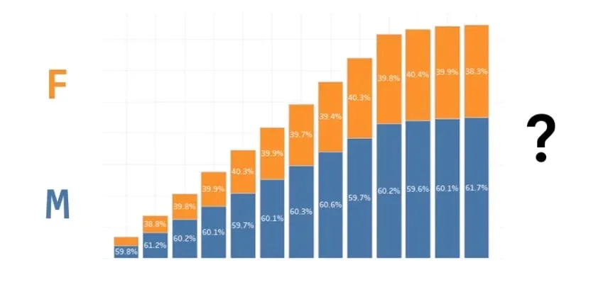
Following this logic, perhaps you are thinking that the solution would be a bar chart where each bar is split into two rows. One representing the male employees, and the other one - the female employees.
The Right Approach
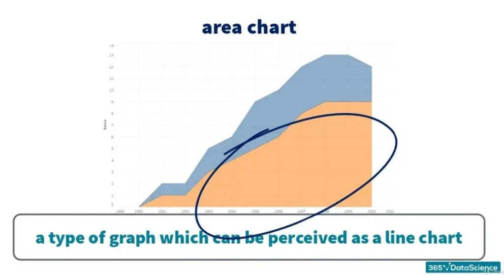
However, we will ask you to accept the following challenge: Respond to the given problem with an area chart. 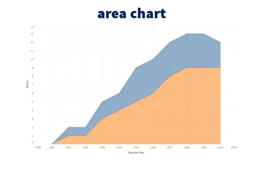
An area chart is a type of graph which can be perceived as a line chart where the area between the lines 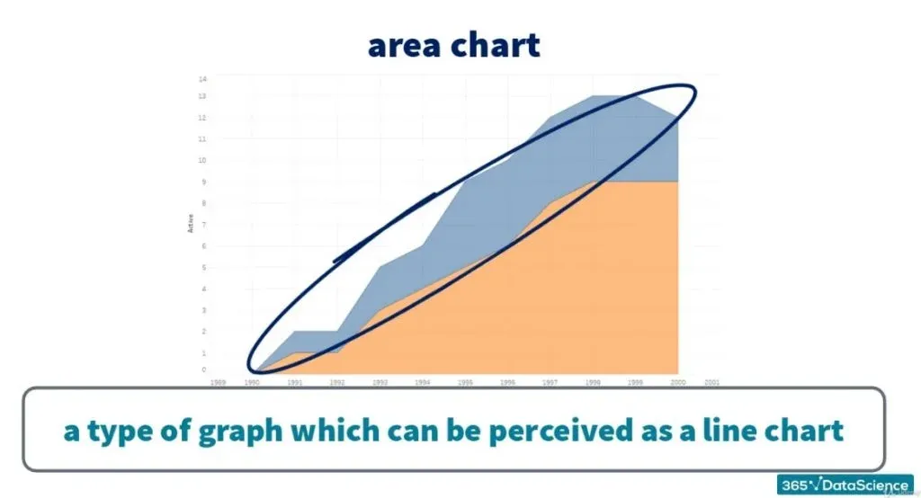
and between the lowest line and the horizontal axis has been filled with colours.
Thus, the result allows you to visually compare the proportional relationship between the quantities examined.
The Information We Need to Extract
Apparently, we will need a column for department name and gender, as we will want to compare our results in these fields. Then, to count the managers who have worked in a certain department, we will use their employee numbers.
Here comes the challenging part.
How can we show that a manager has worked in a particular department in year X, and has not worked there in year Y?
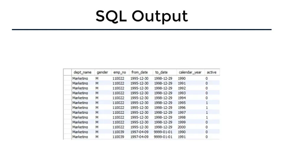
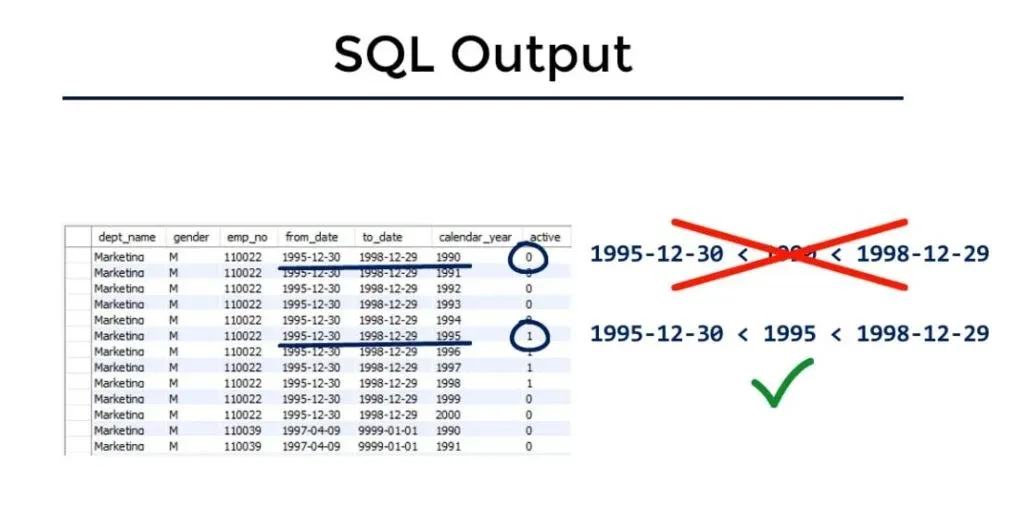
By creating the “active” column which will display 1 or 0 if a person has or has not worked for the company in a certain calendar year!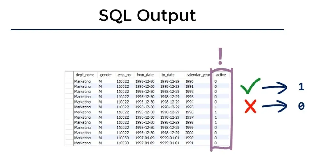
The Rest of the Fields
So, the remaining three fields we need in the SQL output would be the “from_date“ and “to_date“ from the ‘t_dept_manager’ table for each employee, and a calendar year.
In this way, if a calendar year falls within the boundaries of the “from_date“ and “to_date“ , in the ‘active’ field we will see 1. Otherwise, 0 will be displayed.
A Few Hints for Solving Our Business Task in SQL
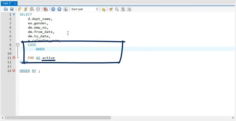
While creating the ‘active’ column, you’ll need a CASE – WHEN statement to designate the circumstances under which ‘active’ must indicate 1. And then the ones under which it must indicate 0. If you have no idea what is a CASE-WHEN statement, don’t worry. You can find out all you need to know about it in the linked tutorial.
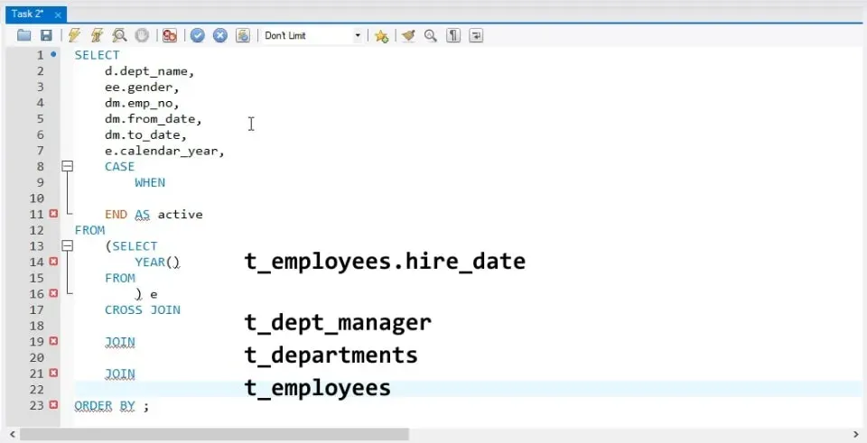
Later, when joining the tables, you can use the following information:
A column containing the hire date of the “t_employees” table must cross-join “t_dept_manager”. Then, it must join “t_departments” and “t_employees”.
Important: Remember that a cross join ensures that you can combine each row from a table with each row from the other table.
Finally, order by employee number and calendar year to finish writing the query.
The Solution
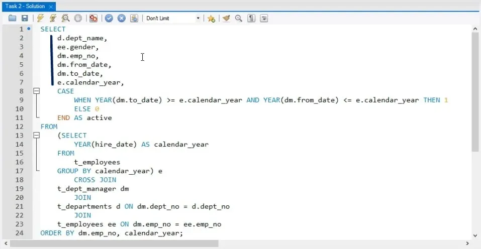
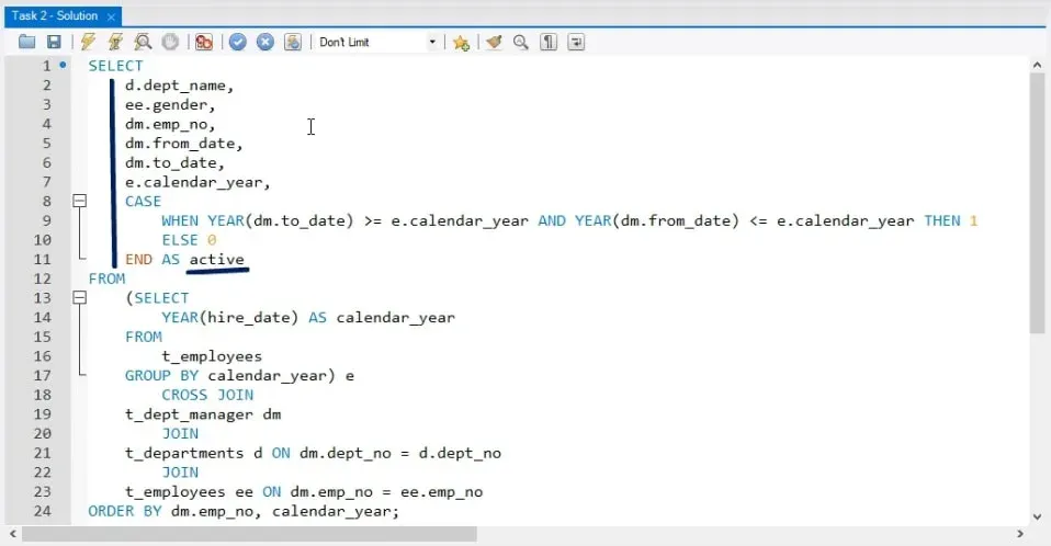
Here’s the query that will give us the desired SQL output:
SELECT
    d.dept_name,
    ee.gender,
    dm.emp_no,
    dm.from_date,
    dm.to_date,
    e.calendar_year,
    CASE
        WHEN YEAR(dm.to_date) >= e.calendar_year AND YEAR(dm.from_date) <= e.calendar_year THEN 1
        ELSE 0
    END AS active
FROM
    (SELECT
        YEAR(hire_date) AS calendar_year
    FROM
        t_employees
    GROUP BY calendar_year) e
        CROSS JOIN
    t_dept_manager dm
        JOIN
    t_departments d ON dm.dept_no = d.dept_no
		JOIN
	t_employees ee ON dm.emp_no = ee.emp_no
ORDER BY dm.emp_no, calendar_year;

SELECT
    *
FROM
    (SELECT
        YEAR(hire_date) AS calendar_year
    FROM
        t_employees
    GROUP BY calendar_year) e
        CROSS JOIN
    t_dept_manager dm
        JOIN
    t_departments d ON dm.dept_no = d.dept_no
        JOIN
    t_employees ee ON dm.emp_no = ee.emp_no
ORDER BY dm.emp_no , calendar_year;
Let’s analyse it step by step.
Analysis
Naturally, we must start by stating the fields that we want to see in the table output – ‘dept_name’, ‘gender’, ‘emp_no’, ‘from_date’, ‘to_date’, and ‘calendar_year’.
All these columns need to be preceded by the aliases of the tables they will be extracted from. 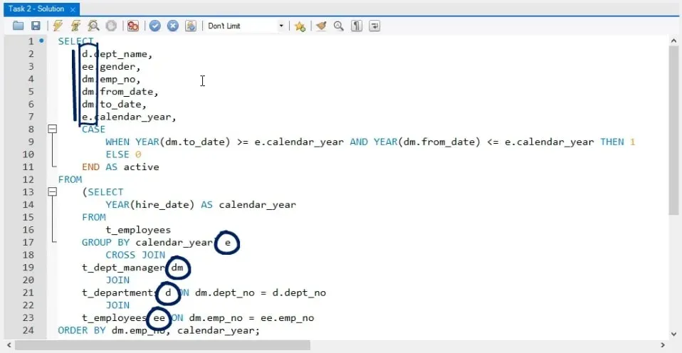
And the last required field is the ‘active’ field.
To create it, let’s take advantage of one of the hints we mentioned before.
The CASE WHEN Statement
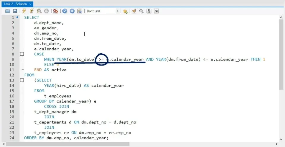
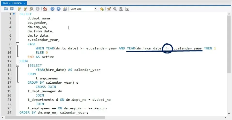
We will use CASE, WHEN, and then the following two conditions:
- the year of the final date of the contract to be greater than a certain calendar year
- the year of the start date to be smaller than the same calendar year.
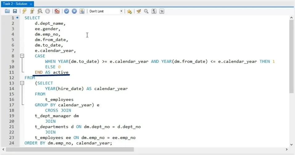
If these are true, we can let ‘active’ display 1 by typing ‘THEN 1’.
Otherwise, (or as can be said in SQL terms - ELSE) we will let it display 0.
Finally, to give this field a name, let’s type END AS ‘active’.
We are done with designating the columns of interest!
The JOINS
Now, let’s think about the joins.
The hint related to this part of the query began in the following way: ”a column containing the year from the hire date of the “t_employees” table must cross-join the “t_dept_manager” table”.
The idea of extracting only a column from the “t_employees” table must ring a bell, and it is to use a subquery within the FROM clause.
The Subquery
In this subquery, we must select the year of the “hire_date” field from the “t_employees” table. Then, we must type “CROSS JOIN”, “t_dept_manager”, and then JOIN “t_departments” and “t_employees” on the relevant matching fields.
Thus, by using this code in the FROM clause, we will retrieve information only for those calendar years where data is available for all designated tables. 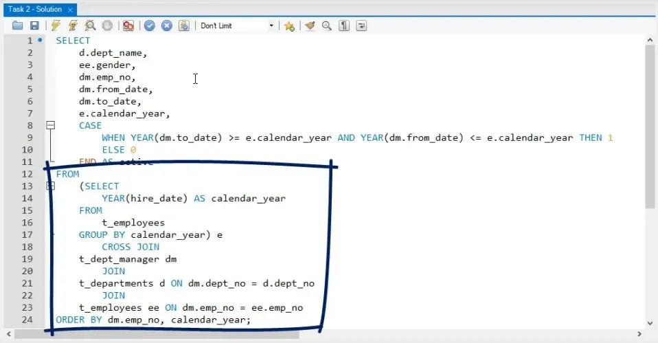
A Quick Test
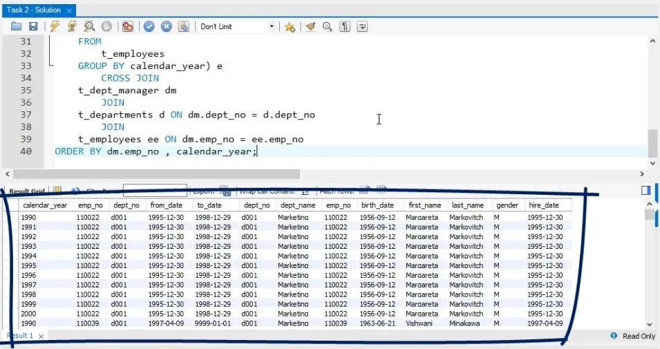
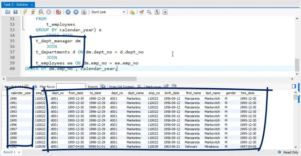
To demonstrate this is the join we need, let’s execute it in a separate SELECT statement, starting with “SELECT * FROM”. The whole query looks like this:
SELECT
    *
FROM
    (SELECT
        YEAR(hire_date) AS calendar_year
    FROM
        t_employees
    GROUP BY calendar_year) e
        CROSS JOIN
    t_dept_manager dm
        JOIN
    t_departments d ON dm.dept_no = d.dept_no
        JOIN
    t_employees ee ON dm.emp_no = ee.emp_no
ORDER BY dm.emp_no, calendar_year;
The Output
As you can see in the picture above, this intermediate output shows that for each manager, as expressed by the different employee numbers, there’s enough information regarding all the subsequent fields. These fields can be found within the data tables mentioned in the join for all years from 1990 to 2000 inclusive.
The Overall Look
So, looking at the query from top to bottom, we can say that we have selected seven of the many columns we retrieved in the last query output.
To conclude the initial query, don’t forget to abide by the last instruction – order by employee number and calendar year.
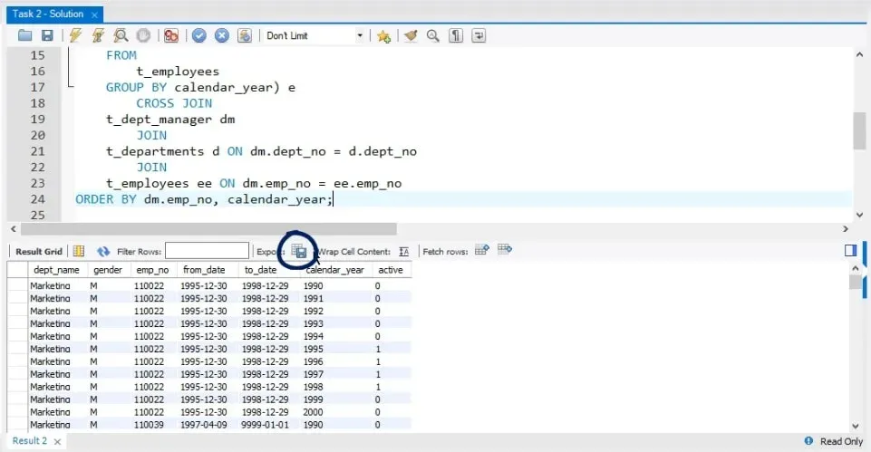
Well, at this stage we can execute the query and obtain the output we were aiming for at the beginning! 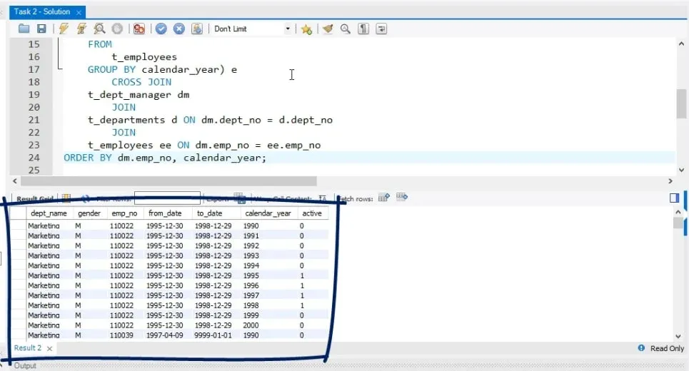
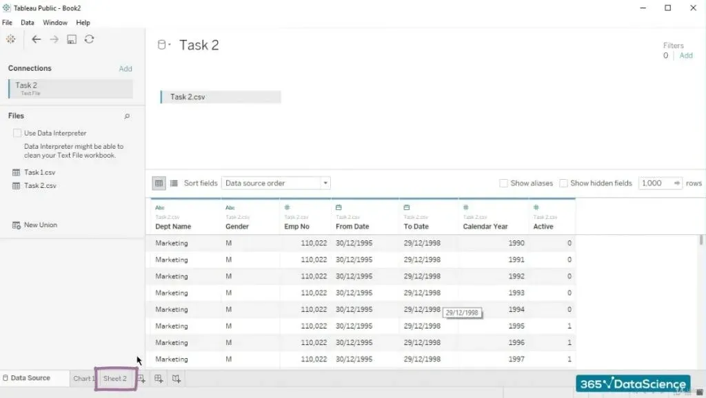
Now, let’s export this SQL output in a CSV format.
The Final Step of the Solution of a Business Task in SQL
Now, it’s time to finalize the solution of this business task in SQL. We will achieve that by loading the data in Tableau and then visualizing it in a way that will respond to it.
Let’s load the data in Tableau.
We can start a new workbook, click on “Text file”, select the CSV file in question, and press “Open”. 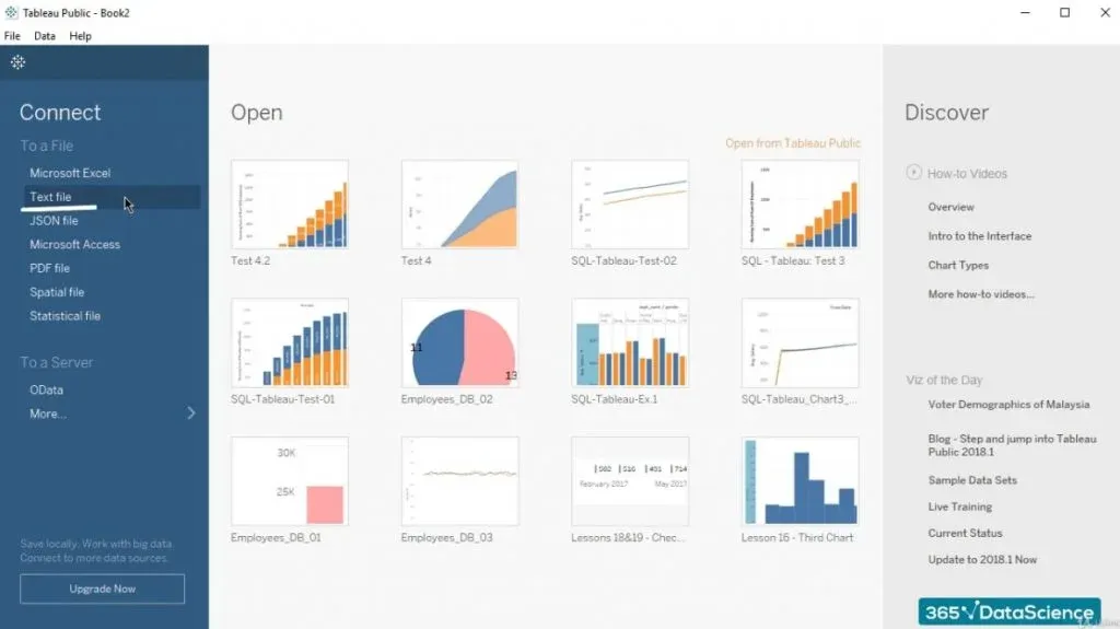
Another Way to Load the Data
However, there’s another option we may want to take advantage of if we wish to remain in the same workbook and create a graph in a new worksheet.
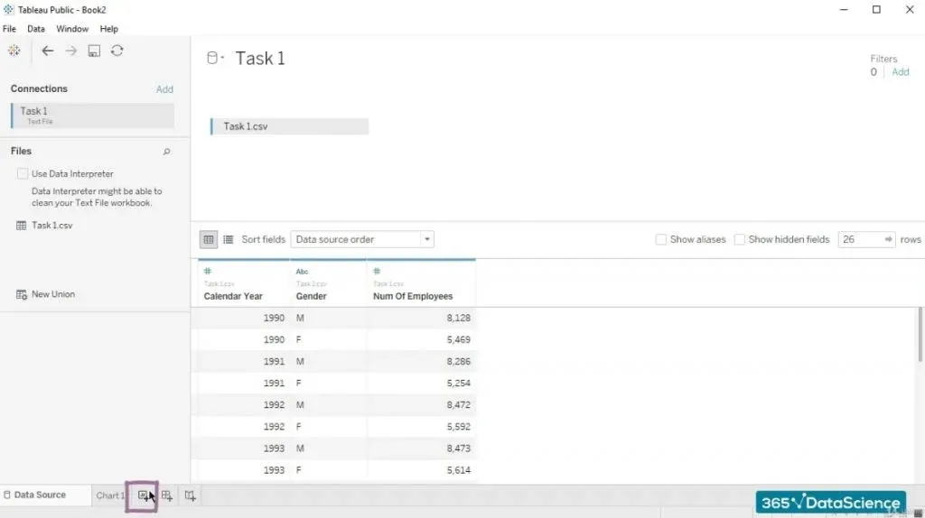
First, let’s click on “New Worksheet” in the lower-left part of Tableau to create a new worksheet.
Notice that if we have previously worked with another worksheet, by clicking on “Data Source”, we’ll go to the same start page we used for it. 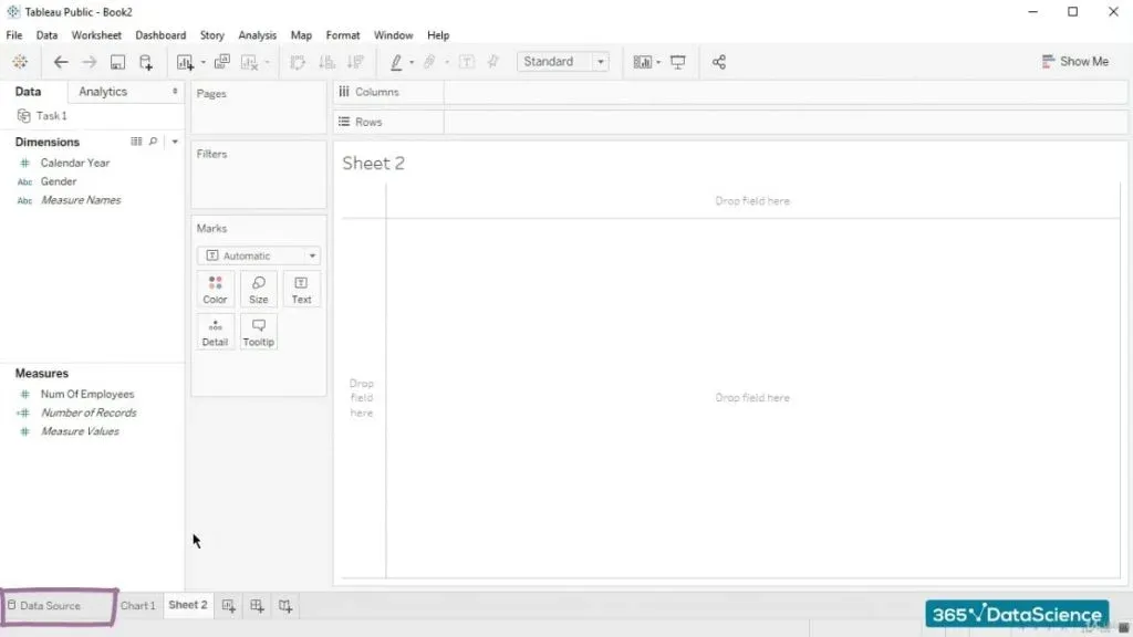
Therefore, we will create a new data source!
Creating a New Data Source
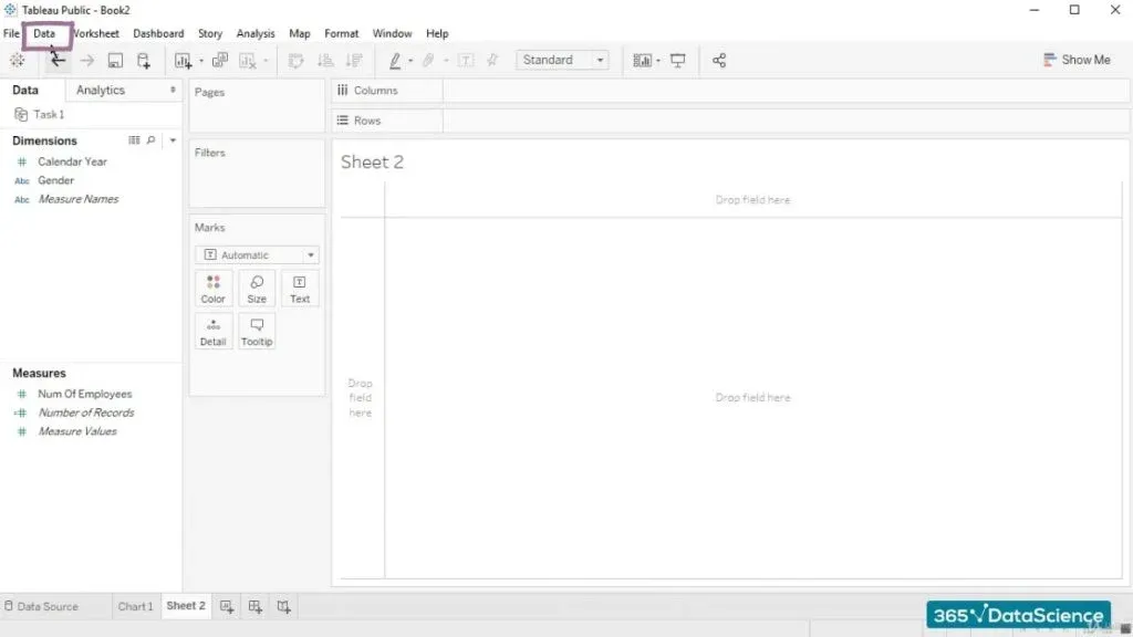
To do that, we must go back to the new worksheet and expand the “Data” menu.
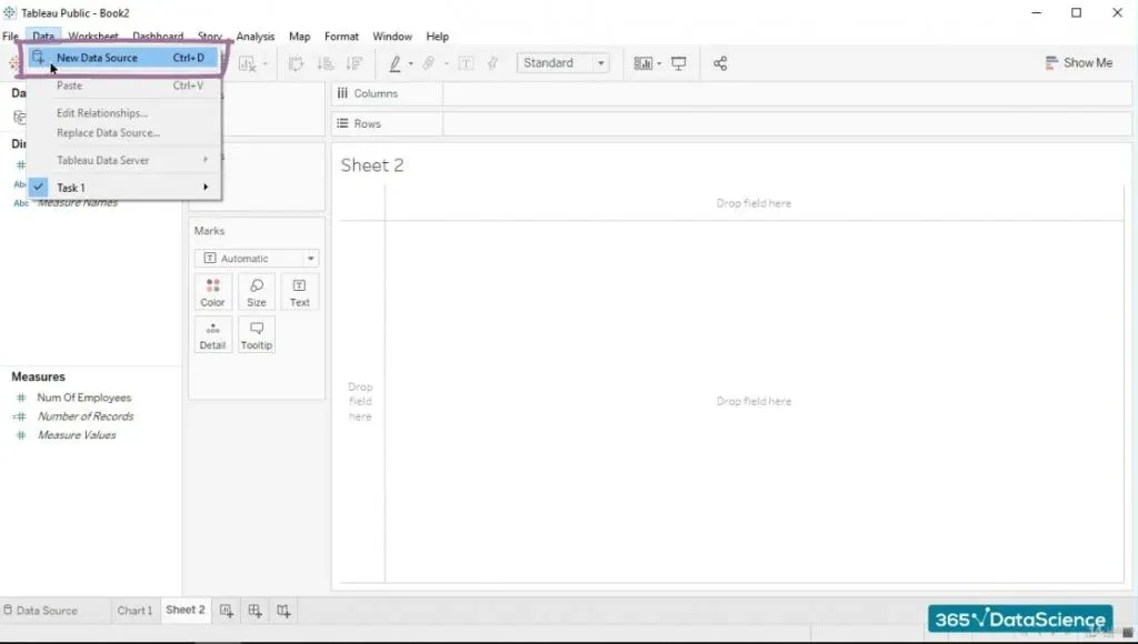
We have to choose “New Data Source”.
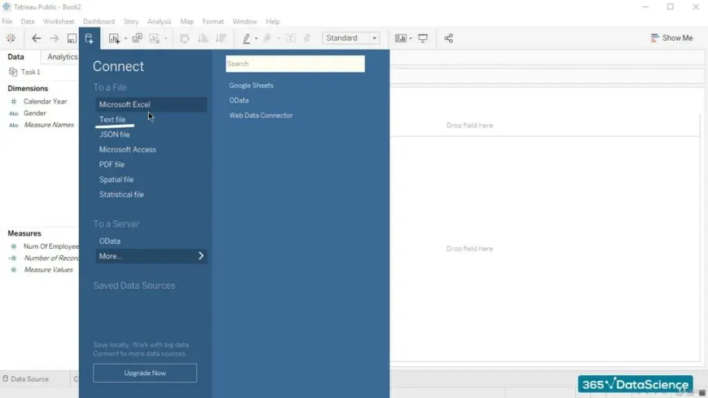
We can select “Text file” again.
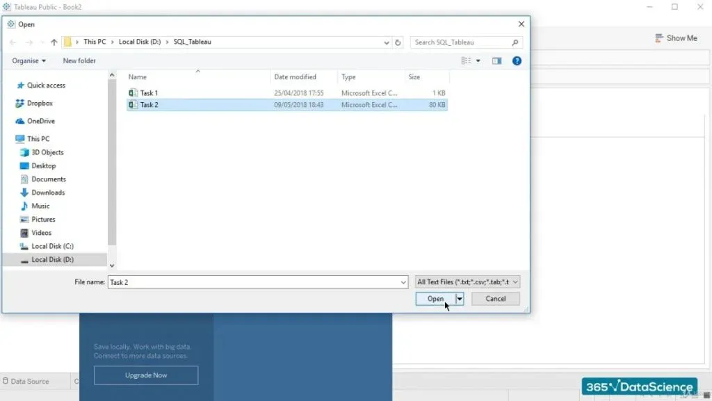
After that, we should pick the new CSV file and then press “Open”.
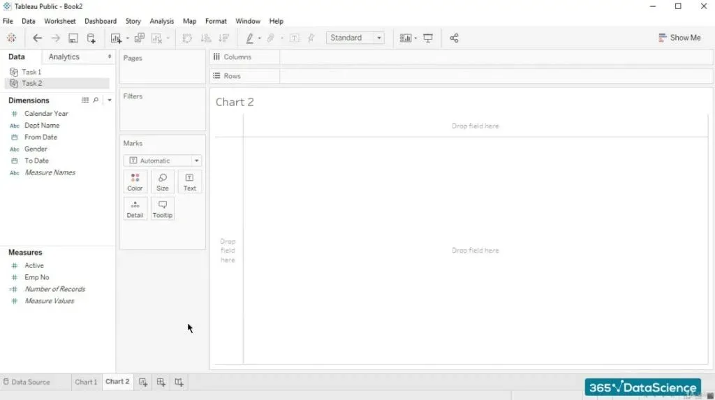
Now we can access Sheet 2.
Let’s rename it to “Chart 2”.
Now, we are ready to work on our visualization.
The Visualization
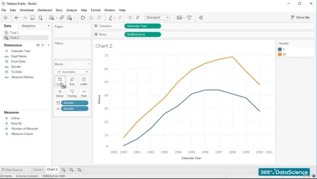
So, we want to compare the number of ‘active’ male employees versus the number of ‘active’ female employees in the company for each year.
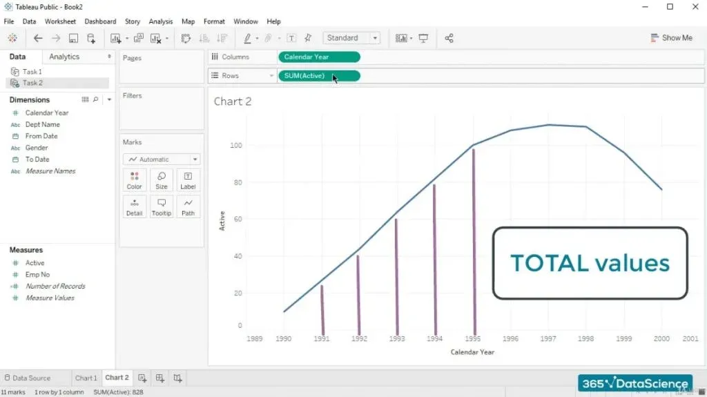
Hence, we should set the years to be laid on the horizontal axis by dragging the “Calendar Year” field up and dropping it in the “Columns” section. 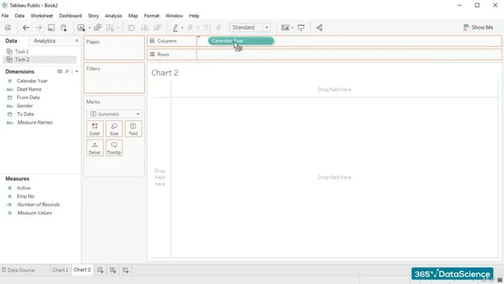
The Rows
Then, we should designate which statistic will represent the rows on our visualization.
There’s no need for discussion - this must be the ‘active’ field. Let’s click on and hold ‘active’, drag and drop it right over the “Rows” section. 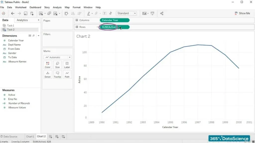
As you can see in the picture above, a SUM function with an argument ‘active’ appeared in the “Rows” section. Why so?
The Benefits of the SUM Function
The reason is that Tableau automatically aggregates the numeric values of a field. In our case, this is doing a perfect job, because in the SQL output, ‘active’ would take values of 1 or 0 only. 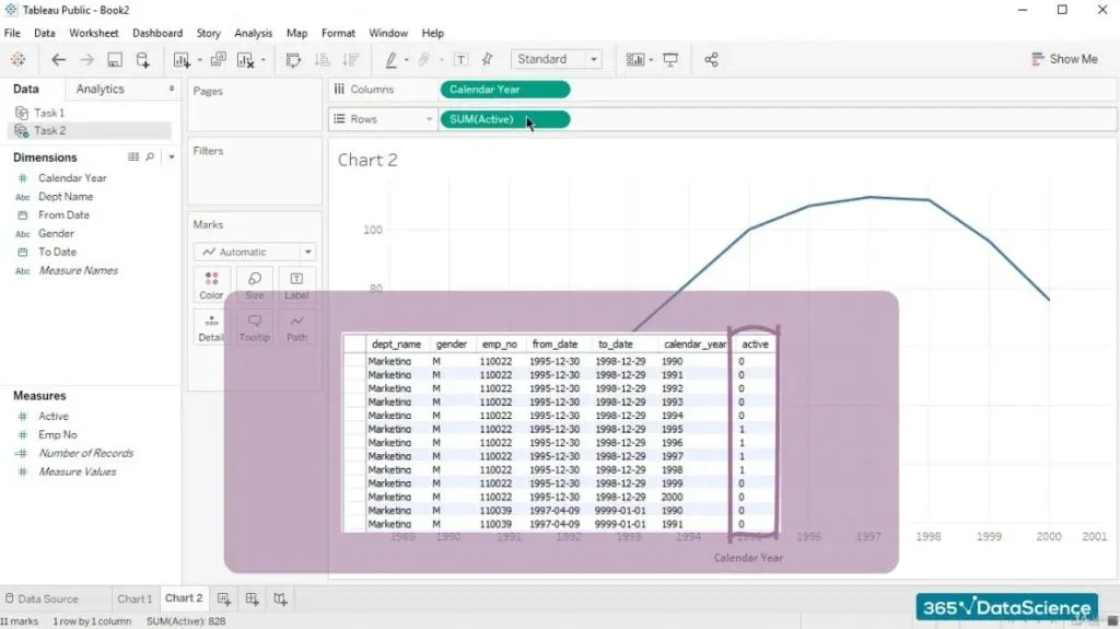
By summing the values automatically for us, Tableau shows us the total number of employees that have been hired in a certain calendar year.
And that is precisely what we need.
The Detail Level and the Colors
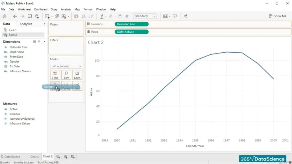
Now, let’s assign ‘Gender’ as a field that will define the detail level and the colors of the graph. We can achieve this by dragging and dropping “Gender” over “Detail”.
And once again over “Color”.
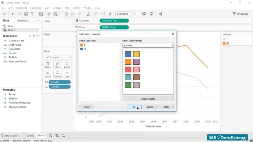
We can also swap the colours representing the male and female employees.
At this point we’ve gotten to something that’s probably new for you.
The Type of Visualization
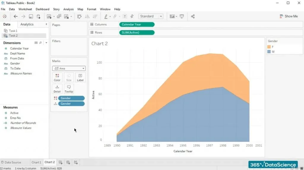
We can expand the drop-down list from the “Marks” section and change the type of visualization to “Area”. 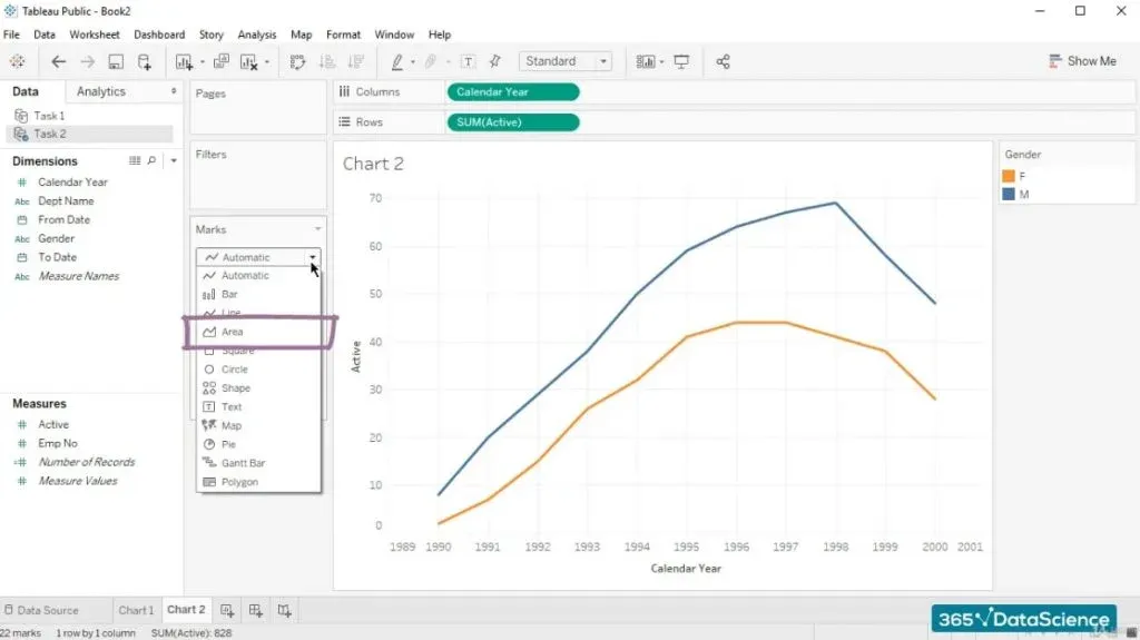
Let’s see how it looks.
How to Interpret it
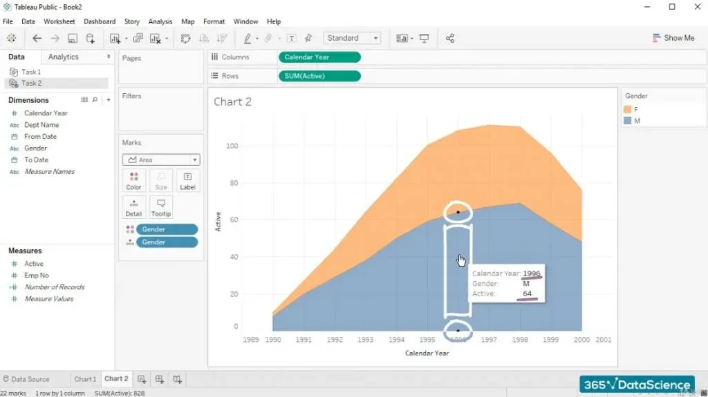
In Tableau, hovering over certain parts of the visualization allows you to obtain specific quantitative information.
For example, as defined by the two dots you can see in the picture below, the area between them tells us that in 1996, there were 64 male managers working in the company.
While if we hover a little bit higher, we can see that 44 female managers were employed during the same calendar year. 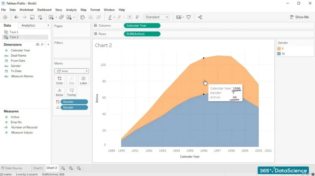
Analogically, we can check the information related to any of the years depicted on the chart.
Finalizing the Solution of Our Business Task in SQL
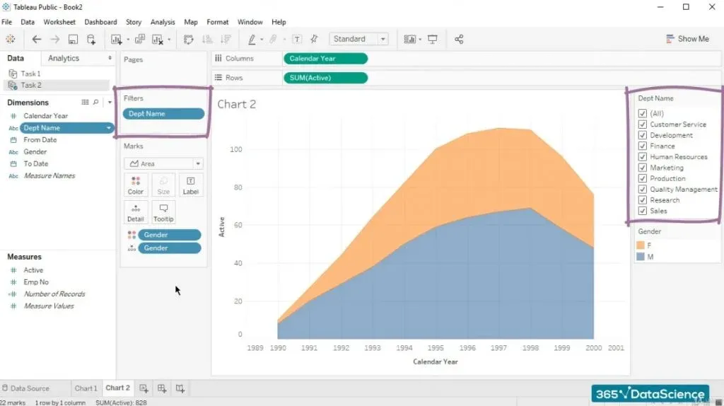
To reply to the initial business task in SQL accurately, we should create the same type of chart for each department.
The quickest way is to right click on “Department name” and then select “Show filter”. 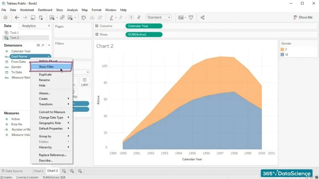
That being done, “Dept name” will appear in the “Filters” section, because the term for this operation in Tableau is called ‘filtering’. 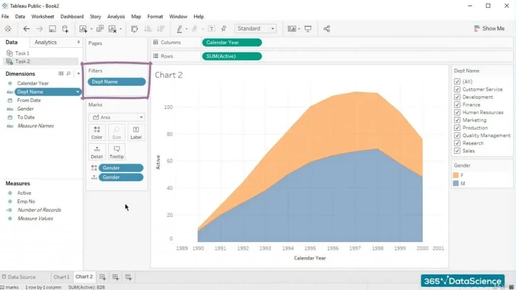
For instance, it is correct to say, “Filter the chart by dept name”.
Exploring the Distribution of Male vs Female Employees in Different Departments
Besides, a multiple value list appears on the right part of the screen.
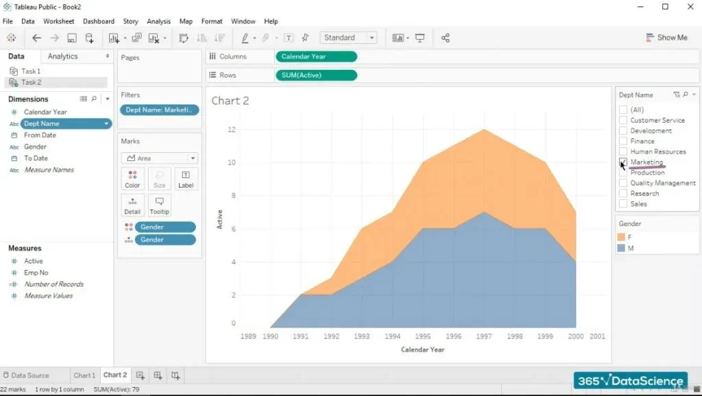
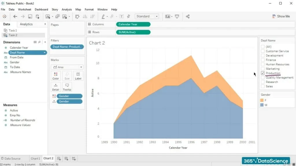
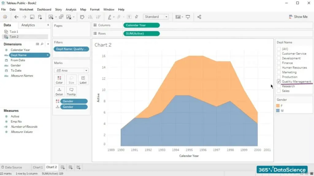
By ticking and un-ticking the different boxes, we can explore the distribution of male versus female employees for the different years for the entire company. Or a specific department.
Such as “Marketing”:
“Production”:
and “Quality Management”:
Why We Use This Database
Before we conclude, we must admit that if you deem some of these graphs slightly odd, we will agree with you.
The data has been fabricated. It is heavily based on the ‘employees’ database, which can be found on GitHub. We’ve chosen to keep using the same data set in this section, too, albeit slightly modified.
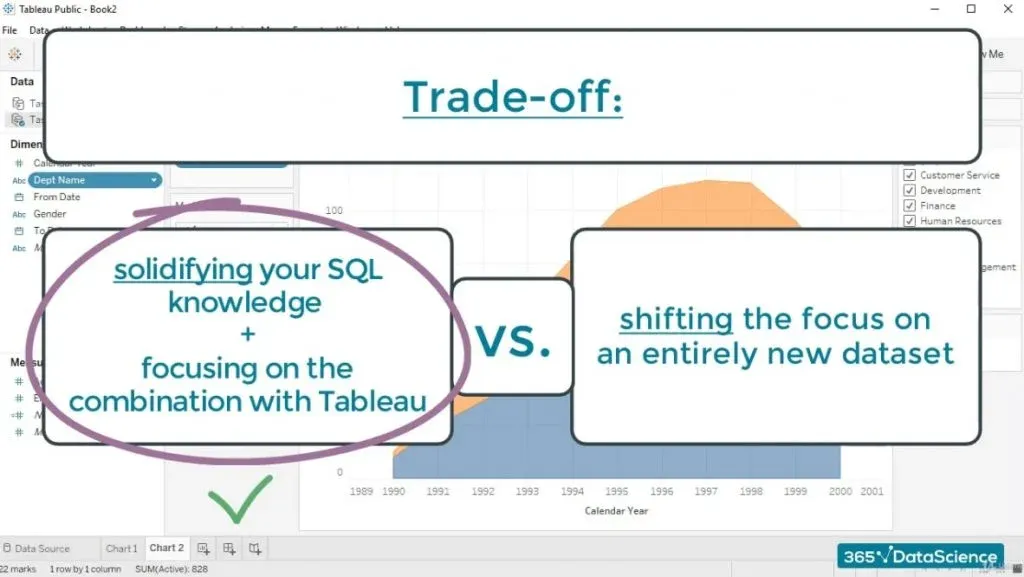
We’ve done this simply for learning purposes. We had to face a trade-off between solidifying your SQL knowledge and focusing on the combination with Tableau or shifting the focus on an entirely new dataset.
And we chose the first option.
The Proper Way to Solve a Business Task in SQL
To sum up, when you are facing a business task in SQL, which you want to visualize in Tableau, you should follow several steps. Let’s look back at what we did:
- First, we figured out what data we are supposed to extract.
- Then, we started writing the code, extremely precisely.
- After that, we went over it, in order to fully understand what it does.
- What we did next, was load the CSV file in Tableau.
- From then on, we created a new data source and managed the way we want our data to be visualized.
So, finding the solution to another business task in SQL shouldn’t be rocket science after solving this one yourself.
That's the last of our SQL Tutorials but there is one last thing for you - Check out the next article to get some useful tip on how to use SQL to its full potential.
***
Eager to hone your SQL skills? Learn how to put theory into practice with our hands-on tutorials!
Next Tutorial: SQL Best Practices


