
The Tableau interface is very intuitive and user-friendly. It creates an inviting workspace area that encourages you to experiment with data, create stunning visualizations, and get smart results. Regardless of your skill level, you will benefit from implementing this software into your data analysis workflow. A good grasp of Tableau will also make you shine bright during a data science interview. All in all, the benefits are plenty.
But if you’re a beginner in data science, in order to enjoy Tableau, you need to understand the mechanics first. For a novice, the many different panes and icons may seem pretty confusing. Don’t be discouraged though. Spend some time to get used to the basics and soon, you will be able to create beautiful and impactful visuals like tables, charts, graphs, etc.
In this tutorial, we will dive into the Tableau interface to show you how to navigate your way around.
Table of Contents
- Creating a New Tableau Sheet
- The Tableau Ribbon
- The Tableau Toolbar
- The Data and Analytics Panes
- The Tableau Shelves
- The Tableau Workspace Area
- The Tableau Interface: Next Steps
The Tableau Interface: Creating a New Sheet
So, you’ve installed Tableau and wondering what to do. Let’s create our first sheet. It’s really easy to do and resembles how we create a sheet in Excel or pretty much every other spreadsheet software. All we have to do is click on ‘Sheet 1’:
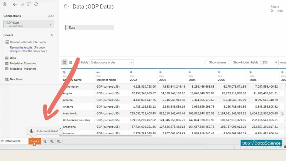
This is what a Tableau sheet looks like. We can have as many of them as we want; simply click on the little icon at the bottom and a new worksheet will be added:
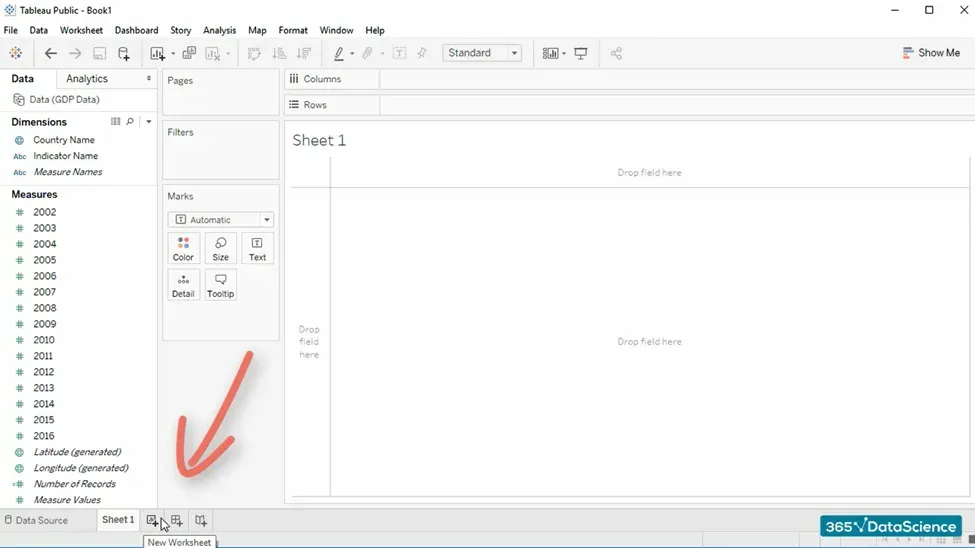
The other two icons in the same row are for creating a new dashboard and a new story, respectively.
If this software is new to you, it’s natural for things to be a bit confusing. As a best practice, we recommend spending some time getting to know the Tableau interface.
Author’s note: If you are interested in learning more about the data science field and the career opportunities it offers, go ahead and download our free data science career guide.
The Tableau Interface: The Ribbon
The so-called “ribbon” is the top-most menu that you see on almost all software programs. In this case, we have 10 different tabs on Tableau’s default ribbon:
- File
- Data
- Worksheet
- Dashboard
- Story
- Analysis
- Map
- Format
- Window
- Help
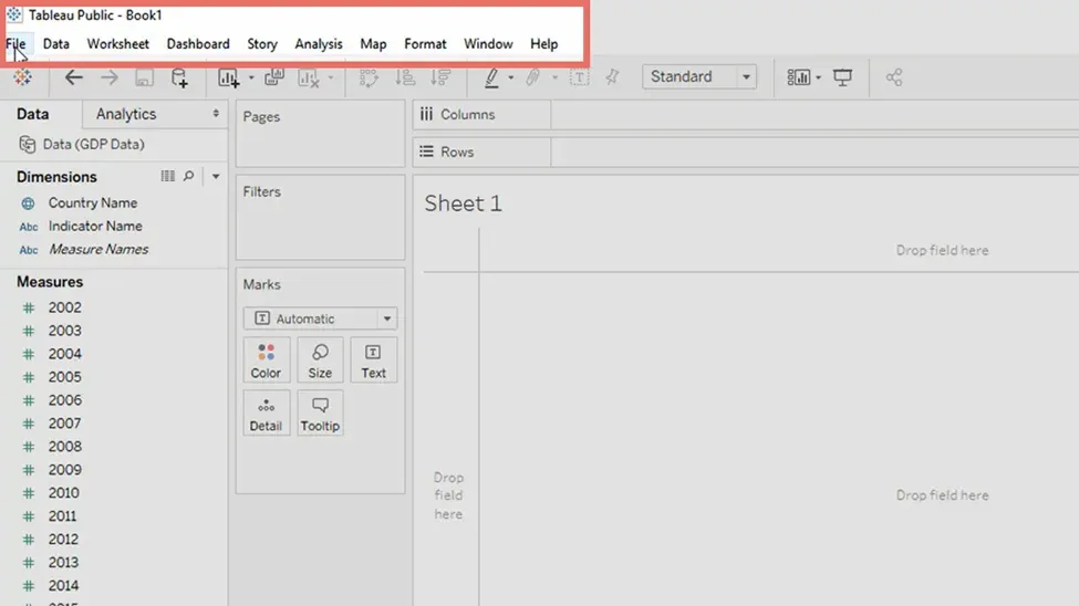
Let’s quickly go through each of them.
File
As with most programs, the File tab contains functionalities related to opening, closing, and saving files:
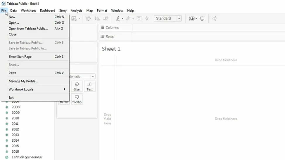
If you would like to, you can also exit Tableau from here, but you don’t need to do that now – we’re just getting started.
Data
Data, on the other hand, is the place in the Tableau interface where you will find functionalities related to the data source you are using:
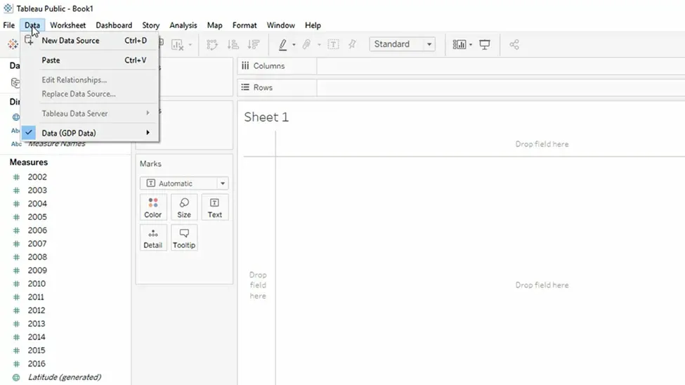
Here you can add a new data connection. For example, you may connect an SQL file. Further, you can replace an existing one, or simply edit the data source of the worksheet you are working with.
Worksheet
Next, we have the worksheet tab. It can be helpful when we want to create a new Tableau sheet, hide or show a chart’s title, caption, summary, and so on.
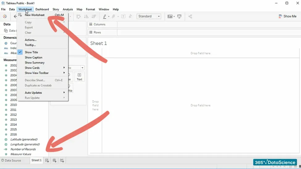
We already have a new sheet (created using the little icon at the bottom left corner). You can do the same thing from the worksheet tab as well. Such repetition is common for most programs.
Functionalities available in the ribbon can be accessed in other places of the Tableau interface. In fact, you will rarely use the ribbon, but it is good to have an overview and be aware that these functions are there as well.
Dashboard and Story
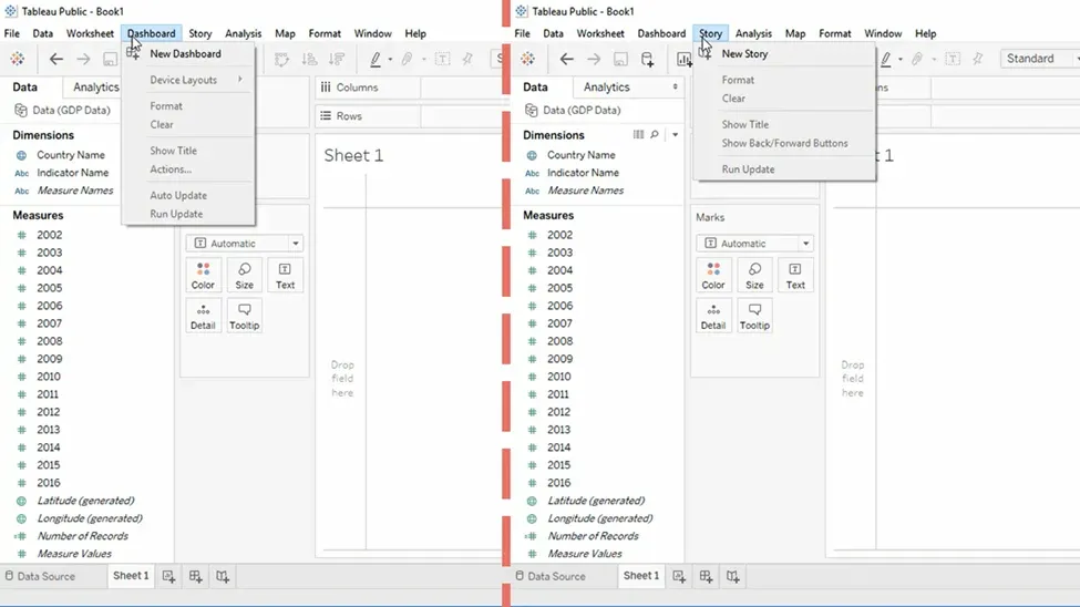
Next, we have the Dashboard and Story tabs, but we won’t dwell on them for too long. You can learn more about them in our dedicated Tableau tutorials.
Analysis
The Analysis tab is where you can tweak your visualization in terms of labels, show figures as a percentage of the total, add trend lines, legends, filters, and more.
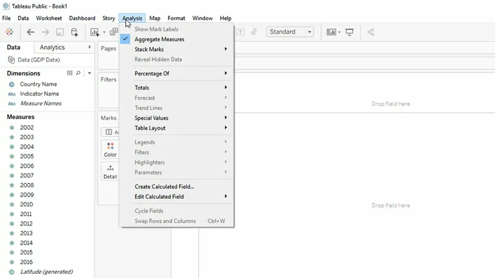
Here, we have some interesting functionalities related to the way we perform our analysis and some of the tools we’ll incorporate into it.
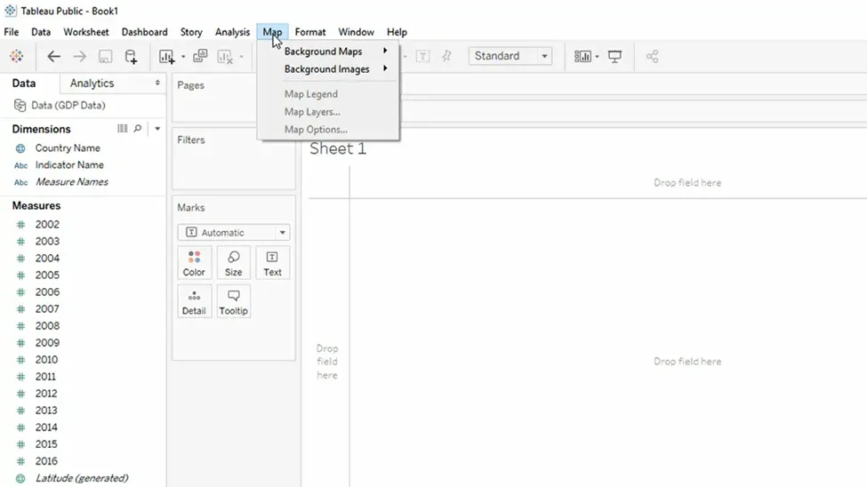
Map
‘Map’ is a tab that is helpful when we use Tableau’s geographic visualization capabilities. This is one of the most powerful and impressive features the software has to offer, so chances are that you will be using it soon.
Format
Through the Format tab, we adjust the way our visualization appears.
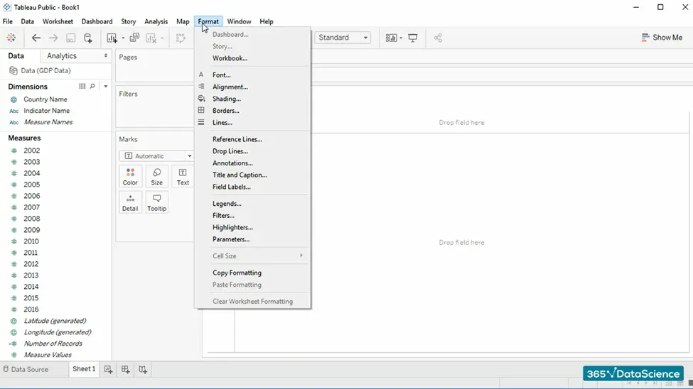
From here, we can modify its font, font size, axis, backgrounds, labels, size, and so much more.
Window and Help
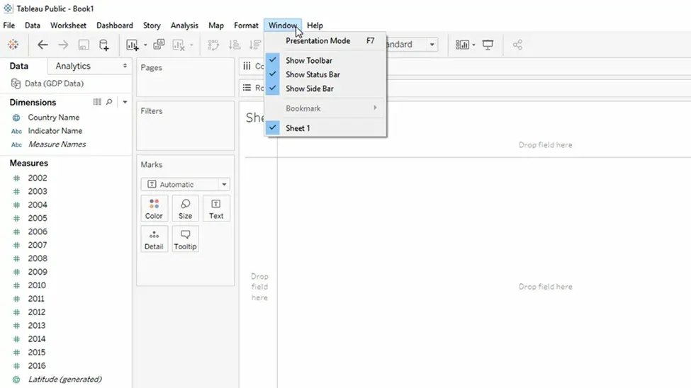
Window and Help are two of the standard tabs in Tableau’s interface that we find in most programs as well. For this reason, we are not going to spend much time on them.
However, one thing we should mention is that Tableau Public has a nice and open community full of users who will be able to help you and whose work you can look at if needed:
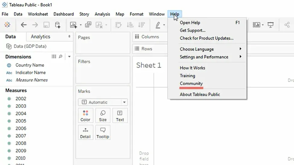
All users of Tableau Public who save their work make it publicly available. Therefore, this can be a useful place where you can search for a given issue you need help with and see what comes up. For example, if you click on “Community” and search for “Geography”, you’ll be able to see what work others have saved previously.
The Tableau Interface: The Toolbar
Next up, we have the Toolbar ribbon. Essentially, this is a row of buttons that will be useful when conducting your data analysis. Some of the commands you’ll find here are:
- Show Start Page
- Undo and Redo
- New Data Source
- New Worksheet
- Clear Sheet
These are just some of the functionalities, however, so feel free to experiment as you go. Hover over a button you’re curious about with your cursor and you’ll see its purpose, as well as a handy shortcut you can access the functionality with more efficiency.
Show Start Page
The Show Start Page button will take you to – you guessed it – the start page in the Tableau interface. You can open your most recent workbooks, as well as connect Tableau with sources like Excel, or even integrate programming servers.
If you’ve just downloaded Tabeau, the Start page will be empty. Think of it as a blank canvas you can fill in with all your fascinating data viz projects.
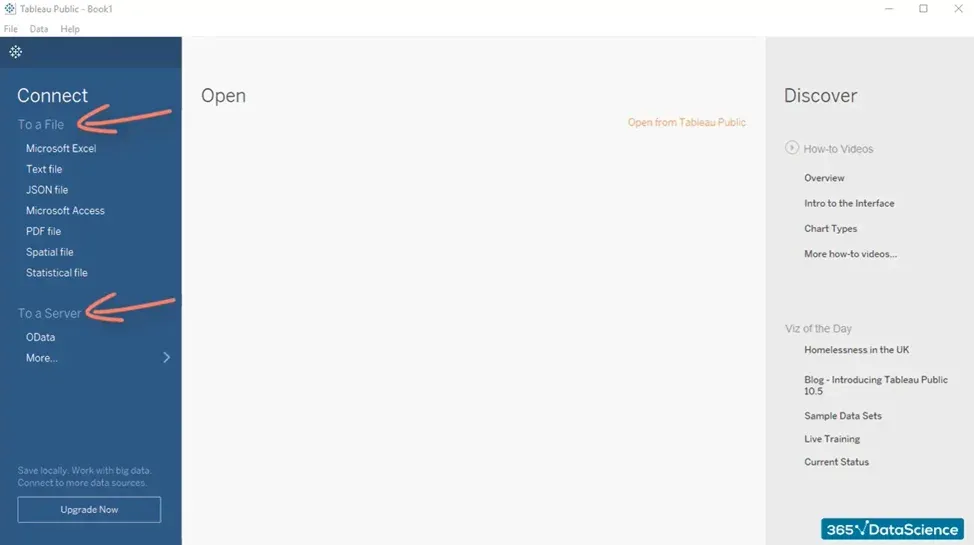
This screen should be somewhat familiar to you as many other software programs use the same convention – most notably, most of the Microsoft Office package, including Excel.
Undo and Redo
You’re probably already familiar with Undo and Redo. Most of the typical Windows shortcuts can be used here as well. As you might already know, the shortcut for undo is Ctrl + Z.
Save
On the right, we have other useful buttons such as Save, which intuitively allows you to save the progress of your work. It’s a very important command and we recommend using it liberally – after all, you don’t want to lose your work.
New Data Source
Quite intuitively, clicking on New Data Source opens the Connect functionality:
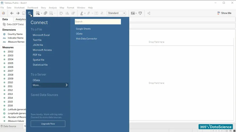
This is practical if you’d like to connect Tableau with SQL and Python, for example, into your current worksheet without having to go back to the Start page.
Other Toolbar Commands
The other buttons we have here are New Worksheet, Clear Sheet, Swap Rows and Columns, and so on:


For now, it would be best if you simply gain an idea of how various objects are positioned within the Tableau interface. For a more in-depth overview of the Toolbar, feel free to refer to Tableau’s Workspace breakdown on their website.
The Tableau Interface: The Data and Analytics Panes
On the left side of Tableau’s screen, we have 2 vital panes – Data and Analytics.
Data
The Data pane is quite important: it shows us what data we’ve loaded, which Tableau then classifies into 2 types:
- Dimensions
- Measures
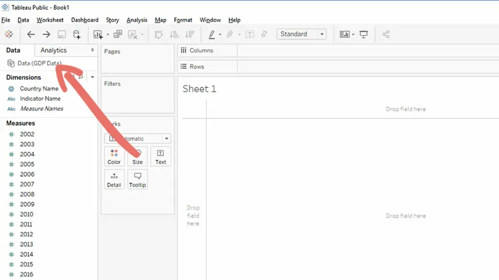
To put it slightly differently, this is a distinction between categorical and numerical data. The data in the Dimensions field cannot be aggregated as it is qualitative in nature. Quite the opposite, Measures can be aggregated and are quantitative in nature.
Analytics
Tableau is a very powerful tool for data science and its capabilities are all-embracing. The Analytics pane is where you can add analytics objects to your worksheet. The pane is divided into 3 parts:
- Summarize
- Model
- Custom
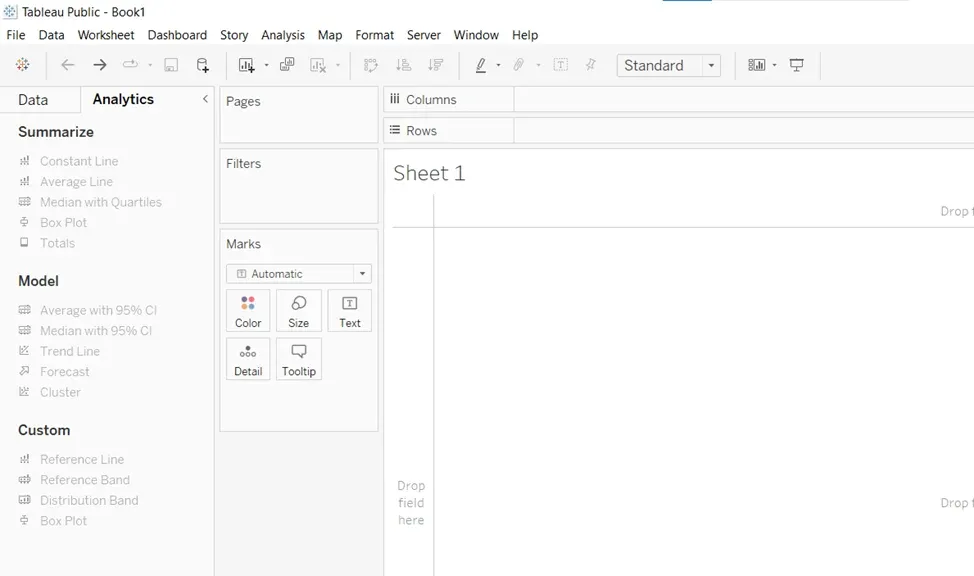
In this pane, you can add features such as reference lines, box plots, and forecasts to your workspace.
The Tableau Interface: Shelves
Finally, here in the middle, we have 3 important sections, otherwise known as shelves:
- Pages
- Filters
- Marks
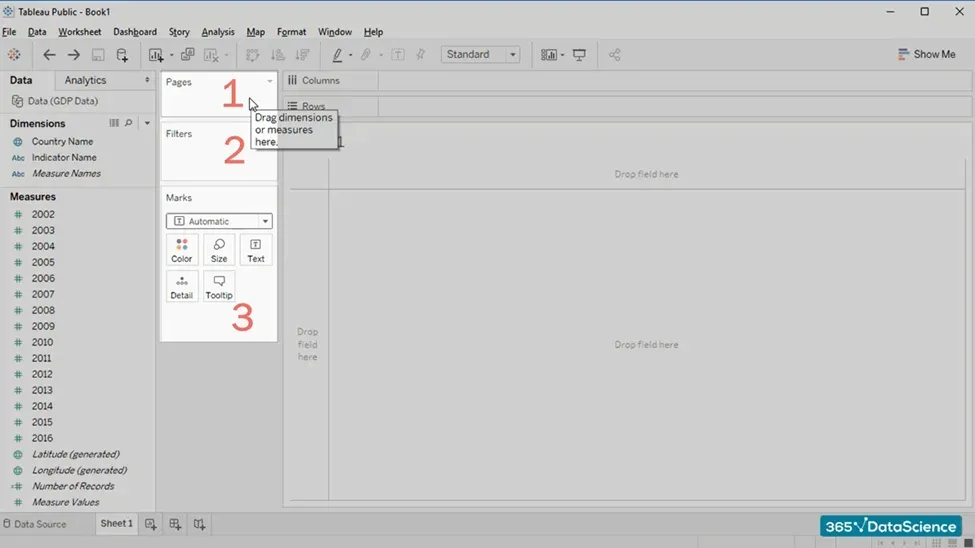
The Pages shelf (1) lets you break a view into a series of pages so you can better analyze how a specific field affects the rest of the data in a view.
Meanwhile, we use Filters (2) when working with filters and customizing which features of the current database you want to display or hide at a certain time.
Last but not least, the Marks shelf (3) contains functionalities related to coloring, size, labels, and so on.
The Tableau Interface: The Workspace Area
The work area is where we’ll create our visualizations, dashboards, and stories, and this is one way to create a chart:
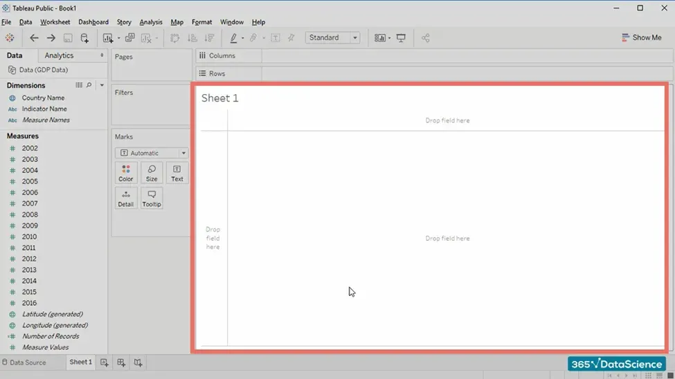
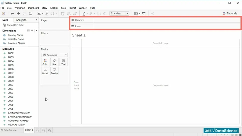
You have certainly noticed that the Columns and Rows part of the sheet started showing us the variables we’ve added to the workspace area:
Meanwhile, the Show Me button on the right allows us to adjust the type of visualization we use:
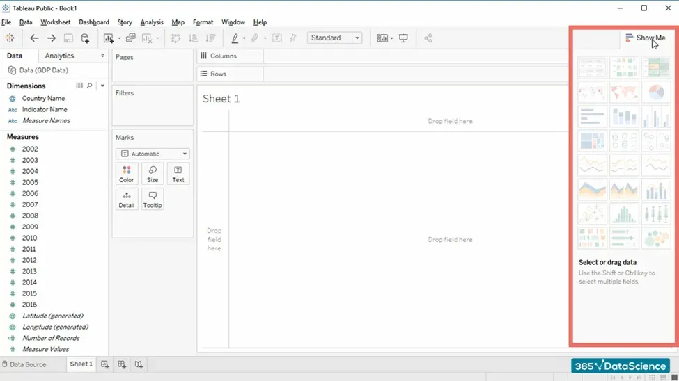
It is a very cool feature because Tableau tells us what types of visualizations we can choose from. Not all charts will be available depending on the data we’re working with.
If you’d like to switch to a different chart, all you need to do is select the respective type and Tableau makes the adjustment automatically.
The Tableau Interface: Next Steps
The Tableau interface allows you to navigate and quickly get the results you are looking for. There’s more than what we’ve covered in our tutorial, however, due to the intuitive nature, you’ll get the hang of the basic terminology in no time.
Tableau is a powerful tool that will get your analytics and visualization skills to the next level – especially once you learn how to use it alongside programming languages such as SQL. It can lead to a successful career as a data analyst or Tableau developer if that’s the area you’re interested in.
Don’t worry if you’re just now entering the world of data science. All you need on your learning journey is the right resources and a go-getter mindset to get the ball rolling. Are you ready to take the next step toward your future data science career?
The 365 Data Science Program offers you self-paced courses led by renowned industry experts. Starting from the very basics all the way to advanced specialization, you will learn by doing with a myriad of practical exercises and real-world business cases. If you want to see how the training works, start with our free lessons by signing up below.
Q&A
What Is the Tableau Interface?
The Tableau interface is the environment you’ll use to conduct your data analysis and create data visualizations, including all of the software’s functionalities. Essentially, this space is made up of several elements designed to help you as you work.
The topmost elements are the ribbon and a toolbar with buttons that perform necessary actions such as creating a new sheet, connecting your Tableau worksheet with other data sources, and of course, saving your progress. On the left-hand side, you’ll find 2 very important panels: Data and Analytics, which show the data you’ve loaded and allow you to add analytics objects to your sheet, respectively. Next to this sidebar are 3 so-called shelves – pages, filters, and marks – through which you can customize the data you’re working with. Finally, when you initially open Tableau, you’ll notice a large empty space (if you haven’t yet connected a data source). That is your workspace area onto which you’ll import and experiment with your data.
Similar to other software, the Tableau interface is intuitive and user-friendly. It’s recommended that you spend some time getting acquainted with the different elements and functionalities before diving into data analysis.
What Is Tableau Used For?
Tableau is a tool used for data analysis and data visualization. It is a powerful software suitable for driving business intelligence and improving data storytelling skills. With Tableau, you can analyze huge amounts of data without wasting time sorting through unnecessary information. Moreover, extracting meaningful insights is made easier as the software eliminates the lengthy steps of gathering and manually importing data. Because of Tableau’s easy-to-navigate interface, loading datasets and spreadsheets is a simple process and you can even integrate other programming tools such as SQL and Python.
The main reason people use Tableau is its data visualization features. You can create many different types of charts, graphs, maps, tables, etc. By visualizing your data in a comprehensive, aesthetically pleasing way, you further enhance the important information that you’ve discovered. In addition, you can better present it to your company’s stakeholders, who are most likely as well versed in data science as you are. Good visualizations make the data easier to understand and you’ll only put forward the details that are truly valuable, rather than presenting random noise.
What Are the Disadvantages of Using Tableau?
While Tableau is a very powerful tool for data analysis, it has its disadvantages such as poor versioning, pricing, limited data preprocessing, as well as requiring coding know-how for complex data analysis.
For starters, Tableau doesn’t offer support rollback for older versions. Essentially, revision history is only possible if you’d have a newer version of the software.
That brings in the next disadvantage, which is its pricing. While Tableau is relatively affordable compared to some of its competitors, it’s certainly not the cheapest. Most small companies would be stretching their budget to incorporate it into their workflow, not including the staff training required. Even for the average consumer, licensing can be pricey, especially if you’re a beginner in data science. The good news is that there is an open-source version, called Tableau Public, however, that has its limitations as well, so it all depends on your needs.
Every data scientist worth their salt knows how important data cleaning is. Tableau, unfortunately, does not have many options, which is certainly a disadvantage. If you’re working with unprocessed data, then you might need to resort to other software to clean it before you can import it into Tableau.
And finally, if you want to take your data viz skills to the next level, you have to have some programming knowledge – particularly in SQL. It is essential if you want to integrate the two tools and analyze data from multiple sources.


